Reading view

There are new articles available, click to refresh the page.

11 Website Layout Examples for Every Type of Page

Everyone who uses the Internet looks at website layout examples every day. Yet, unless you are a designer or in the process of building your own site, few of us ever stop to think about what actually makes a good web-page structure.

You may instinctively feel it when you encounter one that is less than satisfactory. But do you know how to design a website layout that both pleases your visitors and allows you to achieve what you want with your site?

If the answer to that question is no, don’t fret. We’ll show you examples of different types of website layouts you can choose from and help you understand which are most appropriate in different situations. Then, we’ll explain how to choose a layout for your own website, as well as share some tips and tools you can use to create layout mockups.


Table of Contents

  1. 11 Common Types of Website Layouts
    1. 1. Z-pattern
    2. 2. F-pattern
    3. 3. Magazine
    4. 4. Grid
    5. 5. Modular
    6. 6. Single-Column
    7. 7. Content-Focused
    8. 8. Full-Screen
    9. 9. Hero
    10. 10. Split-Screen
    11. 11. Asymmetrical
  2. How to Choose a Website Layout
    1. Understanding website layout vs. website structure
    2. What Is the Goal of Your Website Layout?
    3. Consider the Type of Website You Are Building
    4. Do Your Research
    5. Consider What You Like
    6. Base Your Design on Common Layouts
  3. Creating a website layout mockup
    1. Wireframing your layout
    2. Additional Tips
    3. Tools for Wireframing
  4. Find the Right Website Layout for Your WordPress Site

11 Common Types of Website Layouts

In order to give you ideas about what a website layout can look like, let’s go over some common types, the kinds of websites they are most suitable for, and examples. Be aware that for some of these, the distinction is a bit fluid. You can often apply more than one layout principle to a single site.

1. Z-pattern

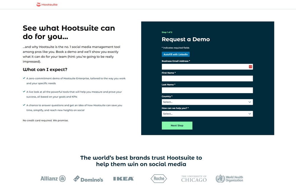
This Z-pattern layout is based on the way many people naturally look at website content. They start at the top left, scan to the top right, then go down to the left and to the right again.

You can take advantage of that, for example, by placing the logo in the upper left corner and the navigation menu across from it. Your most important information, such as your heading and visuals, appears diagonally down left from that, while the call to action is to the right of it again.

This website layout is very skim friendly and most appropriate for sites that have relatively little content that you want to give much attention to, like CTAs, forms, and buttons.

You can also line up several Z-patterns with alternating elements to lead visitors down in zigzag form and keep them engaged.

2. F-pattern

This layout is also based on common page-scanning behavior, first discovered and defined by the Nielsen Norman Group.

It is observable on both desktop and mobile and especially for more text-heavy sites. That makes it well suited for websites with lots of options or written content that needs to be scanned quickly, e.g. news sites or search result pages. You can take advantage of it by using the left side as an anchor.

However, it is important to note that NNG has come out in recent years saying that, while the F-pattern is a natural reading sequence, it is not good for users and websites. They state you should encourage readers to consume the rest of your content through text formatting like bullet points or visuals like icons and images.

3. Magazine

Magazine layouts are inspired by printed newspapers and magazines and there are many examples of this kind of website out there. They usually consist of multiple columns made up of individual containers that create a complex visual hierarchy.

In this website layout, different elements often have different weights assigned to them to show their relative importance. You can do this, for example, with bigger headlines or the use of images. This creates a multi-level hierarchy.

The goal is to allow visitors to scan a great amount of information quickly. As a consequence, it’s a great choice for content-heavy websites, especially those covering a multitude of topics. Dashboards, such as for web applications, are also good candidates. The Gazette theme is another great example for how to use a magazine layout.

4. Grid

Also called box-based website layouts, grid layouts distribute elements across the page according to a clear underlying order.

The result is a well-structured and geometrically-arranged design. It’s ideal for sites that have a lot of content of equal importance, e.g. portfolios. Linked pages often appear in the form of an image plus title and a short abstract.

If your content does not all have the same priority, there are lots of options to determine relative importance of different elements as well.

5. Modular

Next in our list of website layout examples, we have a special kind of grid structure, which is also known as block layout. In it, each unit of content has their own space, is evenly spaced, and thus easy to locate. You might be very familiar with it from Pinterest and other sites that use a card layout.

This website layout is also great for mobile design, as it rearranges well for smaller screens. If you want to use it, it is most suitable for business websites, content collections like product pages, or the display of custom post types.

6. Single-Column

Our next website layout example arranges all content in one vertical column and orders it sequentially.

Single-column layouts are popular and easy to use, especially on mobile, where users prefer to scroll over clicking from page to page. To that end, it benefits from a back-to-top button and sticky menu.

If your content is very text-heavy, remember to break it up with images to ensure readability. As you can imagine, this website layout is frequently used for blogs and anything that has a feed-like content pipeline. Landing pages are also a good candidate.

7. Content-Focused

As the name already suggests, this layout is most appropriate for websites whose primary appeal is (written) content. It’s similar to the single-column variety, often with one main column and one or more side columns for additional information.

While the focus is on the primary content, you can surround it by other elements that you want visitors to notice after landing on the page for the main attraction. This could be a newsletter signup form in the sidebar, advertisement for your product or service, or a sales banner.

Naturally, this page structure lends itself best to blogs or other websites that mainly deal in writing. At the same time, singular pages on websites with a different layout can also benefit from a content-focused approach.

8. Full-Screen

This is a website layout that covers the entire page. There are no sidebars, the screen comes across as a singular unit.

Sometimes this design is coupled with a modular build that scrolls screen by screen, so that each section is like a separate page. It often has an image or even video in the background.

Full-screen layouts are best suited for one-page designs, storytelling, and product pages. They work best if you couple them with captivating colors and/or visuals. If you like this look, the Afterlight theme might be a good option for you.

9. Hero

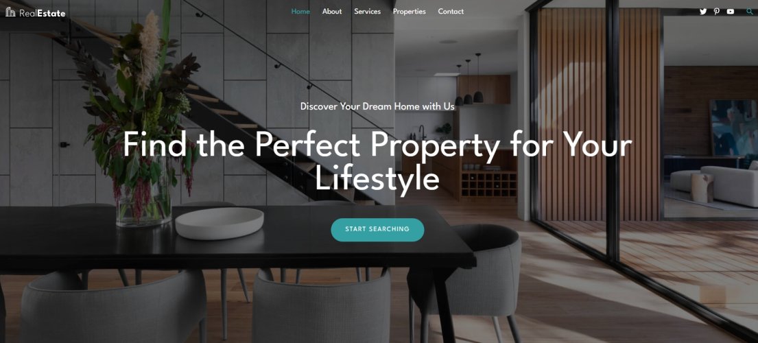
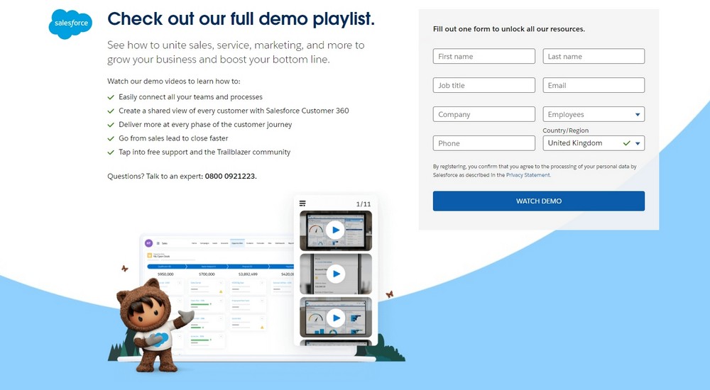
A special type of full-screen website layout with a large image at the top (also called “hero image”) that contains the main elements like your site title, CTA, etc.

Hero layouts are a good way to quickly capture attention and clarify the topic of the page, especially for products. It’s a big, bold visual statement with additional information in the form of text elements.

The layout works best for product pages and ecommerce websites in general. However, some blogs also use it.

10. Split-Screen

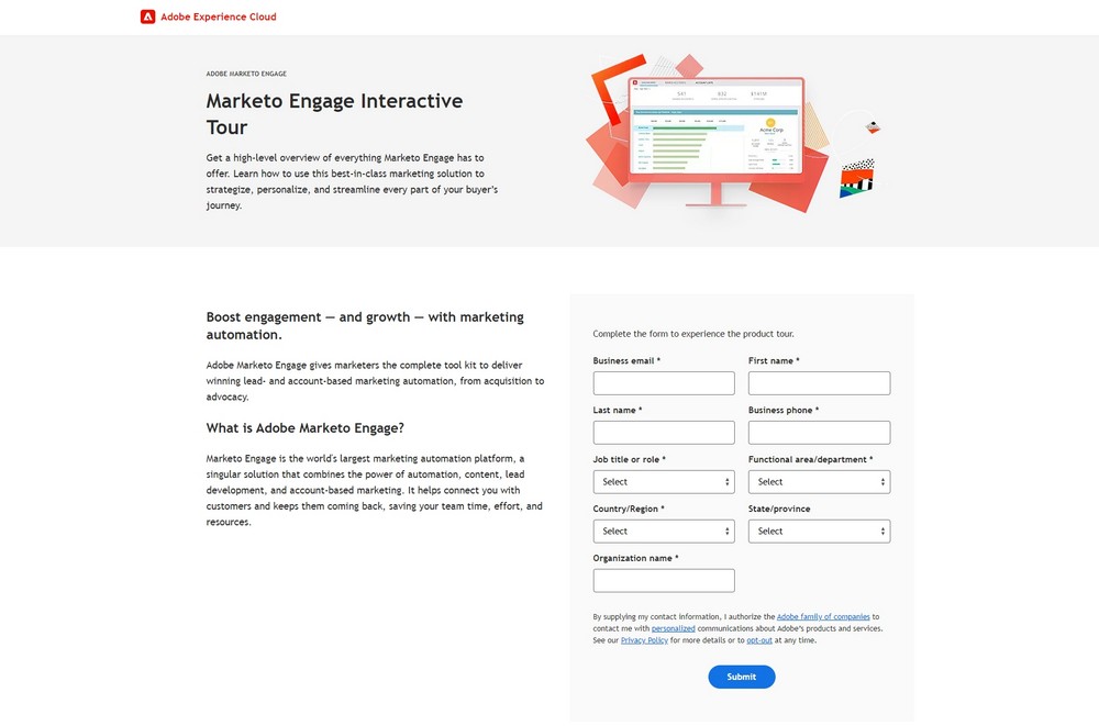
In this website layout, the screen is divided in the middle.

Split-screen layouts provide a balanced symmetry allowing you to represent two different ideas and give them the same consideration. Alternatively, you can also show off the same idea from different angles or use it to divide ecommerce customers at the start of their journey.

Split screen is a great option for websites that use two different types of content (e.g. images and text) or provide two distinct customer journeys. It’s also suitable simply for websites that want a modern look. However, it’s not so great for text-heavy designs because it doesn’t scale well, especially on mobile.

11. Asymmetrical

A design similar to split screen or grid but with uneven distribution, offering an added dynamic.

You can use scale, color, width, and more to provide different focal points and highlights on the page. However, asymmetry does not mean chaos. There’s an underlying order that provides elegance and congruity.

What are good candidates for asymmetrical website layouts?

Websites that want to go for something modern, innovative and guide the user’s attention in dynamic ways. Business websites, online portfolios, or landing pages are prime beneficiaries.

How to Choose a Website Layout

With a better idea about what types of website layouts exist, how do you pick the right one for your website? Here are a few practical tips to do so.

Understanding website layout vs. website structure

First, make sure that a website layout is what you’re looking to implement. In a sentence, this means the way that the elements on your web pages (content, navigation, header, footer, and everything else visible) are arranged to present the information included within them.

In contrast to website structure, layout focuses on the individual page experience and how users consume the content on your pages. It is less concerned about leading them around your site as a whole (though, of course, that’s part of it as well).

While different web pages on your site can (and should) have different layouts, the basic structure usually stays the same. For example, the information needed on a shop page is very different from that of a product page or something like an About section. At the same time, the basic layout elements, especially header and footer, usually stay constant across most pages.

This makes for a consistent user experience, while allowing for flexibility to deliver different types of content to users.

What Is the Goal of Your Website Layout?

Good layout has the power to keep users on your page longer and engage them. Bad layout can do the opposite. In times where most visitors leave your site within ten seconds, you need all the edge you can get. Here are some things that good website layout accomplishes:

  • Makes a good first impression – Users decide within less than half a second whether they like your site or not, so you better make sure your layout is on point.
  • Naturally leads the eye to important content – The focus of every website is content, whether that is products or information. Your page structure can either direct users towards it or away from it.
  • Provides strong user experience (UX) – A good layout helps visitors find what they are looking for, both on page as well as sitewide. It also sets elements in relation to each other, determines their sequence, and gives weight to the right elements.
  • Gives guidance – Layout provides guide rails for your users. It places the most important content at the top and leads them down the page toward your goal. 

The best website layout is one that you barely notice because you can easily find every element you are looking for. It is also one aimed at your target group, their preferences, behaviors, and needs.

Consider the Type of Website You Are Building

As you have seen above, different website layouts are more or less suitable for different types of websites. Therefore, in order to choose the right one for you, you first need to be crystal clear about what kind of site you are building.

Business sites, shops, blogs – they all have very different focal points and demand different layouts. Clarity in this area is the first step towards making the right choice.

Do Your Research

Your website does not exist in a vacuum. Look at websites that are the same type as yours (e.g. blog, ecommerce, B2B, B2C, etc.) but sell different types of products/services or serve different industries/niches than your own.

When you do, identify common website layouts, best practices, what looks good, and see what you can do better with your layout.

Consider What You Like

Yes, a website is primarily there to serve other people. However, at the same time, it also needs to be something you like. If you are turned off by your own website, it’s unlikely that you will put in the energy and enthusiasm needed to run it and make it successful.

For that reason, while considering which website layout to choose, also do some introspection. Think about what you personally like and would like to see on your site.

Base Your Design on Common Layouts

The website layouts we discussed above are commonly known because they work. They have proven to be usable over time, are familiar to users, and ready to go. Therefore, it’s a good idea to go with one of the established layouts and then add your individual flavor to it.

Creating a website layout mockup

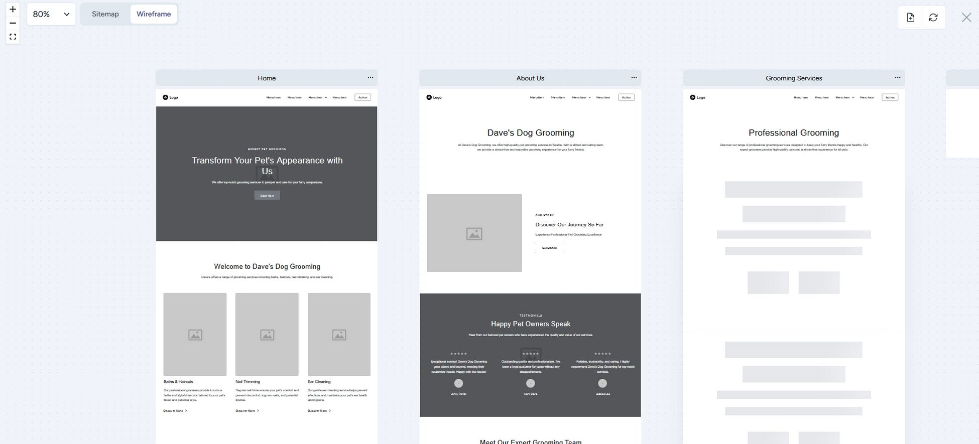
WordPress themes are flexible enough to support different types of page layouts out of the box. But what if you are designing your own theme or are working with a website developer? In this case, you might want to create a wireframe. This helps to map out your page layout and is also good to clarify your ideas and get them onto paper.

Wireframing your layout

A wireframe is like a map of your page. It’s not the finished design but something that shows its structure.

Here’s how to create a simple wireframe:

  1. Think about the user journey – Be aware what your goals are with your layout, where you want to steer visitors and what you want them to do.
  2. Get sketching (and start with mobile) – Wireframes are not meant to be superfancy or detailed. Therefore, you can get started right away (see the tools below). A good idea is to start with the mobile design, then move on to larger screen sizes.
  3. Create the basic framework – Take a bird’s-eye view, tackle the basic design problems first. Think about where to place the navigation and other basic UI elements.
  4. Identify content areas – Mark where your content goes. For that, it’s important to know the content you will use ahead of time (both word count and images) so that you can accurately include it in the map.
  5. Iterate – Even if you are satisfied with your first idea, do a few more passes to give yourself options. It often takes a while for the best ideas to bubble to the surface.
  6. Test – Once you have some website layout ideas collected, it’s time to put them in front of potential users and collect feedback. The tools listed below are suitable for that as well. Getting some real-life feedback is great to improve and get closer to the final version.
  7. Rinse and repeat – Do this over and over until you are satisfied with the results and ready to move to the design phase.

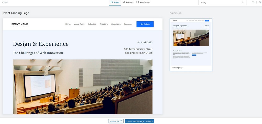
Pro Tip: Did you know that sites hosted with WordPress.com includes wireframe block patterns that you can use? These are patterns that are closer to a blank slate for your page without much design, but they include a basic structural layout. Just choose a wireframe pattern you like from the patterns library and customize it to suit your needs. 

Additional Tips

In order to create the best possible website layout, here are some tips and concepts to keep in mind:

  • Create a visual hierarchy – Decide which elements are the most important and build your website layout so that it focuses on them. Make sure that they are placed where they are easily noticeable and identifiable.
  • Use a grid – Almost all web design is based on some sort of grid. It provides order and a basic structure and scaffolding that you can order your page elements along.
  • Employ the rule of odds – Use odd numbers of elements rather than even. That way, the focus is always on one element instead of in between two of them.
  • Ensure scanability – We have already talked about reading patterns. When designing your website layout, be sure to accommodate the way visitors consume content to make it easy to catch the gist of your site.
  • Focus on the fold – The fold is where the screen cuts off when someone first gets to your site. Above it, in the part that visitors see first, you should have your most important content and call to action.
  • Use enough white space – Negative space, the part without content, is as important as the content itself. It provides space to breathe and allows the emphasis to be where you want users to focus.

Tools for Wireframing

You can use different kinds of tools to build wireframes:

  • Pen and paper – Classic but powerful, easy to use, and great to quickly whip up some website layout ideas without having to learn a new tool.
  • Whimsical – A collaboration tool that works for wireframes and also allows you to get feedback. It’s also easy to use and has a free plan.
  • Invision – Similar to Whimsical. Also works for collaborative designing. Comes with wireframe templates and has a free plan for up to three online whiteboards.
  • Figma – A popular tool for design and prototyping that has free wireframe kits to hit the ground running. Use the free plan to get started without paying.
  • WordPress.com’s wireframe patterns – If you want to start with an pre-designed wireframe template, and adjust from there, WordPress.com has some patterns to make this simple.

Find the Right Website Layout for Your WordPress Site

The layout is one of the most decisive factors for the usability of your website. For that reason, it deserves ample consideration so that you can serve your visitors in the best way possible.

Established page structures are a great way to get started. They have proven themselves over time and are able to fulfill established user expectations. While you can (and should) add your own flavor, you don’t have to reinvent the wheel. It’s also often feasible and sensible to use more than one layout in a website, especially on different pages.

When making decisions, consider your type of website, goals, industry, and personal likes. Then, use wireframing to capture your ideas for your website layout. And remember, it’s all about your users. The best layouts are those that they hardly notice.

Build fast, ship faster with Studio, a fast, free way to develop locally with WordPress. Get started now.

WordPress 6.7 “Rollins”

Each WordPress release celebrates an artist who has made an indelible mark on the world of music. WordPress 6.7, code-named “Rollins,” pays tribute to the legendary jazz saxophonist Sonny Rollins. Known as one of the greatest improvisers and pioneers in jazz, Rollins has influenced generations of musicians with his technical brilliance, innovative spirit, and fearless approach to musical expression.

Sonny Rollins’ work is characterized by its unmatched energy and emotional depth. His compositions, such as “St. Thomas,” “Oleo,” and “Airegin,” are timeless jazz standards, celebrated for their rhythmic complexity and melodic inventiveness. Rollins’ bold and exploratory style resonates with WordPress’ own commitment to empowering creators to push boundaries and explore new possibilities in digital expression.

Embrace the spirit of innovation and spontaneity that defines Rollins’ sound as you dive into the new features and enhancements of WordPress 6.7.

Welcome to WordPress 6.7!

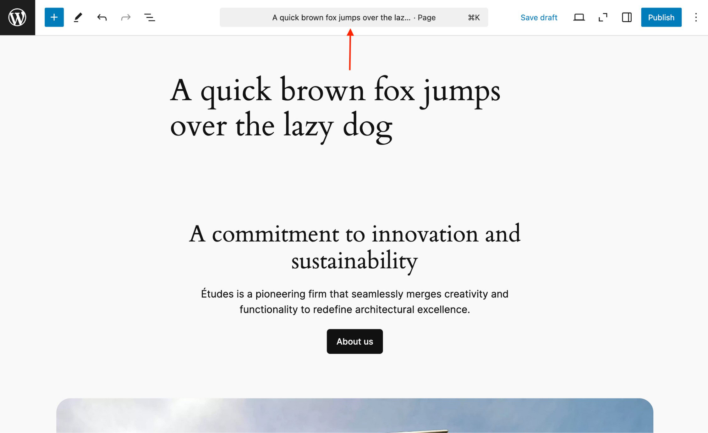
WordPress 6.7 debuts the modern Twenty Twenty-Five theme, offering ultimate design flexibility for any blog at any scale. Control your site typography like never before with new font management features. The new Zoom Out feature lets you design your site with a macro view, stepping back from the details to bring the big picture to life.

Introducing Twenty Twenty-Five

Endless possibility without complexity

Twenty Twenty-Five offers a flexible, design-focused theme that lets you build stunning sites with ease. Tailor your aesthetic with an array of style options, block patterns, and color palettes. Pared down to the essentials, this is a theme that can truly grow with you.

Get the big picture with Zoom Out

Explore your content from a new perspective

Edit and arrange entire sections of your content like never before. A broader view of your site lets you add, edit, shuffle, or remove patterns to your liking. Embrace your inner architect.

Connect blocks and custom fields with no hassle (or code)

A streamlined way to create dynamic content

This feature introduces a new UI for connecting blocks to custom fields, putting control of dynamic content directly in the editor. Link blocks with fields in just a few clicks, enhancing flexibility and efficiency when building. Your clients will love you—as if they didn’t already.

Embrace your inner font nerd

New style section, new possibilities

Create, edit, remove, and apply font size presets with the next addition to the Styles interface. Override theme defaults or create your own custom font size, complete with fluid typography for responsive font scaling. Get into the details!

Performance

WordPress 6.7 delivers important performance updates, including faster pattern loading, optimized previews in the data views component, improved PHP 8+ support and removal of deprecated code, auto sizes for lazy-loaded images, and more efficient tag processing in the HTML API.

Accessibility

65+ accessibility fixes and enhancements focus on foundational aspects of the WordPress experience, from improving user interface components and keyboard navigation in the Editor, to an accessible heading on WordPress login screens and clearer labeling throughout.

And much more

For a comprehensive overview of all the new features and enhancements in WordPress 6.7, please visit the feature-showcase website.

Learn more about WordPress 6.7

Learn WordPress is a free resource for new and experienced WordPress users. Learn is stocked with how-to videos on using various features in WordPress, interactive workshops for exploring topics in-depth, and lesson plans for diving deep into specific areas of WordPress.

Read the WordPress 6.7 Release Notes for information on installation, enhancements, fixed issues, release contributors, learning resources, and the list of file changes.

Explore the WordPress 6.7 Field Guide. Learn about the changes in this release with detailed developer notes to help you build with WordPress.

The 6.7 release squad

Every release comes to you from a dedicated team of enthusiastic contributors who help keep things on track and moving smoothly. The team that has led 6.7 is a cross-functional group of contributors who are always ready to champion ideas, remove blockers, and resolve issues.

Thank you, contributors

The mission of WordPress is to democratize publishing and embody the freedoms that come with open source. A global and diverse community of people collaborating to strengthen the software supports this effort.

WordPress 6.7 reflects the tireless efforts and passion of more than 780 contributors in countries all over the world. This release also welcomed over 230 first-time contributors!

Their collaboration delivered more than 340 enhancements and fixes, ensuring a stable release for all—a testament to the power and capability of the WordPress open source community.

!Benni · 75thtrombone · Aaron Jorbin · Aaron Robertshaw · Aaron Ware · aatanasov · Abha Thakor · abhi3315 · Abhishek Deshpande · Abir · acafourek · Adam Heckler · Adam Silverstein · Adam Wood · Adam Zieliński · Adarsh Akshat · Adrian · aduth · Ahmar Zaidi · Ahmed Kabir Chaion · Ahmed Saeed · Ahsan Khan · Ajit Bohra · Akash Dhawade · Aki Hamano · Akira Tachibana · Akshat Kakkad · Al-Amin Firdows · Alan Fuller · Albert Juhé Lluveras · Alessandro Tesoro · Alessio · Alex Concha · Alex Cuadra · Alex Lende · Alex Stine · alex27 · Alexander Frank · Alexandre Buffet · Alexandru Horeanu · Ali Ali · aliaghdam · allilevine · Alvaro Gómez · Alvi Tazwar · Amin Charoliya · Amir Abbas · Amit Raj · Amjad Ali · Anand Thakkar · Andrea Fercia · Andrea Roenning · Andrei Draganescu · Andrei Lupu · andreiglingeanu · Andrew Hayward · Andrew Ozz · Andrew Serong · Andrey "Rarst" Savchenko · André Maneiro · Andy Fragen · Angelika Reisiger · Aniket Patel · Ankit K Gupta · Ankit K. Gupta · Ankit Kumar Shah · Ankur Vishwakarma · Anne McCarthy · Anthony Burchell · Anthony Hortin · Antoine · Anton Vlasenko · Antonio Sejas · apmeyer · Ari Stathopoulos · Armando J. Perez Carreno · Armands · arnaudbroes · Art Smith · Artemio Morales · Arthur Chu · arypneta · asafm7 · Aslam Doctor · Autumn · Ayesh Karunaratne · Bård Bjerke Johannessen · Béryl de La Grandière · Balu B · Barry Ceelen · Bart Kalisz · Beatriz Fialho · Ben Dwyer · Benjamin Denis · Benjamin Zekavica · Benoit Chantre · Bernhard Kau · Bernhard Reiter · Bernhard Riedl · bernhard-reiter · berubenic · Bhavesh · bijit027 · Birgit Pauli-Haack · blindmikey · bobbyleenoblestudios · Bogdan Nikolic · Brad · brad hogan · Brad Jorsch · Brandon Kraft · Brent Jett · Brett Shumaker · Brian Alexander · Brian Coords · Brian Gardner · Brian Gosnell · Brian Henry · bridgetwes · brobken · Bruno Freiberger Garcia · Cambabutonono · Carlos Bravo · Carlos G. P. · Carolina Nymark · Carsten Bach · cbirdsong · Chirag Mathur · ChriCo · Chris Reynolds · Chris Trynkiewicz (Sukces Strony) · Christoph Daum · Christopher Finke · Christopher Kanitz · Christy Nyiri · Ciprian · codersantosh · Colin Stewart · Corey Worrell · Courtney Robertson · craynor · creativethemeshq · Cullen Whitmore · Cupid Chakma · cweiske · Cyrille · da5f656f · Dademaru · daleharrison · Damon Cook · Damon Cook · Dani Guardiola · Daniel Richards · Daniele Scasciafratte · Danny · dannyreaktiv · darerodz · Dareth NHANG · Darren Ethier (nerrad) · Darshit Rajyaguru · daveagp · David · David Ballarin Prunera · David Baumwald · David Biňovec · David Bowman · David Brown · David Calhoun · David Godleman · David Henriet · David Herrera · David Levine · David Rozando · David Shanske · David Smith · ddewan · Dean Sas · DEBARGHYA BANERJEE · Deepak Rohilla · Deepak Vijayan · Dekadinious · Dennis Snell · Derek Smart · Deryck · designsimply · Devansh Chaudhary · devspace · Dhananjay Kuber · Dharmesh Patel · Dhrumil Kumbhani · Dhruval Shah · Dhruvang21 · Dilip Bheda · Dilip Modhavadiya · Dion Hulse · Divi Banks · dj.cowan · djennez · Doni Kuntoro · Dor Zuberi · Drew Jaynes · Drivingralle · drzraf · Earle Davies · eballeste · eclev91 · Ed Beck · ejnwebmaster · elfu98 · Elio Rivero · Ella van Durpe · Elliott Richmond · Emmanue ATSÉ · Emmanuel Hesry · emmanuel78 · Enrico Battocchi · Enrique Sánchez · Eric Dye · Erik · erikiva · erikyo · Evan Herman · Evan Mullins · Fabian Kägy · Fabio Rubioglio · FahimMurshed · Faisal Ahammad · Faisal Alvi · Faizan Nabi · Farhan Ahmed · Fayyaz · Felix Arntz · Felix Renicks · Fernando Jorge Mota (a11n) · Firoz Sabaliya · Francisco · Fransisca H · fullworks · Gale Wallace · gansbrest · Gareth Elwell · Garrett Hyder · Gary Pendergast · Gaurav Tiwari · gauravsingh7 · Georg · George Mamadashvili · Gerardo Pacheco · Germán Freixinós · gmariani405 · GraemeF · Grant M. Kinney · greentreefrog · GreenWorld · Greg Ziółkowski · Guido Scialfa · Gyurmey · Héctor Prieto · Halil ESEN · hanneslsm · Hans-Gerd Gerhards · Hardip Parmar · Hareesh S · Harper Holsinger · Harsh Gajipara · harshvaishnav · Haz · hectorjarquin · hedgefield · Helen Hou-Sandi · Henrique Iamarino · Himanshu Pathak · hirschferkel · Hit Bhalodia · Hossein · htmgarcia · huubl · Huzaifa Al Mesbah · Ibrahim · Ibrahim Riaz · Imran Hossain (a11n) · Isabel Brison · IT Path Solutions · itapress · Ivan Ottinger · Jack Stevens · Jacob Cassidy · Jacob Smith · jagirbahesh · Jainil Shah · Jakob Trost · James Koster · James Osborne · James Rosado · James Wesley Goedert · Jan Pfeil · janak Kaneriya · Jarda Snajdr · jarekmorawski · Jarko Piironen · Jason Bahl · Jason LeMahieu (MadtownLems) · javad2000 · Javier Arce · Jawad Malik · Jay · Jayadevan k · jbrya029 · JD Ahir · Jean-Baptiste Audras · Jeff Chi · Jeff Ong · Jeffrey de Wit · Jeffrey Paul · Jenil Kanani · Jennifer Farhat · Jenny Dupuy · Jeremy Felt · Jeremy Herve · Jerry Jones · Jesko Bendmann · Jessica Lyschik · Jetal dobariya · Jigar Panchal · jimmyh61 · Joe Dolson · Joe Hoyle · Joe McGill · Joen Asmussen · John Blackbourn · John Espiritu · John Godley · John James Jacoby · John Regan · JohnRDOrazio · Jon Surrell · Jonas · Jonathan Bossenger · Jonathan Desrosiers · Jonny Harris · Jonny Waters · jordesign · Jorge Costa · Jos Klever · Jose Varghese · Josepha · Joshua Goode · Jossnaz · Juan Aldasoro · JuanMa Garrido · julianoe · Julie Moynat · Juliette Reinders Folmer · Juned Sabaliya · Justin Tadlock · K. Adam White · Kaavya Iyer (woo-hc) · Kadim Gültekin · KafleG · Kai Hao · Kajal Gohel · Kamal Hosen · Kamran Hussen · Karan Gupta · Karol Manijak · Karthik Thayyil · Kartik Mehta · Kartik Suthar · kbrownkd (a11n) · Keffr3n · Kel Santiago-Pilarski · Kellen Mace · Kelly Choyce-Dwan · keoshi · Kevin Behrens · Kevin Taron · kevinswalsh · Khokan Sardar · Kira Schroder · Kishan Jasani · kisquian · Kjell Reigstad · kkmuffme · Knut Sparhell · Kowsar Hossain · kracked888 · Krishna Neupane · kristastevens · Krupa Nanda · Krupal Panchal · Kunal Madhak · Kunjan Gohel · Kurt Payne · Kushang Tailor · Lae · Lara Schenck · lastsplash (a11n) · Laura Byrne · laurelfulford · Lauren · Lawrence Joe · leemon · Lena Morita · Liam Gladdy · lifelightweb · Linkon Miyan · Linnea Huxford · liviopv · Louis Wolmarans · Lourens · Love Soni · Lucas · Luigi Teschio · Luis Felipe Zaguini · luisherranz · lukasbesch · Luke Carbis · Madhu Dollu · madpeter · Maggie Cabrera · Mahmudul Haque Nadim · Mai · Makarand G. Mane · manbo · Manesh Timilsina · Manuel Schmalstieg · Manzoor Wani (a11n) · María Anguas · Marc · Marc Armengou · Marcel Tannich · Marcelo de Moraes Serpa · Marcin Pietrzak · Marco Ciampini · Marco Pereirinha · marcwieland95 · Marek Železný · margolisj · Maria Yohana · Marie · Marin Atanasov · Mario Santos · Marius L. J. · mariushosting · Mark Howells-Mead · Mark Parnell · Mark-k · Martijn van der Klis · martin.krcho · marybaum · mat_ · Matias Benedetto · Matias Ventura · Matt Mullenweg · Matt Robinson · Matt Sherman · Matteo Enna · Matthew Boynes · Matthew Riley MacPherson · Matthias Kittsteiner · mattraines · maurodf · Mayank Tripathi · Mayur Prajapati · mcrisp1972 · Md Abul Bashar · Md Hossain Shohel · Md. Istiaq Hossain · mdviralsampat · megane9988 · Mehedi Hassan · Mehul Kaklotar · Mel Choyce-Dwan · meteorlxy · Micha Krapp · Michael Beckwith · Michael Bourne · Michael James Ilett · michaelpick · michaelwp85 · Michal Czaplinski · Michelle Bulloch · Miguel Axcar · Miguel Fonseca · Miguel Lezama · Mikael Korpela · Mike McAlister · Mike Ritter · mikeb8s · Mikey Binns · milamj · Milana Cap · Mitchell Austin · mklusak · mleathem · mlf20 · Mobarak Ali · Mohit Dadhich · Morgan Estes · Mosne / Paolo Tesei · mossy2100 · mreishus · Muhibul Haque · mujuonly · Mukesh Panchal · Mumtahina Faguni · Nadir Seghir a11n · Naeem Haque · Nagesh Pai · Narendra Sishodiya · Naresh Bheda · Nate Finch · Nate Gay · Nazmul Hasan Robin · Nebojša Jurčić · nek285 · nendeb · neo2k23 · neotrope · Nicholas Garofalo · Nick Bohle · Nick Diego · Nick Halsey · Nick the Geek · Nicole Furlan · nidhidhandhukiya · Nihar Ranjan Das · Nik Tsekouras · Nikita Solanki · Niraj Giri · Nirav Sherasiya · Nithin John · Nithin SreeRaj · Noah Allen · Noruzzaman · nurielmeni · obliviousharmony · Olaf Lederer · Olga Gleckler · Oliver Campion · Olivier Lafleur · Omar Alshaker · Oscar Hugo Paz · p15h · Paal Joachim Romdahl · Pablo Hernández · Pablo Honey · Pamela Ribeiro · pander · Paolo L. Scala · Paragon Initiative Enterprises · Parin Panjari · Parth vataliya · Pascal Birchler · Pat O'Brien · Patricia BT · Patrick Lumumba · Paul Bearne · Paul Biron · Paul Kevan · Paul Schreiber · Paul Wilde · paulcline · Paulo Trentin · Pavan Patil · pcarvalho · Pedro Mendonça · perryrylance · Peter Rubin · Peter Wilson · petitphp · pevogam · Phi Phan · Phil Johnston · Philipp Bammes · philwebs · Pieterjan Deneys · Piotrek Boniu · Pitam Dey · Plamen Georgiev · Pooja N Muchandikar · pooja9712 · porg · ppolo99 · Praful Patel · Pranit Dugad · Pratik Kumar · Presskopp · prettyboymp · prionkor · pwtyler · Rachel Baker · Rachel Winspear · Rafael Fischmann · Rafael Gallani · Rafiqul Islam · Rahmat Gumilar · rahulharpal · Raj Patel · Rajin Sharwar · Rajkumar Shashwata Halder · Ramon Ahnert · Ramon Corrales · ramon fincken · Ramon James · Ramswarup Rathod · Raul Martinez · rcneil · realthemes · Rejaul Alom Khan · Renatho (a11n) · reputeinfosystems · retrofox · Riad Benguella · Rich Tabor · Rick Hellewell · Riddhi Patel · Rishi Mehta · Rishi Shah · Rishit Gupta · rithik56 · Robert Anderson · Robert Biswas · Robert Ghetau · rocket.works - Dominik Friedrich · Rodel Calasagsag a11n · Rodrigo · Rodrigo Primo · Rohan Jha · rohitmathur7 · Rostislav Wolný · Roy Tanck · roygbyte · royho · rpf5573 · rslee · Ruchir Goswami · Rufaro Madamombe · Ryan Boren · Ryan Leeson · Ryan Urban · Ryan Welcher · S P Pramodh · Sébastien SERRE · Sérgio Gomes · Sören Wünsch · sadmansh · Saeed Piri · Sagar Tamang · sahiladit · Sainath Poojary · Sakib Mohammed · Sam Toohey · samiamnot · Sampat Viral · Samuel Sidler · Samuel Silva · Sanne van der Meulen · Sarah Norris · sarahricker · Sarthak Nagoshe · Sathiya Venkatesan · Satish Prajapati · Saul Fougnier · Saulius Vikerta · Saxon Fletcher · Sayedul Sayem · scholdstrom · Scott Buscemi · Scott Kingsley Clark · Scott Reilly · Scott Taylor · scottculverhouse · seanavers · Seif Radwane · Sergey · Sergey Biryukov · Serhiy Zakharchenko · Seth Rubenstein · Shail Mehta · Shalin Shah · Sharon Austin · SheulyShila · Shoe · Showrav Hasan · Shreya Agarwal · Silas Köhler · siliconforks · Simone Maranzana · Siobhan · smerriman · Sneha Patil · Sophie - a11n · Souptik Datta · Sourabh Jain · Sourav Pahwa · staurand · Stefano Minoia · stein2nd · Stephen Bernhardt · Steven Lin · Steven Thompson · Stoyan Georgiev · styleshit · Sudip Dadhaniya · Sumit Bagthariya · Sumit Singh · Sunil Prajapati · Sunny · superchlorine · Sybre Waaijer · Syeda Fahima Jannath · Takahashi Fumiki · Takashi Irie · Tammie Lister · Tanbir Ahmod · Tanvirul Haque · Tapan Kumer Das · Taylor Gorman · tdrayson · thejaydip · thelmachido a11n · them.es · Thomas Kräftner · Thrijith Thankachan · Timi Wahalahti · Timothy Jacobs · Tirth Doshi · tmanoilov · toastercookie · TobiasBg · tobifjellner (Tor-Bjorn “Tobi” Fjellner) · Tom Cafferkey · Tom de Visser · Tom J Nowell · Tomas Llobet-Arany · tomhine · Tonya Mork · Toro_Unit (Hiroshi Urabe) · Torsten Landsiedel · tropicalista · Troy Chaplin · Trupti Kanzariya · tunetheweb · twstokes · Ugyen Dorji · Umesh Gupta · Umesh Singh · up1512001 · Uttam Kumar Dash · valer1e · vertisoft · Vicente Canales · Vijaysinh Zala · Viktor Szépe · Vinit · Vipul Ghori · Vipul Gupta · Vipul Patil · Vraja Das · Vrishabh Jasani · wbdv · WebMan Design | Oliver Juhas · webwurm · wesrapyd · Weston Ruter · Will Skora · William Alexander · williampatton · wongjn · WPeople · wpsoul · wzieba · xipasduarte · Yani · Yann · Yannis Guyon · Yogesh Bhutkar · ytfeLdrawkcaB · Yui · Yukinobu Asakawa · Yuvrajsinh Sisodiya · Zack Krida · zeelthakkar · zitaruksergij · Zunaid Amin

More than 40 locales have fully translated WordPress 6.7 into their language making this one of the most translated releases ever on day one. Community translators are working hard to ensure more translations are on their way. Thank you to everyone who helps make WordPress available in 200 languages.

Last but not least, thanks to the volunteers who contribute to the support forums by answering questions from WordPress users worldwide.

Get involved

Participation in WordPress goes far beyond coding, and learning more and getting involved is easy. Discover the teams that come together to Make WordPress and use this interactive tool to help you decide which is right for you.

WordPress 6.7 Brings New Power and Flexibility

Welcome to the latest in WordPress innovation with the release of WordPress 6.7! This update brings a wave of new features, design flexibility, and performance enhancements to elevate your WordPress experience, whether you’re building your first site or fine-tuning a complex project.

From the introduction of the Twenty Twenty-Five theme to powerful new editing tools and developer capabilities, WordPress 6.7 empowers you to create a site that’s dynamic, engaging, and uniquely yours.

As always, WordPress.com sites are updated automatically, so you may already see these new features live. Read on to discover what’s new and how these updates make it easier than ever to build, design, and manage a standout site on WordPress.com.

Table of contents

  1. The basics
  2. Twenty Twenty-Five theme release
  3. Expanded block customization options
  4. Streamlined creation with Zoom Out
  5. Simplified Query Loop block
  6. Improved font management tools
  7. Customizable Data Views
  8. Developer features
    1. Template Registration API
    2. Data Views API
    3. Block Bindings improvements
  9. And more

The basics

WordPress 6.7 brings a host of new features, design tools, and bug fixes to enhance your website creation experience. WordPress.com updates sites automatically, so there’s nothing you need to do before you can enjoy these benefits.

As a WordPress.com user, you may have already enjoyed early access to some of these improvements, reflecting our commitment to keeping you equipped with the most up-to-date features. If you experience any issues, our Happiness Engineers are here to help at wordpress.com/help.

Let’s look at some new enhancements that can help take your site to the next level.

Twenty Twenty-Five theme release

As part of the annual tradition, WordPress 6.7 introduces a new default, block theme: Twenty Twenty-Five

Twenty Twenty-Five is designed for bloggers of all scales—from hobbyist writers to major news sites—capturing a balance between simplicity and versatility. It allows you to intuitively create a site that feels truly personal while offering the flexibility for complex designs. With a diverse array of patterns and templates for everything from landing pages to photo blogs, the theme is tailored to enable seamless storytelling for any purpose. Natural, universal imagery and thoughtfully chosen typography bring warmth and a timeless aesthetic that resonates on a global scale.

Built to support multiple languages and visual styles, Twenty Twenty-Five includes a curated selection of color palettes and font pairings, ensuring both accessibility and elegance in design. Whether you lean toward a minimalist personal blog, a striking photo gallery, or a content-rich magazine layout, the theme’s templates and design tools empower you to build a site that is uniquely yours

Screen shot of variation one of the new Twenty Twenty-Five theme released with WordPress 6.7
Screen shot of variation three of the new Twenty Twenty-Five theme released with WordPress 6.7
Screen shot of variation two of the new Twenty Twenty-Five theme released with WordPress 6.7

Expanded block customization options

WordPress 6.7 also introduces even more styling flexibility, adding additional options for borders, backgrounds, shadows, and spacing across numerous blocks. These updates allow you to create custom designs without extra code. Notably, the Group block now supports shadow effects and the Content block allows for a background image, while blocks like Paragraph, Heading, and Buttons offer additional options for borders, color, and padding.

Streamlined creation with Zoom Out

The new Zoom Out feature offers a fresh way to view and design your content at a high level. By toggling to this zoomed-out perspective, you can easily style entire sections or adjust the arrangement of blocks across a page, all without getting caught up in the details of individual blocks.

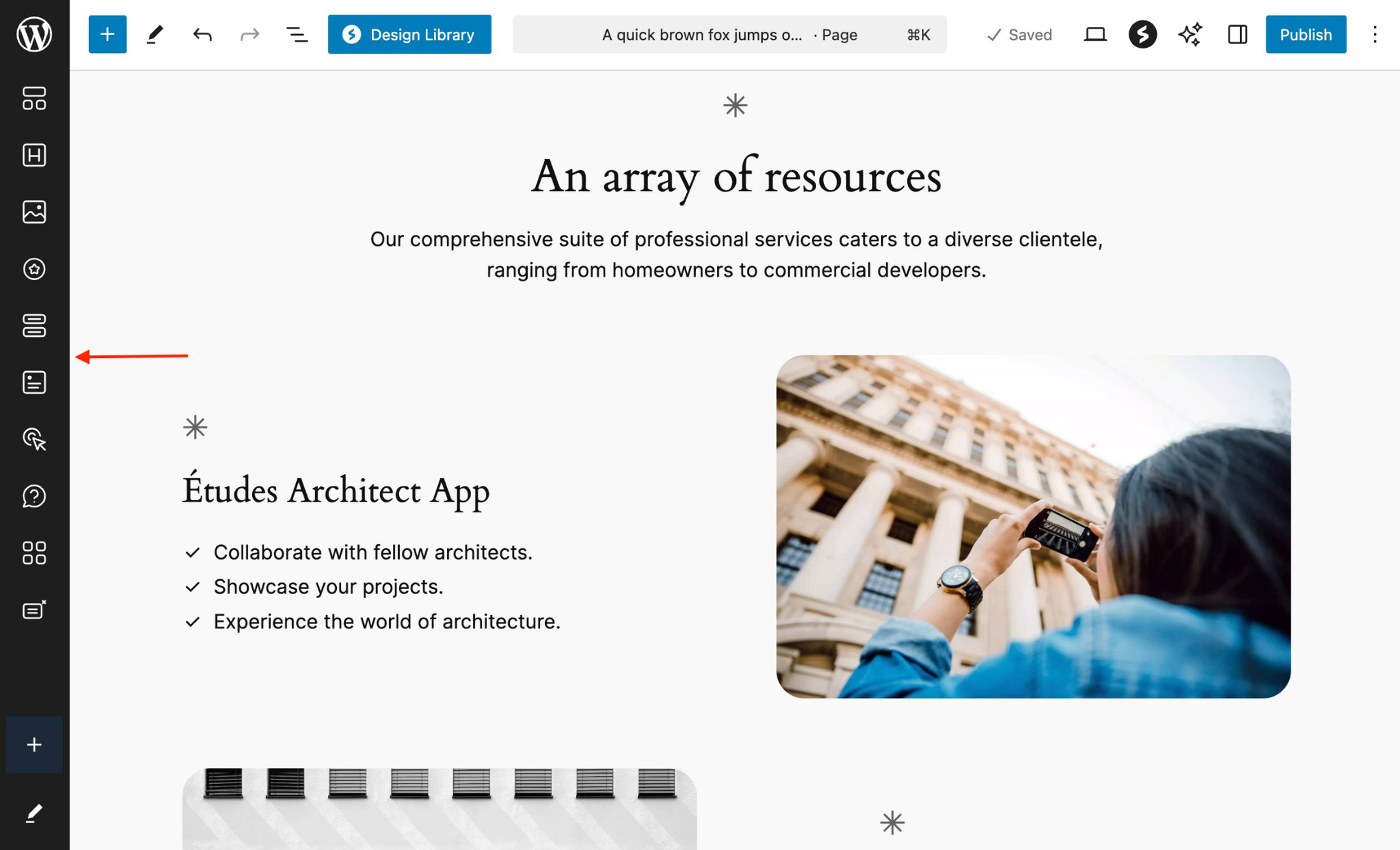
With Zoom Out, you can make broader edits using patterns, giving you control over top-level containers and block groups. Click or drag-and-drop to add patterns and use the arrows to the left to rearrange them. When you’re ready to dive back in, simply double-click the content area or click the Zoom Out icon to return to the standard editor view. This feature is a game-changer for efficient layout creation, whether you’re building pages or fine-tuning templates.

Simplified Query Loop block

The Query Loop block, known for its power and complexity, has been refined to make it more user-friendly. A new toggle allows you to choose between “Default” and “Custom” modes, simplifying the creation of content-rich sections on your site. In Default mode, the block automatically inherits settings from your template, so posts display instantly without extra configuration. This means you can drop in the Query Loop block and see your content right away, saving setup time. For more specific use cases, switch to Custom mode for precise control over what content is displayed.

Additional refinements include a cleaner layout of the Settings Sidebar on the right, making it simple to adjust display options in one place.

Key features and updates to take note of:

  • Quick preview when adding the block from the inserter
  • Display controls moved from the toolbar to the sidebar
  • New post format filter for customized content display (on select themes)
Screen shot of updated Query Loop settings

Improved font management tools

The latest updates bring powerful new options to font management for block themes, making it easier to customize typography across your site. In the Global Styles section, you can now create, edit, and delete custom font size presets. These presets let you define reusable font sizes site-wide, with options to customize names, base sizes, and fluid scaling, which automatically adjusts font size based on screen dimensions.

Additionally, fonts are now grouped by source (theme or Google Fonts), giving you a clear view of where each font originates. A convenient “Select All” option lets you quickly activate or deactivate fonts as needed, with active fonts visibly highlighted for easy management.

Customizable Data Views

Data Views, a powerful tool for managing pages, patterns, and templates in the Site Editor, now features several enhancements to simplify navigation:

  • Grid Layout Preview Size: Choose the view that works best for you.
  • Customizable Columns: Reorder columns based on your preference.
  • Bulk Actions on Grid Layout: Select multiple items and take action quickly.

These refinements make it easier than ever to organize your site, whether you’re handling a few pages or hundreds.

Developer features

WordPress 6.7 introduces several enhancements for developers, making it easier to create unique site experiences.

Template Registration API

This release allows developers to register custom block templates directly within plugins, simplifying the process of creating and managing front-end template outputs. The Template Registration API enables developers to define default content for custom post types, taxonomies, and virtual pages—all built on the block system, so both themes and users can customize templates to their needs.

Data Views API

Developers can now use a new API to register and unregister Data Views actions, offering more flexibility in managing project-specific actions. Learn how to use Data Views in your own plugins and for adding images to the Media Library. This update is part of ongoing work in Gutenberg’s Phase 3 and the Admin Redesign project, providing expanded tools for custom workflows.

Block Bindings improvements

Building on Block Bindings introduced in previous releases, this update adds a user interface for admins and editors to connect block attributes with custom field data directly in a block.

And more

There are too many great updates to cover them all here, but here are a few smaller yet valuable enhancements worth noting:

  • Block inserter: The block inserter now stays open while you interact with the editor canvas, making it easier to navigate your content as you add blocks.
  • Editor topbar: The action icons in the top right corner have been reordered for improved accessibility.
  • Pre-publish check buttons: The second Publish (or Save) button has been repositioned within the pre-publish panel, so you won’t need to move your mouse after clicking the initial Publish (or Save).

WordPress 6.7 brings hundreds of improvements, developer features, and bug fixes. The above highlights are only a taste of what’s available. If you’d like to dive deeper, the official WordPress 6.7 Field Guide has all the technical details.

Click below if you’re a developer and want to leverage the benefits of hosting your sites with WordPress.com:

💾

💾

Exciting WordPress Black Friday Deals 2024 You Shouldn’t Miss

WordPress Black Friday Deals

The whole internet is on the hunt for the greatest Black Friday deals for 2024! 

We thought we would save you some time and effort by highlighting the best WordPress Black Friday deals on our premium plugins and theme. 

This post has the list of the best WordPress Black Friday and Cyber Monday deals that are worth checking out. 

Exclusive discounts and deals like these are available only once a year! 

If you’re in the market for a wide range of WordPress themes, plugins, or tools, now is the time to invest.

Got WordPress products you want to include in the list? Think we are missing out on the great Black Friday deals?

Best WordPress Black Friday Deals & Cyber Monday Offers 2024

With exclusive deals and discounts on almost every product, it can be hard to find what you’re looking for.

If you’re looking for WordPress tools, here are some picked deals you won’t want to miss.

Spectra Pro – Discount to be announced!

Spectra-BFCM-Banner

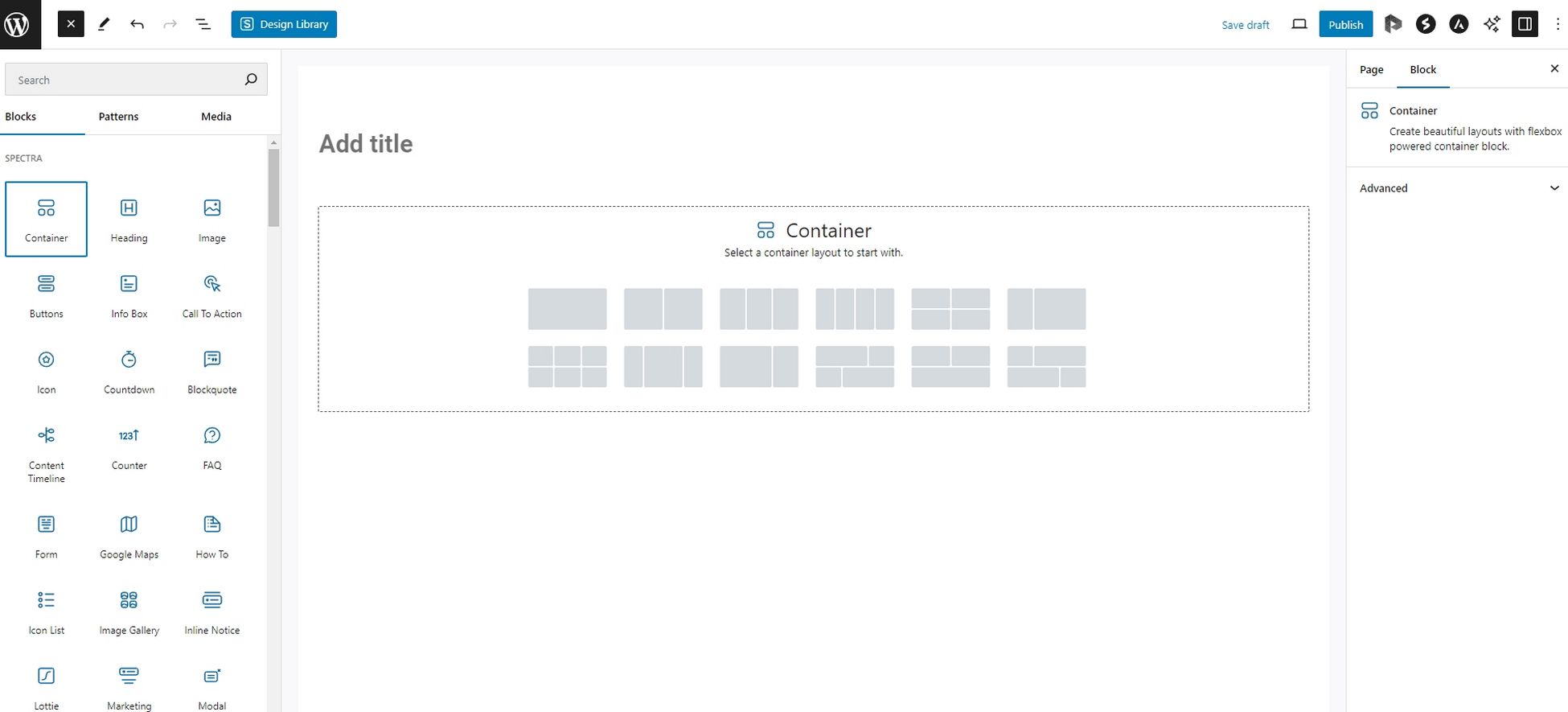
Spectra Pro is an innovative visual website builder that integrates seamlessly into the WordPress block editor. It adds smart new blocks, block patterns, wireframes, readymade templates, and more tools to the block editor.

Spectra Pro also includes a popup builder, modal builder, and loop builder to help build engagement. It’s a complete website builder with all the tools you need!

Discount: Revealed soon
Coupon code: Revealed soon
Validity: Revealed soon

Astra – Discount to be announced!

Astra-BFCM-Banner

Astra is an incredibly popular lightweight, responsive WordPress theme. The theme offers Starter Templates with a library of 250+ professionally built templates, full compatibility with WooCommerce, and leading page builders. It also provides many customization options and tools to create fantastic websites. 

Discount: Revealed soon
Coupon code: Revealed soon
Validity: Revealed soon

ZipWP – Discount to be announced!

ZIPWP-BFCM-Banner

ZipWP is an AI-driven website builder designed to help you create stunning, professional websites in minutes. Perfect for agencies and freelancers, ZipWP eliminates the need for technical expertise, offering beautifully designed, mobile-responsive templates and expertly written content. 

Save time, impress clients, and build high-quality websites in minutes using ZipWP. Opting for a premium plan unlocks additional tools and exclusive templates that make your site stand out.

Discount: Revealed soon
Coupon code: Revealed soon
Validity: Revealed soon

Ultimate Addons for Elementor – Discount to be announced!

UAE-BFCM-Banner

Ultimate Addons for Elementor is a giant library of add-ons for building attractive websites with the Elementor page builder. It offers many templates, add-ons, and blocks to help you create a website with ease. The plugin is easy to use, simple to understand, and an excellent choice for Elementor users!

Discount
: Revealed soon
Coupon code: Revealed soon
Validity: Revealed soon

Ultimate Addons for Beaver Builder – Discount to be announced!

UABB-BFCM-Banner

Ultimate Addons for Beaver Builder is the plugin you need to transform your productivity with custom modules and templates. It is an excellent plugin for Beaver Builder users. The plugin is the ultimate solution to build a stunning website faster than ever and offers 50+ module presets, 60+ unique modules, 300+ rows, page templates, and more!

Discount: Revealed soon
Coupon code: Revealed soon
Validity: Revealed soon

Convert Pro – Discount to be announced!

Convert Pro-BFCM-Banner

Convert Pro is a very popular WordPress email opt-in and lead-generation plugin that helps convert visitors into customers. It offers features like lead generation, abandonment recovery, advanced triggers, targeting options, and more. The plugin also provides performance tracking and A/B testing and helps increase subscribers and conversions.
This Black Friday, take advantage of the biggest discounts to grab this must-have tool for converting visitors into subscribers.

Discount: Revealed soon
Coupon code: Revealed soon
Validity: Revealed soon

Schema Pro – Discount to be announced!

Schema Pro-BFCM-Banner

Schema Pro is the best WordPress SEO plugin for adding schema to your website. This powerful plugin helps you outperform your competitors in search engines and bring more traffic to your website with very little effort. Schema Pro is easy to use and can automate much of the process, which is another reason to use it!

Discount: Revealed soon
Coupon code: Revealed soon
Validity: Revealed soon

WP Portfolio – Discount to be announced!

WP Portfolio - WordPress Black Friday Deals

WP Portfolio is the most advanced WordPress portfolio plugin we have ever created. It provides a platform for showcasing beautiful websites, images, and videos to attract clients and customers. If you want to use your work to attract new clients, this is the plugin to use!

This Black Friday and Cyber Monday, take advantage of the biggest discounts of the year to get your hands on this amazing plugin and attract new clients with stunning portfolio presentations.

Discount: Revealed soon
Coupon code: Revealed soon
Validity: Revealed soon

SureFeedback – Discount to be announced!

SureFeedback-BFCM-Banner

SureFeedback is the best plugin to receive feedback for websites you create for clients. Using a sticky note-style feedback mechanism, you can get clear, contextual feedback directly on designs. It’s so good, that you’ll wonder how you ever designed websites without it! 

Discount: Revealed soon
Coupon code: Revealed soon
Validity: Revealed soon

CartFlows – Discount to be announced!

CartFlows-BFCM-Banner

CartFlows is the #1 sales funnel builder plugin to help increase conversions and maximize profit. It turns your WordPress website into an optimized selling machine and offers powerful features like one-click upsells, one-click order bumps, A/B split testing, dynamic offers, checkout form layouts, and more.

Discount: Revealed soon
Coupon code: Revealed soon
Validity: Revealed soon

Presto Player – Discount to be announced!

PrestoPlayer-BFCM-Banner

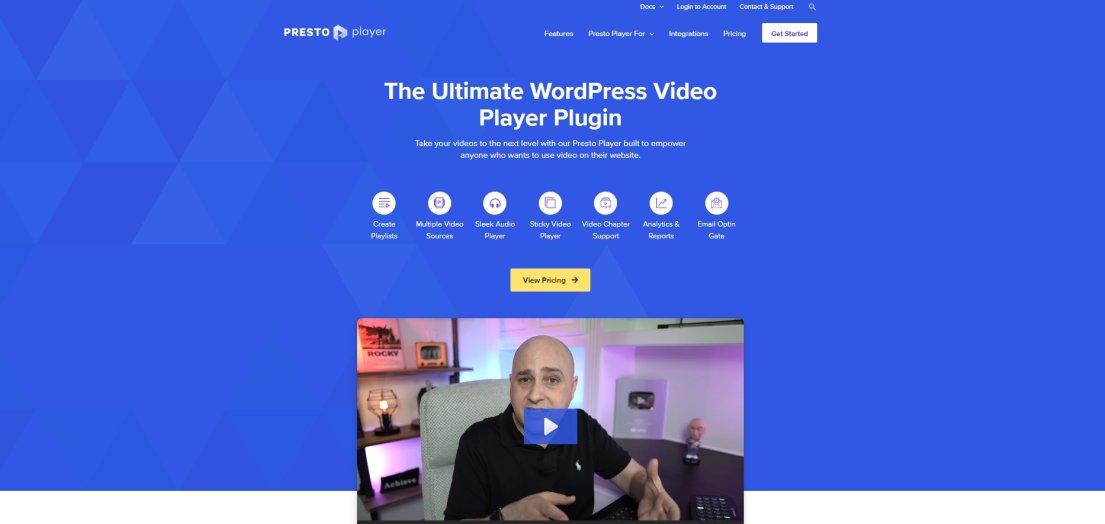
Presto Player is the ultimate WordPress video player plugin that takes website video to the next level. It empowers anyone who wishes to use video on their website and offers a sleek audio player, a modern video player, video chapter support, analytics and reports, and more. It comes with everything you need to make the most out of the video!

Take advantage of the biggest discounts of the year during Black Friday and Cyber Monday to get this feature-packed plugin at a fraction of the price.

Discount: Revealed soon
Coupon code: Revealed soon
Validity: Revealed soon

SureCart – Discount to be announced!

SureCart-BFCM-Banner

SureCart is the ultimate solution for creating and managing your online store on WordPress. It is a simple yet powerful eCommerce platform designed and developed to grow your business by selling online effortlessly. SureCart offers a simple-to-use all-in-one platform that includes everything you need to set up your own online store.

Discount: Revealed soon
Coupon code: Revealed soon
Validity: Revealed soon

SureMembers – Discount to be announced!

SureMembers-BFCM-Banner

SureMembers is the ultimate membership plugin to help you to sell and grow your membership website with ease. It offers the fastest and easiest way to protect content on your website. Get the most value by opting for the annual plan, offering features like easy content paywalls, drip feed content, custom access rules, secure digital downloads, and more.

Discount: Revealed soon
Coupon code: Revealed soon
Validity: Revealed soon

SureTriggers – Discount to be announced!

Suretriggers-BFCM-Banner

SureTriggers is a cutting-edge automation platform that connects over 1000+ apps and WordPress plugins to streamline manual tasks, boost productivity, and enhance ROI. With an easy-to-use visual canvas, you can build seamless workflows that power your business operations effortlessly.

Join over 70,000 users who are already automating WordPress and beyond. SureTriggers is 90% more affordable than Zapier, making it the best value for your automation needs!

Discount: Revealed soon
Coupon code: Revealed soon
Validity: Revealed soon

LatePoint – Discount to be announced!

Latepoint-BFCM-Banner

LatePoint is a powerful appointment scheduling plugin for WordPress, designed to streamline bookings for businesses of all sizes. With its user-friendly interface, customizable booking forms, and seamless integration, LatePoint makes managing appointments effortless. 

Whether you’re running a salon, clinic, or consultancy, LatePoint helps you save time, reduce no-shows, and deliver a smooth booking experience for your clients.

Discount: Revealed soon
Coupon code: Revealed soon
Validity: Revealed soon

Conclusion

This Black Friday & Cyber Monday, save big by purchasing your favorite WordPress products at a hefty discount. 

As we discover more WordPress Black Friday deals, we will make sure to update this post, so keep checking back for more savings. 

All the products mentioned in the list are worth checking out from popular themes to premium plugins that elevate your WordPress experience. Whether your passion lies in designing a beautiful website, developing a valuable course for your readers, or creating an online store, these products offer a wide range of features to help you succeed. 

With the generous discount available, there’s every reason to purchase them!

Also, Check out our Black Friday deals 2024 to get your desired WordPress products!

Instagram Feed Block: A Change in Approach

Instagram Feed Block

Hello, web creators!

We have some important updates to share with you about the Spectra Instagram Feed Block.

Here at Brainstorm Force, we aim to provide the best possible experience. However, sometimes unforeseen challenges arise, and we want to be transparent about the changes affecting the Instagram Feed Block.

From the beginning, our goal has been to simplify the process of displaying Instagram feeds on your website — just log in with your Instagram account, and Spectra takes care of the rest.

However, the reality behind the scenes is becoming increasingly complex.

We have worked tirelessly to maintain the Meta app that powers this block, allowing you to avoid the hassle of creating your own.

Unfortunately, Meta’s continuous restrictions and unpredictable policies have made it increasingly difficult to ensure a smooth experience.

In 2024 alone, we faced four significant issues with Meta, each requiring a considerable amount of time and energy to resolve, yet problems still persist.

Recently, Meta enforced restrictions on our app, forcing us to navigate the entire process to regain necessary permissions.

This ongoing situation places us in a difficult position.

We want to prevent any unexpected interruptions with your Instagram feeds due to Meta’s unpredictable policies.

While we strive to provide you with the best service, this challenge has prompted us to take a necessary step back.

What’s Changing?

To ensure a more reliable solution, we’ve decided that moving forward, you will need to create your own Meta app to use the Instagram Feed Block.

We understand this adds an extra step, and we genuinely regret any inconvenience. However, this will help protect you from unexpected service disruptions caused by Meta’s actions.

Meta has given a deadline of December 4th, but we’ve already received reports that some users are experiencing loading issues with the media from Meta.

While we are doing our best to keep our app running, communication with the Meta team has been challenging due to lengthy response times.

We are currently working on this change and hope to release it by November.

To facilitate a smooth transition, we will provide detailed written and video tutorials to guide you through the process of setting up your own Meta app. These resources will be available soon, and the changes are set to roll out this quarter.

This isn’t just an issue with Spectra; many plugins offering Instagram feed features are facing similar challenges and are also moving toward a user-based app setup due to Meta’s recent changes. These adjustments reflect broader industry shifts in response to Meta’s evolving policies.

Wrapping Up

We deeply appreciate your understanding and patience as we navigate these challenges.

Although this change wasn’t part of our original vision, we remain committed to ensuring that Spectra continues to help you create beautiful websites with ease.

No matter the obstacles, we will always strive to serve the Spectra community.

Thank you for being a part of our journey and for placing your trust in us.

The WordPress Ecosystem Is Evolving — and So Are We

Hello, WordPress warriors and web creators!

With Black Friday and Cyber Monday just around the corner, I’m sure many of you are busy prepping your sites for the sales.

I just want to take a moment to share some important updates about where Spectra is headed. There’s a lot going on, and changes are on the horizon.

But first, I can’t wait to share the news that Spectra just passed the magical million user milestone!

That’s 1 million active users. People like you and I who are using Spectra to build amazing websites.

This is huge for us, and we’re excited to celebrate this with our Brainstorm Force family—you.

Evolving With WordPress

As you know, the WordPress landscape is constantly shifting, and that brings both opportunities and challenges.

Over the past year, we’ve seen some key changes in WordPress that have directly impacted the features we’ve been building for Spectra.

I’d like to share three examples where this evolution has shifted our path forward.

Quick Action Bar

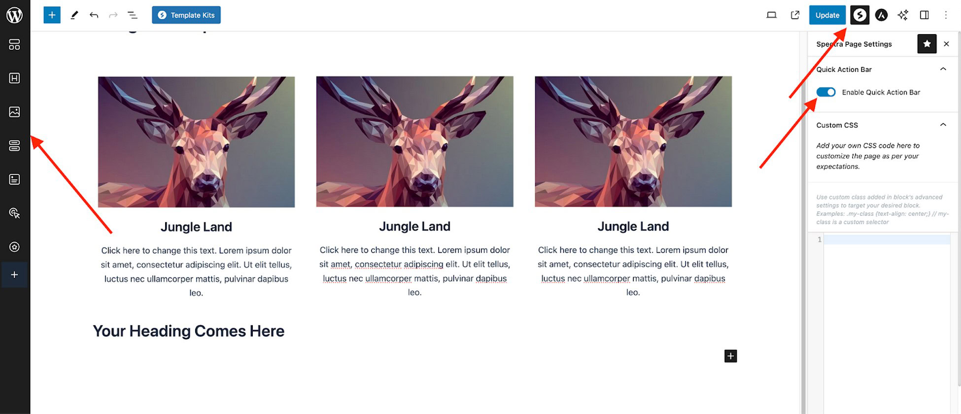
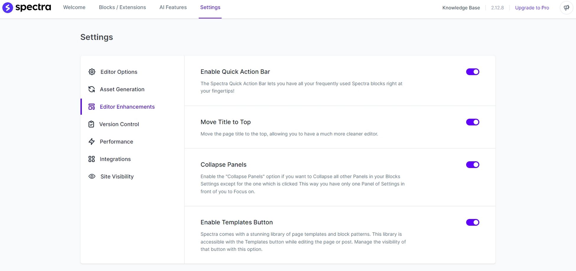
Earlier this year, we introduced the Quick Action Bar to make building sites more efficient by keeping block panels open as you worked.

Quick Action Bar

This was meant to address the issue of panels closing and content shifting when adding a block.

However, WordPress version 6.7 is set to introduce a feature that will keep block panels open—essentially solving the problem we were addressing.

Block panels WordPress 6.7

While the Quick Action Bar was a helpful addition, the upcoming change renders it largely obsolete.

Title Placement

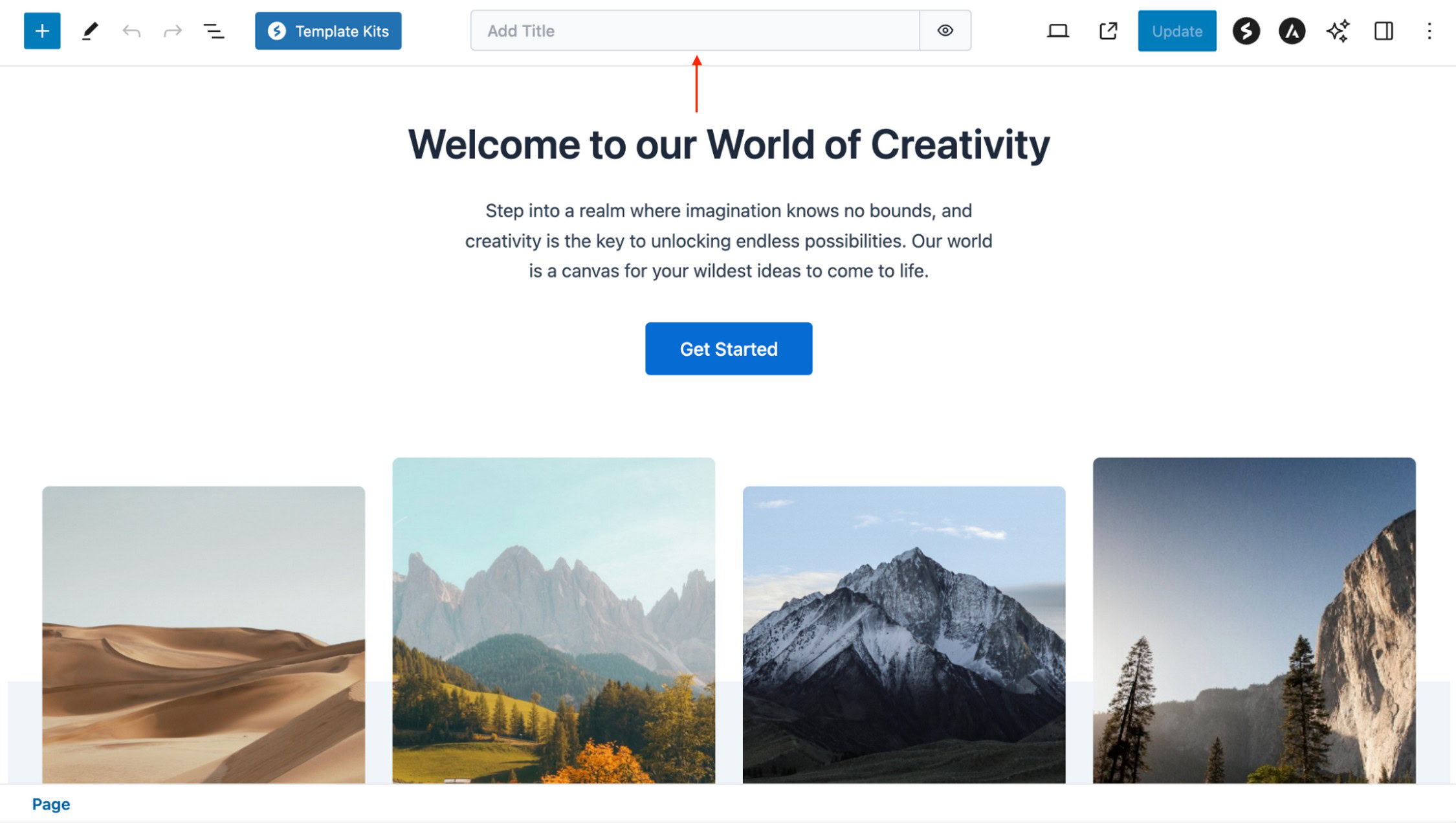
You may have also noticed that we invested time in moving titles to a designated area at the top of the page.

Title Placement

However, we later had to deprecate that feature because WordPress version 6.6, adopted that same area for its own changes.

WordPress version 6.6

As a result, the effort we put into that feature became redundant.

This experience taught us a valuable lesson: building ahead of changes can sometimes backfire, leading to the unfortunate reality that the work we’ve done may become obsolete.

It’s an example of where we’ve had to pivot based on how WordPress is evolving.

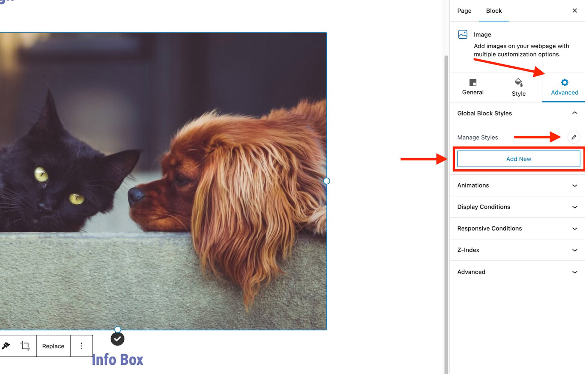
Global Block Styles

One of our most ambitious features this year was Global Block Styles.

Released in beta back in October 2023, Global Block Styles were designed to allow you to create reusable styles across your site to save time and effort.

It was an advanced feature and we were excited about the positive feedback we received.

We’ve put a lot of effort into Global Block Styles.

The idea was simple but ambitious: create a library of styles you could apply to any page, giving you greater consistency and control.

Our team worked hard to integrate it with Spectra’s core blocks, refactor complex styles, and ensure compatibility with a wide range of themes.

We spent months working on it.

But it quickly became clear that integrating Global Block Styles with non-core blocks was a major technical challenge.

Managing inner blocks, keeping default settings intact, and balancing theme compatibility added even more complexity.

We made significant progress, but there are still hurdles to overcome before the feature can be fully implemented.

Then WordPress released Sync Patterns—a feature that essentially overlaps with what we were trying to build.

It’s maturing quickly, and after evaluating the trajectory, we had to ask ourselves: Is this the best use of our time and effort?

The answer, we realized, was no. So, we decided not to invest any more effort into it.

At Spectra, our mission is to make WordPress and web creation as simple and accessible as possible.

But when it introduces features that fulfill the same need, it doesn’t make sense to continue down a parallel path.

This isn’t just about avoiding duplication—it’s about being strategic and focusing our energy on building things that truly add value.

So, after much consideration, we’ve decided to pause further development of Global Block Styles.

We won’t be removing the feature from Spectra Pro for those of you who are already using it. But we want to set the right expectation — this feature will remain in beta for the foreseeable future, and we don’t have plans to take it out of beta at this time.

We’ve also decided to remove it from our marketing to avoid any confusion moving forward.

Looking Ahead – A Focus on Useful Blocks

While it may feel like we’re stepping back, the reality is that we’re refocusing.

Moving forward, we’re going to align more closely with WordPress and focus on building new, useful blocks that make a tangible difference in how you build websites.

We already have some exciting things lined up, including developing our Loop Builder and other valuable improvements.

You’ll have the freedom to create any kind of design with drag and drop block positioning. We’re also working with Motion Effects, a smooth system that animates blocks as you scroll.

The FAQ block will get a revamp too, transforming into an accordion-style element that allows you to insert other blocks inside for added versatility.

We’re also integrating free, copyright-safe images directly into Spectra, simplifying the process of adding high-quality visuals to designs.

And that’s not all — we’re exploring even more new blocks and features for the near future!

Wrapping Up

We’re incredibly grateful for the support and feedback you’ve given us over the years.

Spectra has grown alongside the WordPress ecosystem. As we hit the milestone of 1 million active installations, we’re more committed than ever to bringing you features that add real value to your workflow.

We’re excited about what’s coming next. We’re confident that by aligning our efforts with WordPress, we’ll be able to deliver even better tools for web designers like you.

Thank you for being part of our journey.

The Spectra Website Builder Surpasses 1 Million Active Users!

It doesn’t seem all that long ago when we were celebrating our 100th or 1,000th user in the Brainstorm Force office.

Now we’ve hit a milestone we didn’t think we would hit so soon, 1 million active users!

It’s one thing to be convinced that your product is good. It’s another to find out your audience thinks so too!

So let’s begin with a heartfelt thank you.

It’s an amazing achievement and when we say we couldn’t have done it without you, we really, really mean it!

To show our gratitude, we have a special surprise for all of you. It includes something that could make the upcoming sales season much more lucrative.

More on that in a little while.

Why 1 Million Active Users Matters

When we first decided to create a WordPress website builder, we had a simple goal.

We wanted to enable everyone to build beautiful, functional websites without the need for coding skills.

It was a lofty ambition, but we were driven by a passion for block building and a belief in its potential.

We began small, with Ultimate Addons for Gutenberg, but that was just the beginning.

It launched back in 2018 as a plugin for Gutenberg, now the block editor. It added some cool building blocks we thought WordPress was missing.

A turning point came when we launched our first major update in 2022. This is when Ultimate Addons for Gutenberg became Spectra.

It’s also when we introduced a suite of new features and performance improvements.

This update resonated with users. We saw a surge in downloads and positive feedback.

This told us we were on the right track and that Spectra really did have potential.

That’s why hitting 1 million active users matters.

Because it’s more validation that we’re getting it (mostly) right and that you’re loving what we’re creating.

Why 1 Million Active Users Matters
We had a suspicion that Spectra would be popular, but not in my wildest dreams did I think we would hit 1 million active users so quickly! 

It’s testament to the vision, hard work and skill of an entire team. I have the privilege of working with an amazing collection of people, all dedicated to delivering a product they want to be proud of. 

I think they have delivered that and more. I know I’m proud of it.

While we’re taking a minute to celebrate, the work isn’t done for Spectra. We have some amazing ideas and big plans for the next few updates so watch this space!
Mehedi Hasan, Product Manager for Spectra

There is still work to do. We have more features and blocks we want to add and so much more we want to achieve with Spectra.

So while we’re ecstatic at hitting 1 million users, we won’t be resting on our laurels.

We’re working through a list of suggestions you have submitted through our channels and dozens of internal recommendations too.

Suffice to say, we have big plans for Spectra over the next couple of years!

Spectra – The Journey to 1 Million

For those of you who have recently discovered Spectra, it’s history is longer than you might think:

13 June 2018

Version 0.0.1

Initial launch as Ultimate Addons for Gutenberg (UAGB)

13 June 2018
29 October 2018

Version 1.0.0

Introduced Info Box, Multi Buttons, and Post Grid blocks. 

29 October 2018
19 November 2018

Version 1.2.0

Introduction of Content Timeline, Team, Social Share

19 November 2018
01 June 2020

Version 1.15.0

Introduction of FAQ Schema, How-To Schema

01 June 2020
17 August 2022

Version 2.0.0

Rebranded UAGB to Spectra.

17 August 2022
06 July 2023

Spectra Pro 1.0.0

Spectra Pro release – Introduced premium blocks such as Login, Registration, Dynamic Content, and Modal Pro.

06 July 2023
01 May 2023

Version 2.6.0

Introduced Separator Block, Animations

01 May 2023
01 October 2023

Version 2.8.0

Added Sticky Container and Site Visibility features

01 October 2023
01 November 2023

Version 2.10.0

Integrated ZIP AI, unlocking AI-powered capabilities

01 November 2023

What’s Next For Spectra?

We mentioned a little earlier that we’re working through a list of suggestions you have provided and internal ideas we came up from market research.

We plan to implement as many of them as possible over the next year or two.

We’re keeping most of our plans under wraps right now, but rather than leave you hanging, here are a couple of things to look forward to in upcoming updates.

We’re currently working on

  • Block Positioning
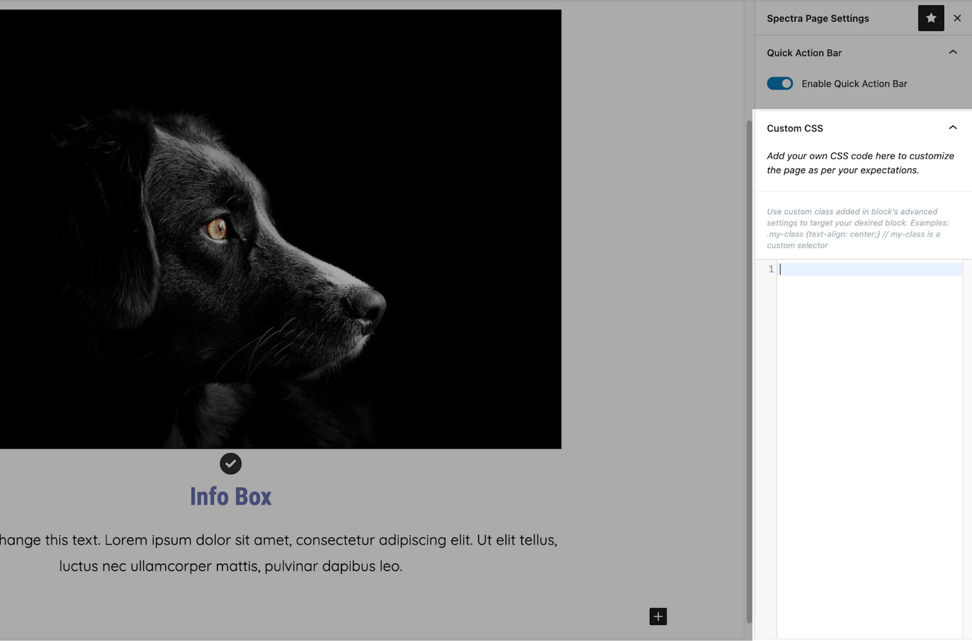
  • Custom CSS
  • Loop Builder

And other features and we think you’re going to love them!

We are also working on many other aspects of Spectra, expect to see them in future updates!

A Big Thank You From the Spectra Team

We promised a special surprise at the top of the page. We think we have kept you waiting long enough, now it’s time to deliver.

To celebrate that 1 million active user milestone, we have something very special in store.

For a limited time only, we’re offering an exclusive, never before seen discount on all Spectra Pro plans!

Buy Spectra Pro and receive up to 50% off the purchase.

Yep, you read that right, get Spectra Pro at half price!

Consider it a big thank you from everyone here at Spectra for helping us hit the magical 1 million active user milestone.

May it be the first of many such celebrations!

Prepare for Sales Season With Spectra

The special discount couldn’t have come at a better time, as the sales season is almost upon us.

Upgrade to Spectra Pro using the special offer to access 3 special seasonal templates.

There are 2 templates for Black Friday and one for Halloween. All represent the same dedication to quality and design as Spectra.

If you’re planning a Halloween party or event, the Halloween template is everything you want from a template and more!

Spectra Halloween template

If you’re planning a Black Friday sale, the two BFCM templates deliver a great user experience and almost compel you to spend.

You can use all 3 templates for free when you opt for Essential Toolkit or Business Toolkit.

To show our gratitude, we’re offering an exclusive, one-time deal to celebrate.

Multilingual SEO Tips: Go Global Using an AI Plugin

Multilingual SEO is an essential strategy for those who want to reach a global audience and make it easier to find your website on search engines.

With over 7,000 languages spoken worldwide and only 25.9% of internet users speaking English, it’s crucial to provide other languages on your website.

Research also shows that:

  • 72.1% of consumers spend most of their time on websites that use their native language.
  • 72.4% are more likely to buy products with information in their language.

While it’s important to translate your website into different languages, It’s equally important to optimize your website’s multilingual SEO to match.

It’s that latter point we’ll discuss today.

What Is Multilingual SEO and When  Should You Use It?

What Is Multilingual SEO

Multilingual SEO is a strategy for optimizing website content for multiple languages.

The idea is to make it easier to be found in new markets and be accessible to users in different countries through organic search.

Multilingual SEO involves optimizing translated content for native speakers in countries other than yours.

While English is the most widely used language online, only about half of online users speak it.

This highlights the importance of multilingual SEO in reaching a broader audience.

Why Multilingual SEO Boosts Visibility

Why Multilingual SEO Boosts Visibility

Multilingual SEO can boost your visibility in several ways:

  1. Expand market reach: By optimizing content for multiple languages, you can reach a broader audience in different countries. For example, the Spanish fashion brand, Zara optimizes its website for over 20 languages. As a result, it has significantly increased its online sales, with substantial contributions from international markets.
  2. Improve rankings in local search: Content optimized for specific languages tends to rank higher in local search. For instance, Booking.com optimizes its content for various languages and locations. In Japan, they use local keywords such as ‘ホテル予約’ (hotel reservation) and have successfully achieved top rankings on Google Japan for accommodation-related searches.
  3. Enhance user experience: Visitors are more likely to engage with and trust a website in their language. For example, IKEA adapts its website content not only to local languages but also to cultural preferences. In Saudi Arabia, they change the text direction from left to right to right to left, in line with the Arabic reading pattern.

By implementing SEO optimized translation to your website, you can effectively increase your global reach, improve search engine rankings, and enhance the user experience.

Prepare a Multilingual SEO Strategy

Prepare a Multilingual SEO Strategy

Preparing an effective multilingual SEO strategy involves several key steps.

Ideally, you would plan your multilingual strategy when you’re building your WordPress website. You can do it later if you need to though.

Understand the Target Audience

Understanding your target audience is a first and most crucial step in a multilingual SEO strategy.

This involves analyzing each target market’s search habits, language preferences, and cultural nuances.

It’s important to realize that what works in one country may not be effective in another.

For example, suppose you have an online store selling kitchen appliances and want to enter the Japanese market.

In that case, you should understand that Japanese people might search for “炊飯器” (rice cooker) more frequently than other kitchen appliances.

You also need to consider that cooking rice is an important part of Japan’s culture, so your content might need to focus on this aspect.

Local Keyword Research

Local keyword research ensures your content is relevant and easily found by your target audience.

This is not just about translating keywords from your original language but finding the keywords that local searchers actually use.

For example, if you have a beauty blog and want to enter the French market, instead of just translating

“skincare routine” to “routine de soin de la peau,”

French people more commonly use:

“rituel beauté.”

Using this phrase in your content and metadata can increase your chances of being found by the French audience.

Social Media Strategy

Social media is an important component of SEO.

This involves tailoring content to the platforms popular in each country and understanding how the local audience interacts on social media.

For instance, if you have a fashion eCommerce business and want to enter the Chinese market, platforms like Weibo and WeChat are more popular than Facebook or Instagram.

You might need to collaborate with local influencers or create content that aligns with Chinese culture to increase brand visibility.

Optimize for Local Search Engines

Optimizing for local search engines involves more than just Google.

Local search engines hold a significant market share in some countries and may have different algorithms.

For example, if your business wants to enter the Russian market, you might consider optimizing for Yandex.

Doing so can help improve your visibility in the Russian market, where many users prefer Yandex over other search engines.

10 Tips to Improve Multilingual SEO

After understanding what initial strategies you need to implement, improving your multilingual SEO is time well spent.

Let’s discuss ten multilingual SEO tips you can apply.

1. Translated URLs

Translating URLs (slugs) into all target languages is an important step in optimizing multilingual SEO.

This helps search engines and users better understand the page content and increases relevance in search engine results.

This is usually done automatically by some website translation services or multilingual plugins.

For example, if you have an online shoe store with an “About Us” page at the URL “www.yourshsoes.com/about-us,” the Spanish version could be “www.yourshoes.com/es/sobre-nosotros.”

This helps Spanish-speaking visitors understand the page content from its URL.

It also increases the chances of the page appearing in Google search results in Spain for related keywords.

2. Dedicated URL

The second tip is to use a dedicated URL structure for each language.

There are several URL structure options to choose from, each with its advantages and disadvantages:

  • Separate domain (www.yourshoes.es)
  • Subdomain (es.yourshoes.com)
  • Subfolder (www.yourshoes.com/es/)

The subfolder structure is the most commonly used option in multilingual websites.

For example, if you have an online shoe store, the URL for running shoes in the Spanish version could be “www.yourshoes.com/es/zapatillas-de-correr/nike-air-zoom”.

This structure helps content management and SEO while providing clear signals to Google about each page’s language and country targeting.

3. Apply Hreflang Tags

Implementing hreflang tags can inform search engines about the relationship between pages in different languages or regional variations.

This helps display the correct version based on language or location.

You can apply hreflang tags in the HTML header.

Let’s continue using the online shoe store example:

<link rel="alternate" hreflang="en" href="https://www.yourhses.com/running-shoes/nike-air-zoom" />

<link rel="alternate" hreflang="es" href="https://www.yourshoes.com/es/zapatillas-de-correr/nike-air-zoom" />

<link rel="alternate" hreflang="de" href="https://www.shoesstore.com/de/laufschuhe/nike-air-zoom" />

This tag helps ensure that users from Spain will be directed to the Spanish language version of that product page.

4. Use Keyword in the URL

Including target keywords in the URL can help search engines and users quickly understand the page’s content.

It also improves its rankings in search results for those keywords.

For example, for the running shoes category page, instead of using a generic URL like:

“www.yourshoes.com/es/category-1”

You could use a URL that contains keywords:

“www.yourshoes.com/es/mejores-zapatillas-de-correr”

Using these keywords makes the URL more descriptive and provides clear signals to search engines about page content.

5. Use Canonical URL

Canonical URLs are crucial in multilingual SEO to avoid duplicate content issues.

This is especially useful when content is similar across language versions or when a single page can be accessed through multiple different URLs.

For example, if you have a product page for Nike Air Zoom running shoes that can be accessed through multiple URLs, you can specify its canonical URL as follows.

<link rel="canonical" href="https://www.yourshoes.com/es/zapatillas-de-correr/nike-air-zoom" />

This URL will inform search engines that this is the “official” version of the page, helping to consolidate SEO signals and avoid duplicate content issues.

6. Submit a Multilingual Sitemap

Creating a multilingual sitemap can help search engines understand the structure and hierarchy of your multilingual site.

It should include all language versions of each page with appropriate hreflang tags.

Using our shoe store example, a multilingual sitemap could look like this:

<?xml version="1.0" encoding="UTF-8"?>
<urlset xmlns="http://www.sitemaps.org/schemas/sitemap/0.9"
        xmlns:xhtml="http://www.w3.org/1999/xhtml">
  <url>
    <loc>https://www.yourshoes.com/running-shoes/nike-air-zoom</loc>
    <xhtml:link rel="alternate" hreflang="es" href="https://www.yourshoes.com/es/zapatillas-de-correr/nike-air-zoom"/>
    <xhtml:link rel="alternate" hreflang="de" href="https://www.yourshoes.com/de/laufschuhe/nike-air-zoom"/>
  </url>
</urlset>

Often, automatic translation plugins generate a multilingual sitemap for you, including schema.

Submit it to the Search Console to help Google index and better understand your site’s multilingual structure.

7. Use AI Plugin Translation

Utilizing AI translation can greatly aid with effective multilingual SEO.

AI plugins such as the Linguise translation service plugin, swiftly and accurately translates content and assist with multilingual SEO.

The plugin helps with automatic translation of content and URLs, metadata translation and delivers superior quality translations.

8. Optimize Your Keywords

Keyword optimization in a multilingual context involves more than just direct translation.

It requires thorough keyword research for each target language, understanding local language nuances, and adapting your content strategy accordingly.

When optimizing the Nike Air Zoom running shoe product page for the Spanish market, don’t simply translate:

“best running shoes” to “mejores zapatillas de correr”.

Conduct research to find terms that are most commonly searched in Spain.

For example, it’s more common for the Spanish to say:

“zapatillas para correr” or “calzado deportivo para running”

Use SEO tools like Google Keyword Planner, SEMrush, or similar with location settings adjusted to your target country.

9. Translate Your Metadata

Translating and optimizing metadata (titles, meta descriptions, image alt text) for each target language is also key to multilingual SEO.

Well-optimized metadata can enhance CTR (Click-Through Rate) on search engine result pages and provide strong relevance signals to search engines.

For example, for the Nike Air Zoom product page on your English-language site, the metadata might look like this:

  • Title: “Nike Air Zoom: Premium Running Shoes | ShoeStore”
  • Meta description: “Discover Nike Air Zoom shoes, perfect for demanding runners—maximum comfort and performance. Free shipping. Buy now at ShoeStore!”

Don’t forget to include target keywords (“running shoes”) and value propositions, such as maximum comfort, free shipping and so on.

10. Adapt to Changes in Search Engine Algorithms

Search engine algorithms continue to evolve, and your multilingual SEO strategies should adapt accordingly.

This may involve adjustments in how you present content, site structure, or even the types of content you produce.

With the emergence of Google’s Search Generative Experience (SGE), a growing emphasis is on content that answers specific questions.

This could mean creating content that addresses common queries in your target languages.

Ensure your answers are comprehensive and informative, as SGE tends to display direct answer summaries in search results.

Multilingual SEO Websites with AI Translation!

Multilingual SEO is a crucial strategy for businesses aiming for success in the global digital market.

By implementing these tips, such as translating URLs and utilizing AI translation plugins like Linguise, you can enhance visibility across different language markets.

If you build a strong strategy by understanding your target audience, conduct thorough keyword research, and adapt to algorithm changes, you’ll be all set for success.

So, what are you waiting for? Let’s implement multilingual SEO on your website now!

Divi vs Elementor: The 2024 Comparison You Need to See

Which page builder should you choose? Elementor or Divi?

This is a tricky question since both help you build stunning websites.

It’s a question we’re going to help you answer.

77% of marketing agencies cite bad user experience as a significant weakness of client websites.

Page builders aim to solve this problem with optimized templates and user-friendly features.

If you give us a few minutes, we’ll provide a detailed Divi vs. Elementor comparison to help you choose between these page-building heavyweights.

You’ll learn:

  • The critical differences between Elementor and Divi
  • How do both builders perform
  • Modules offered
  • What each builder offers per dollar spent

While Divi and Elementor are powerful tools, they aren’t the only players in the game.

We’ll also discuss Spectra, a robust website builder.

Like Divi and Elementor, Spectra offers a range of page building tools that make website creation a breeze.

Elementor vs Divi Builder: Key Differences

Whether you’re a blogger, entrepreneur, developer, or agency, the best fit depends on your needs and skill level.

Let’s break down some key differences between Elementor and Divi.

FeatureElementorDivi
User interface/ExperienceSimple drag and drop editor with keyboard shortcuts.Drag and drop editor with floating inline editing.
Design flexibility and customizationPopup builder with advanced triggers and rules.Theme Builder with built-in split testing.
Speed and performanceSEO-friendly with clean code and faster loading times.Relies on shortcodes.
Templates and layoutsMultiple templates and popup designs.Extensive library of pre-built templates.
PricingFree version with 40 basic widgets. Premium plans from $49/year.No free version. $89/year for unlimited sites or $249 lifetime access..

If you’re thinking of an alternative, Spectra could be a great option to explore.

Spectra
Uses the WordPress block editor and works with any WordPress theme.
Website building capability with popup builder, coming soon mode, dynamic content, loop builder and much more.
Performance-centric and optimized for blazing-fast websites.
Offers pre-designed blocks and page templates.
Freemium product with annual and lifetime plans starting from $49/year.

“Divi boasts a comprehensive theme builder, providing users with extensive control over their website’s design. Elementor, with its real-time design capabilities, offers a seamless and visually intuitive experience. Customization capabilities are quite similar but somehow vary between Divi and Elementor.”

Joe Fylan.

Now, let’s review page builder performance.

Divi vs Elementor: Performance

Let’s compare Divi and Elementor to see which performs best.

We’ll set up a standard environment for each page builder to get the most accurate picture.

We’ll use:

  • The default 2024 WordPress theme
  • No extra plugins
  • No cache plugin or server-side caching
  • Hosted on ZipWP
  • Testing through Google PageSpeed Insights and GTMetrix

We designed the test pages by using the following elements:

  • Small paragraph text
  • Image (resolution: 596×630 px, size: 712KB)
  • One call to action button

To make this as fair as possible, we’ll conduct four speed tests:

  1. Baseline test that didn’t use a page builder
  2. Basic website created with Elementor
  3. Basic website created with Divi
  4. Basic website created with Spectra

Please note: Loading speed depends on many factors, such as the quality of your web hosting and server location. However, we did our best to make it as accurate as possible.

Page Speed Using Fresh Website

The test page looks like this:

Fresh website for speed test

Let’s see how fast our website loads without using a page builder:

Google PageSpeed Insights

Fresh website performance

GTMetrix Test

Fresh GTMetrix performance

Our baseline website scores well on Google PageSpeed and GTMetrix.

The GTMetric performance result shows that our page made 15 Total Page Requests (HTTP requests).

Remember that number as it’s important.

Elementor Page Speed

We’ll use the free version of Elementor for testing. With our three elements still included, the test page looks like this:

Elementor site overview

The following results appear on desktop and mobile:

Google PageSpeed Insights

Elementor site Google Page speed test

GTMetrix

Fresh website performance

Elementor scores lower for both mobile and desktop versions.

As you can see, the total HTTP requests have doubled!

Divi Page Speed

Here’s what our Divi test page design looks like:

Divi page overview

Let’s see how it renders on mobile and desktop devices.

Google PageSpeed Insights

Elementor Divi Performance

GTMetrix

Elementor GTMetrix Performance

Elementor and Divi differ quite a bit in terms of performance. Elementor makes more page requests than Divi, but Elementor loads slightly faster.

Spectra Page Speed

Unlike Elementor and Divi, the Spectra website builder works inside WordPress. It adds less code that can impact performance.

Here’s what our test page looks like with Spectra:

Spectra site overview

Google PageSpeed Insights

Page speed score for Spectra

GTMetrix

Spectra GTmetrix score

If you’ve noticed, Spectra outshines Divi and Elementor in matters of speed and performance.

Its minimal code runs almost as smoothly as the default theme. Plus, it has smaller page sizes and faster load times!

spectra user review about speed

Verdict on Performance

While scores for Elementor have decreased compared to the default theme, it loads faster than Divi despite rendering more page requests.

This could be attributed to its efficient handling of elements.

With its minimal code, Spectra closely resembles the default theme in terms of performance.

It outperforms both Divi and Elementor in page size and load times.

For most WordPress users, Spectra offers the best balance of performance, design options, and ease of use.

Divi vs Elementor: User Interface

Elementor and Divi both use drag and drop interfaces with inline editing. However, they use different approaches to how they work.

Elementor primarily operates from a fixed sidebar, whereas Divi Builder uses floating buttons and widgets.

Here’s how they compare.

The Elementor Interface

When you create a new page with Elementor, you’ll be taken to the WordPress default editor.

Next, click the Edit with Elementor button to start editing the page.

edit with elementor

The Elementor builder has two core sections:

  1. A live preview of your page in the center you can edit with drag and drop
  2. There is a sidebar on the left with elements and settings for everything you want to do with your page. You can hide this sidebar if you prefer a quick full-screen preview.

To add a new element to your page, drag it over from the list in your sidebar.

When you click on an element in the right pane, a pink outline appears around it. The relevant settings are displayed in the left sidebar.

If you click on an element, the sidebar will display its settings.

This setting area is divided into three tabs: Content, Style, and Advanced.

Elementor setting area

Elementor allows you to edit text directly using inline editing.

Once you start adjusting an element from the sidebar, the changes are displayed live on the page.

You can also use the text editor in the sidebar (applicable when adjusting text elements). The sidebar edits automatically sync with the main element on the right panel.

Elementor live text editing

If you want to master Elementor, we have a YouTube video course for beginners.

Access the Free Elementor Course

Divi to Elementor change review

The Divi Interface

Divi Builder features both front-end and back-end editing. We’ll focus on front-end functionality for now.

When you try designing a page using Divi Builder, you’ll be asked if you want to use Divi Builder or a default editor.

use divi builder

Using the Divi Builder option will give you three choices:

  • Build from scratch – Start with a blank page.
  • Choose a premade layout – Choose from readymade templates.
  • Build with AI – Explore Divi’s AI features for rapid design.
Divi new site choice boxes

You’ll notice that Divi’s builder has no fixed sidebar like Elementor. Instead, you access everything with floating buttons that open popups.

For example, if you want to insert a new module, you’ll use a floating popup.

divi builder modules

As soon as you add a module, the settings window appears, showing the relevant settings for that module.

For instance, we added a circle counter module.

divi builder module settings

When you hover over a module in Divi, its edit icon will appear. This allows you to customize the module however you like

Just click the small edit icon, and the settings window will appear. After adding modules to the page, you can use inline editing similar to Elementor.

You can also drag elements around the page.

The Spectra Interface

Using Spectra is easy if you’re familiar with the WordPress site builder.

Just click on Add New Page to start.

Add new page with elementor

Spectra uses the native WordPress builder. Depending on your needs, you can divide the space into multiple columns.

You’ll see a:

  1. A block panel to select appropriate blocks
  2. A central working panel where you control the page’s visual layout
  3. A settings area allows you to adjust settings details for a given element.

The menu bar at the top helps with functions like inserting blocks and turning distraction-free editing on or off.

To add a block to the editing area, just add the element you want by clicking the block inserter.

The sidebar shows the settings for each block. These settings are categorized into three tabs: General, Style, and Advanced.

spectra setting area

Spectra also lets you edit text directly within blocks.

spectra inline editing

A handy Spectra feature on the top right panel shows the most commonly used blocks.

It helps you quickly choose what you need without invoking the block inserter.

spectra quick action bar

Here is a complete walkthrough video of Spectra in action.

Verdict on User Interface

While both Divi and Elementor offer robust features, your choice might depend on your expertise and needs.

Elementor’s user-friendly interface and free version are preferable if you’re a beginner.

Divi works better if you’re an advanced user who prefers greater design flexibility and doesn’t mind a steeper learning curve.

Spectra is simple. By using the WordPress editor, it helps you create without needing technical skills.

Elementor vs Divi Builder: Modules And Sections

Both Divi and Elementor offer a wide variety of modules, but the approach and terminology differ slightly.

Design Elements

We will help you understand the foundational design elements of Divi and Elementor.

Elementor

Elementor calls its modules “widgets. These are categorized into Basic, Pro, Theme, and WooCommerce widgets:

  • Basic widgets:
    • Inner section, heading, text editor, image and video, button and divider, Google maps, icon, image box, and icon box, gallery and carousel, social icons, and progress bar.
  • Pro widgets:
    • Forms, slides, posts and portfolio, login, price table, and price list.
  • Theme elements:
    • Customize site elements like headers, footers, and post content.
  • WooCommerce widgets:
    • Extensive tools to build and customize online stores.

Elementor also supports third-party addons that further extend its functionality.

Elementor Pro adds more advanced widgets and templates. As of 2024, Elementor has introduced new features such as Elementor Hosting and Elementor AI.

Divi

Divi uses the term “modules.” These include simple text editing with full control over fonts, colors, spacing, images and videos, sliders, galleries, portfolios, shops, forms, calls to action, pricing tables, and testimonials.

Divi also offers advanced modules like tabs, toggles, accordions, and others for easy design.

Spectra

Spectra focuses on delivering a streamlined and efficient design experience.

It includes:

  • Spectra blocks are custom blocks for various content types and design elements, including text, images, buttons, testimonials, sliders and forms.
  • Third-party WordPress blocks: Seamless integration with the vast library of blocks available in the WordPress ecosystem.
  • Global style controls: Spectra’s global style settings allow you to easily manage and customize the appearance of your entire website.

Elementor vs Divi Builder: Modules And Sections

Here’s a summarized side-by-side table on how Divi and Elementor handle content arrangement :

ElementorDiviSpectra
Largest sectionSectionSectionContainer
Section dividerColumnRowContainer
Design elementWidgetModuleBlock

Let’s now delve into the details.

Elementor

Elementor uses three types of elements:

  • Sections – These are the largest group and are similar to rows. You can include columns and widgets inside a section.
  • Columns – These help you divide your page vertically. You can resize columns using drag and drop.
  • Widgets – These are design elements you’ll use, like text or a button.

The free version of Elementor includes 32 basic widgets to build your designs. You get 68 widgets with Elementor Pro.

There are also third-party Elementor addons that will provide additional widgets.

Here’s a complete list:

list of elementor elements

You can also add additional widgets using third-party addons like Ultimate Addons for Elementor.

Ultimate Addons for Elementor

Divi Builder

Divi Builder provides three different building blocks:

  • Sections are the largest containers.
  • Rows fit inside sections and let you use different column layouts to divide pages vertically. You cannot resize columns with drag and drop, but you can assign custom widths using CSS or pre-built column layouts.
  • Modules are the actual design elements (blocks).

Divi provides a split test option and an A/B testing feature unique to the Divi Builder. It lets you conduct split tests on any element on your page.

There’s no free version of Divi Builder: the paid plan includes one set of 48 modules.

list of Divi modules

Like Elementor, you can also use third-party plugins for additional modules.

Spectra

With Spectra, you have a robust layout system that includes rows and columns.

Inside the Spectra editor, we have:

  • Containers that have flex properties. You can add multiple containers or columns inside a container
  • Blocks are placed within containers.

Spectra is a WordPress plugin that provides over 30 innovative blocks to enhance the WordPress editor. Each block is fully customizable, allowing full personalization.

Here’s the complete list of blocks. Notice the toggle beside that turns them on or off:

list of spectra blocks

Verdict on Modules and Sections

Elementor wins thanks to the number of blocks.

Spectra closely trails Elementor as it provides powerful blocks, a form builder, loop builder and animations.

Elementor vs Divi Builder: Styling Options

As you might expect, both Elementor and Divi Builder offer lots of styling options.

Elementor

When you first install Elementor, its styles will automatically be applied to the content you create.

By accessing plugin settings, you can turn this off and use your theme’s global style instead.

Elementor style setting

Once you dig into the Elementor interface, you’ll see three different tabs to control how every section, column, and widget looks and functions.

elementor style options

You can set up alignment, colors, and typography in the Content and Style tabs.

These controls vary depending on the type of element that’s active.

The Advanced tab controls settings like custom margins and padding, element visibility on devices, and so on.

Depending on a user’s device, you can also set up separate styling settings.

elementor advanced style

With Elementor Pro, you can add custom CSS to individual elements, which will be applied in the live preview.

elementor css code option

Divi Builder

Divi Builder gives you three different tabs to control elements:

  • Content contains basic settings like text.
  • Design covers everything from alignment to colors, shadows, animation, and more.
  • Advanced lets you add custom CSS to control responsive visibility.
divi builder setting widget

You can apply design settings differently for different devices.

divi builder screen sizes

Divi Builder makes it easy to add CSS both before and after the main element:

divi builder custom css

Divi also has Divi Preset, which allows you to save a custom appearance as a preset.

You can quickly apply these saved presets when you add a new module to your page.

divi add preset option

Spectra

Spectra allows you to style each block from the block setting area.

When you select a block, the right sidebar shows three tabs: General, Style, and Advanced.

You can adjust the appearance of each block type from the Style tab.

spectra setting area

Spectra also allows you to add CSS at the page and post level.

spectra custom css

To use the custom CSS option, first enable it in the Spectra settings area.

You can allow buttons to inherit their style from the theme, which maintains consistency.

spectra settings in wpadmin

You can also control the global style for blocks to maintain a consistent appearance.

If you still need to set up a global style for a block type, you can create one directly from the editor.

create global preset in spectra

Verdict on Styling Options

Divi and Elementor provide similar options for styling elements, adding custom CSS, and copying styles.

What sets Divi apart is its draggable sizing feature. This feature helps you easily adjust the size, margin, and padding of any module, row, or section.

Spectra has similar features to those of Divi and Elementor, which integrate with the WordPress block builder.

All three page builders offer detailed styling options, leaving you plenty of choices.

Elementor vs Divi Builder: Template Libraries

Divi and Elementor provide large premade template libraries to help you quickly build sites.

Elementor

Elementor offers two template types:

  • Pages – Full-page designs.
  • Blocks – Designs for individual sections of a page.

If you’re using the free version of Elementor, you get 40+ block templates and 30+ page templates.

You can also save any of your designs as templates to reuse later.

Elementor Pro unlocks the full template library, with 50+ Pro widgets and 300+ Pro Elementor templates:

elementor templates

If you’re using Spectra, you can access a variety of pre-made website templates once you install Spectra (you’ll find these under the Appearance menu in your WordPress dashboard.

Divi Builder

Elegant Themes gives access to over 350+ templates spread across 177 layout packs:

divi templates library

A layout pack is essentially a set of themed templates.

For example, you might have eight different templates to build an entire restaurant website.

Like Elementor, you can also save your designs for later reuse.

Spectra

Spectra offers over 100 predesigned page templates and block patterns.

spectra template library

The library is split into three tabs: Patterns, Pages, and Kits.

Patterns are unique sections made up of blocks you can add to a webpage to fulfill various needs.

For example, you can use a pattern to create a call to action section and place it on every page.

Pages and Kits allow you to apply designs to single or multiple pages.

Spectra lets you choose whether to restrict or allow library access.

spectra enable template library option

Verdict on Template Libraries

Divi wins with over 350 templates. Elementor and Spectra aren’t that far behind, though.

Elementor vs Divi Builder: Theme Building

Elementor was the first to offer full theme building via Elementor Pro. Divi added this feature later on through its Divi theme builder.

Full theme building means an interface to build your header, footer, and template parts as well as page content.

Elementor

The Elementor Pro Theme Builder is key to creating custom themes.

First, you’ll need a base theme like Hello Elementor.

Next, navigate to Templates > Theme Builder in your WordPress dashboard.

Choose the template type you want to create and style it appropriately.

Lastly, define where each template should appear on your site using display conditions (e.g., all single posts, archive pages for a specific category).

We created an entire Elementor video course to help you create amazing websites.

Divi Theme Builder

Divi Theme Builder is a powerful page building tool.

It allows you to use the Divi Builder to construct theme templates and assign them to pages or posts across your site.

To access the builder, navigate to Divi > Theme Builder.

Click Add New Template and select the template (e.g., header, footer, single post).

Next, use Divi’s visual builder to design your templates. You can add modules, customize styles, and incorporate dynamic content.

Lastly, assign your custom templates to specific pages, posts, or website sections.

You can use conditional logic to control where each template appears.

Spectra

Spectra focuses on performance and simplicity.

To use it, navigate to Appearance > Spectra Theme Builder in your WordPress dashboard. Select the template type (e.g., header, footer, single post) and design it using Spectra’s intuitive interface.

Spectra’s drag and drop builder helps you add essential blocks, customize styles, and include dynamic content.

Verdict on Theme Building

Both Elementor and Divi limit theme building to paid versions and provide a simple way to build and customize pages from scratch.

Spectra offers some theme customization with the free version of Spectra:

  • Custom block patterns: You can create and save custom block patterns that you can reuse throughout your site for consistent styling.
  • Block styles: Spectra offers styling options for individual blocks, allowing you to customize their appearance to match your theme’s overall design.

Spectra Pro includes a dedicated theme builder module that allows you to create and customize headers, footers, templates, and other theme parts within the block editor.

Elementor vs Divi Builder: AI Features

Both Divi and Elementor have AI capabilities.

Divi AI is part of Elegant Themes’ Divi theme, while Elementor AI is integrated within the Elementor page builder.

Here’s a table that directly compares the two AI builders:

FeatureDivi AIElementor AISpectra AI
Content generationText and image generation directly within the visual builder. No limits on use with a Divi subscription.Text and image generation through prompts. Limited by credits depending on your subscription plan.Text and image generation. Code generation. Translation features. Limited by credits.
Design enhancementLimited AI-powered design suggestions.AI-powered design suggestions within the editor. Custom CSS generation. Image generation.AI-powered design suggestions, custom HTML and CSS code generation, and image optimization.
Workflow integrationSeamlessly integrated with the Divi theme and builder.It works within the Elementor editor as an addon.Works as a plugin within the WordPress block editor (Gutenberg).
PriceIncluded with a Divi subscription (starts at $89/year).Separate addon with tiered pricing based on credit usage.Separate addon with tiered pricing based on credit usage.
Target audienceDivi users who prioritize content generation and want a unified experience.Elementor users who seek design assistance and automation.WordPress users who want AI assistance in the block editor for both content and design.
Unique featuresNoneNoneProofreading, language translation, responding to comments & questions, and automating tasks.

Divi AI excels at AI-powered content generation for seamless website creation. Elementor AI focuses on design enhancement and automation.

Spectra AI offers affordable AI for users who prefer simplicity.

It uses ZipAI, an all-encompassing AI assistant for WordPress. Its features encompass content generation, code assistance, and translation.

Verdict on AI Features

Elementor AI is more powerful but Divi AI is easier to use. Spectra adds AI assistance to areas many users have problems with, such as content and image generation.

As each option is useful in its own right, let’s call this a draw.

Divi vs. Elementor: Pricing

Let’s now discuss the pricing details for both builders.

Elementor

Elementor has a free plan that allows you to test essential features before committing.

The paid version, Elementor Pro, has 4 plans:

  • Essential: $59/year for one website
  • Advanced: $99/year for up to 3 websites
  • Expert: $199/year for up to 25 websites
  • Agency: $399/year for up to 1000 websites

Visit Elementor’s official pricing page for features provided with each plan.

Divi

Divi doesn’t have a free plan but offers two premium plans Basic and Pro.

Yearly:

  • Basic: $89.00/year
  • Pro: $277.00/year

Lifetime:

  • Basic Lifetime: $249.00
  • Lifetime with Pro services: $297.00 for the first year and $212.00/year for succeeding years.

The Divi Pro plan is designed for unlimited sites and costs $289 per year. It includes Divi AI, Divi Cloud, and Divi VIP.

This plan also includes the Extra, Boom, and Monarch themes. Divi extensions are not included in any plans.

If you need something from the Divi marketplace, you’ll need to subscribe separately.

Note: Divi VIP provides 24/7 premium support with a response time of 30 minutes or less.

Spectra

Spectra has a free version with a range of blocks and features. The pro version has advanced features for those who need more.

Annual:

  • Spectra Pro: Starts from $49/year for one website
  • Essential Toolkit: $79 per year
  • Business Toolkit: $149 per year

Lifetime:

  • Spectra Pro: Starts from $199 for one website
  • Essential Toolkit: $399
  • Business Toolkit: $599

The Essential Toolkit is a package that includes Astra Pro, Ultimate Addons for Elementor, Ultimate Addons for Beaver Builder, and Spectra Pro.

You also get priority support.

This toolkit starts at $79 per year and is designed to make website creation quick and easy.

The Business Toolkit offers additional value for professionals seeking multi-site licenses.

Priced at $149 per year, you get:

  • The Spectra Pro page builder
  • Over 250 premium Starter Templates
  • Priority support from a dedicated team
  • SureFeedback
  • SureWriter Pro
  • SureTriggers (6 month license)
  • CartFlows Starter (6-month license)
  • ZipWP Pro (3 month license)
  • SkillJet Academy membership
spectra pricing table

Verdict on Pricing

If you’re just starting and trying to decide between Elementor and Divi, Divi offers better value.

However, if you’re looking for more control and the best of both worlds, Spectra’s Business ToolKit is a cost-effective and feature-rich option.

Elementor vs Divi Builder: Other Considerations

Beyond the one-to-one comparisons, each page builder offers some features that can’t be directly compared.

Elementor

  • Global widgets – Reuse the same widget in multiple spots on your site and then update every instance by editing the global widget once.
  • Clear code – Removes all code once deactivated.
  • Maintenance mode / Coming soon page – Design a maintenance mode or coming soon page.
  • Shape dividers – Add SVG shapes from the Elementor interface.
  • Embed anywhere – Embed saved templates anywhere on your site, including the sidebar and footer.

Divi Builder

  • A/B testing – Divi Builder lets you run A/B tests for different modules to see which performs better for a specific goal.
  • Autosave – Divi now automatically saves every change to its database to prevent accidental loss.
  • Global modules – Add a single module to multiple pages and then update all of them at once.

Spectra

  • Duplication through copy paste styles and reusable blocks.
  • Asset generation – Generate CSS and JS separately for Spectra blocks. This approach helps improve the performance of pages.
  • Site speed – Spectra operates on top of the native WordPress page builder, ensuring no unnecessary code could impact website performance.
  • Wireframes for prototyping.
  • Integrate anything – Any plugin compatible with WordPress will also work seamlessly with Spectra.

Each page builder has unique features, so there’s no winner or loser here.

Which Page Builder Is Best?

Now that you’ve clearly identified each page builder’s strengths, choosing the right option should be easy.

Both Elementor and Divi are popular choices, each with its standout features.

In our opinion,

  • Go for Elementor if you’re comfortable with yearly plans, and don’t mind the performance hit that comes with it.
  • Go for Divi if you prioritize website performance, a modern user interface, flexibility, and quality support. Remember, Divi works best with its Divi theme.
  • Go for Spectra if you prefer modern features, speed, flexibility, dedicated support, a strong ecosystem, and a native WordPress environment.
spectra user review on wordpress.org about customization

Do you have experience with Divi or Elementor? Which one works best for you? Have you tried Spectra? Let us know in the comments below!

Divi vs Elementor Frequently Asked Questions

Which Is Better: Elementor or Divi?

Which is better depends on your personal needs. Both are powerful tools with strengths and weaknesses. You can try both builders and see which one fits your goals.

Here’s a summary table to help:

FeatureElementorDivi
UsabilityIntuitive surface that favors beginnersSteep learning curve leans towards experienced users
DesignVast library of predesigned templates and blocksProvides more control over the layout
FlexibilityExtensive third-party integrations and addonsDeep integration with the Divi theme
SpeedSlower backendFaster performance
PricingFreemium modelPurely premium
CommunityDiverse community of people with varied resourcesCommunity primarily focused on the Divi ecosystem

Is There Anything Better Than Divi?

While Divi is a powerful and versatile page builder, there are other options worth considering:

  1. Oxygen Builder offers unparalleled flexibility and control over website design. It’s popular among developers and experienced designers.
  2. Thrive Architect: Offers a suite of tools designed for high-converting landing pages and sales funnels.
  3. Gutenberg (WordPress block editor): While not a dedicated page builder like the others, it offers a block-based editing experience. It’s an excellent option for those who prefer a native WordPress solution.

Ultimately, it’s worth exploring these alternatives to determine your needs.

You can also combine different tools to achieve your desired results. For instance, to maximize the benefits, you could pair a lightweight theme like Spectra with a page builder like Elementor.

Is Elementor Still the Best in 2024?

Elementor continues to be among the best website builders in 2024. Over four million WordPress websites actively use it, and it maintains an impressive 4.6-star rating (out of 5) on over 6,000 reviews. It also has a solid rating on TrustPilot.com.

However, “best” depends on specific needs. Its simplicity makes it popular among casual users, marketers, and freelancers/agencies building client sites.

Can You Switch From Elementor to Divi?

You can switch from Elementor to Divi, but it requires careful consideration and effort. Switching may take considerable time. You’ll probably lose styling and face compatibility issues. You’ll also need to familiarize yourself with Divi’s interface and features, but it can be done.

💾

Today, let&#039;s go through the basics of Spectra, the WordPress visual website builder 👉 https://wpspectra.comWhen getting started, it can be overwhelming to a...

11 Must Have WordPress Plugins for Business Websites in 2024

WordPress is a flexible content management system perfect for creating business websites.

One of its standout features is the extensive range of plugins available to enhance your site’s functionality.

From optimizing performance to boosting security, plugins can transform your website into a robust business tool.

With thousands of free plugins available on the WordPress repository and many premium options from third-party marketplaces, finding the right plugins can be overwhelming.

To help you get started, we’ve curated a list of must-have WordPress plugins for business websites in 2024.

Here’s what you need to know.

Why Use WordPress Plugins for Your Business Website

Using WordPress plugins can significantly enhance your business website by providing

  • Enhanced Functionality – Add features like contact forms, booking systems, e-commerce capabilities, and social media integration without custom coding.
  • Improved Performance – Boost site speed with caching, image optimization, and lazy loading plugins. Enhance security with malware protection and anti-spam tools.
  • Better User Experience – Engage users with live chat, forums, and personalized content. Improve navigation with mega menus and search enhancements.
  • SEO Optimization – Use SEO plugins to improve search rankings. Integrate analytics for traffic and behavior monitoring.
  • E-commerce Capabilities – Transform your site into an online store including product listings, payment gateways, and inventory management.
  • Marketing and Social Media – Automate marketing with email tools, lead generation, and social sharing plugins. Manage content and schedule posts easily.
  • Ease of Use and Management – Most plugins are user-friendly and require no coding. Regular updates ensure compatibility and feature enhancements.
  • Cost-Effective Solutions – Many plugins are free, and premium options are affordable compared to custom development.

Essential WordPress Plugins for Business

If you’re looking for a WordPress business plugin that delivers the features, usability and reliability you need, read on!

To give you context, we tried and tested each of them so you don’t have to. If you would like to test these plugins yourself, make sure your device is working properly first (e.g., no charging problems, sufficient free space, and adequate RAM) to avoid any technical issues.

1. Spectra – Best Free WordPress Page Builder

Spectra – Best Free WordPress Page Builder

Plugin Stats

  • Downloads: 700,000+
  • Rating: 4.7/5
  • Notable features: Grid builder, powerful editor, advanced customization options, SEO optimization
  • Best suited for: Creating and customizing fast WordPress websites
  • Price: Free (with premium options)

Spectra is a powerful free website builder plugin that makes it easy to create stunning websites without having to know code.

It offers a vast library of blocks, templates, and pre-built websites that can be customized to fit your brand.

Spectra’s seamless integration with WordPress ensures a smooth building experience with no dependencies on external code, ensuring fast and stable performance.

The plugin includes features like container layouts, popup and loop builders, dynamic content, and responsive design conditions.

With its clean code and performance optimization, Spectra is designed to deliver fast-loading, SEO-friendly websites.

2. LatePoint – Best Free WordPress Appointment Scheduling Plugin

LatePoint – Best Free WordPress Appointment Scheduling Plugin

Plugin Stats

  • Downloads: 21,000+
  • Rating: 4.8/5
  • Notable features: Intuitive booking system, agent dashboard, custom schedules
  • Best suited for: Managing appointments on WordPress websites
  • Price: From $49 per year

LatePoint is a powerful appointment scheduling plugin for WordPress designed to make life easier for businesses that handle bookings.

Whether you’re an IT repair specialist or a hairdresser accepting salon bookings, LatePoint can help.

You can easily create and manage services, set custom schedules, and allow clients to book appointments online with ease.

With features like automated notifications, payment integrations, and detailed analytics, LatePoint is ideal for businesses that need an efficient and reliable booking system.

3. Presto Player – Best Free WordPress Video Player Plugin

Presto Player – Best Free WordPress Video Player Plugin

Plugin Stats

  • Downloads: 100,000+
  • Rating: 4.9/5
  • Notable features: Supports multiple video sources, lead capture, analytics
  • Best suited for: Integrating and optimizing videos on WordPress websites
  • Price: Free (with premium options)

Presto Player is a powerful video player plugin for WordPress, designed to enhance your site’s video content.

It supports multiple video sources like YouTube, Vimeo, and Bunny.net, and offers features like lead capture, video chapters, and Google Analytics integration.

Whether you’re a marketer, course creator, or podcaster, Presto Player helps you engage your audience with advanced customization options and secure video hosting.

The plugin also provides tools for creating custom video layouts, adding call to action overlays, and tracking video performance, ensuring you get the most out of your visual content.

4. SureMembers – Best WordPress Membership Plugin

SureMembers – Best WordPress Membership Plugin

Plugin Stats

  • Downloads: 4,800+
  • Rating: 4.9/5
  • Notable features: Easy content paywalls, drip feed content, custom access rules
  • Best suited for: Creating and managing membership sites on WordPress
  • Price: From $69 per year

SureMembers is a versatile, user-friendly WordPress membership plugin designed to help secure and manage content on your site.

It allows you to create access groups, set up paywalls, and drip feed content to members. With features like custom access rules and secure digital downloads, you can easily monetize content and offer exclusive access to your audience.

SureMembers seamlessly integrates with popular WordPress plugins, enhancing your membership site’s functionality.

Whether you’re a blogger, podcaster, influencer, or course creator, SureMembers provides the tools you need to build a thriving membership site.

5. SureCart – Best Free WordPress eCommerce Plugin

SureCart – Best Free WordPress eCommerce Plugin

Plugin Stats

  • Downloads: 20,000+
  • Rating: 4.8/5
  • Notable features: Flexible payment options, intuitive dashboard, customizable checkout
  • Best suited for: Building and managing WordPress online stores
  • Price: Free (with premium options)

SureCart is a robust, user-friendly eCommerce plugin designed to help you create and manage online stores that use WordPress.

With SureCart, you can set up flexible payment options, customize your checkout process, and use an intuitive dashboard to manage your products and orders seamlessly.

The plugin supports multiple payment gateways, digital and physical products, and provides tools for subscription management and customer communication. It’s an excellent choice for entrepreneurs looking to sell online.

6. SureTriggers – Best Free WordPress Automation Plugin

SureTriggers – Best Free WordPress Automation Plugin

Plugin Stats

  • Downloads: 30,000+
  • Rating: 5/5
  • Notable features: Visual workflow builder, multi-step automations, extensive integrations
  • Best suited for: Automating workflows on WordPress websites
  • Price: Free (with premium options)

SureTriggers is an all-in-one automation platform designed to help you streamline business by connecting apps and services.

With its visual workflow builder, you can easily create complex automations by dragging and dropping triggers and actions.

SureTriggers supports integrations with popular tools like Google Sheets, Slack, Trello, and many WordPress plugins. It allows you to automate tasks and improve efficiency across your digital ecosystem.

7. CartFlows – Best Free WordPress Sales Funnel Builder Plugin

CartFlows – Best Free WordPress Sales Funnel Builder Plugin

Plugin Stats

  • Downloads: 200,000+
  • Rating: 4.8/5
  • Notable features: One-click upsells, order bumps, A/B split testing
  • Best suited for: Creating sales funnels on WordPress websites
  • Price: Free (with premium options)

CartFlows is a powerful sales funnel builder designed to optimize your WordPress website for conversions.

With CartFlows, you can create high-converting checkout pages, upsell offers, and order bumps effortlessly. The plugin’s A/B split testing feature allows you to fine-tune your funnels for maximum efficiency.

CartFlows integrates seamlessly with WooCommerce, making it easy to manage your eCommerce sales process.

Whether you’re selling products, courses, or services, CartFlows provides the tools to increase your revenue and enhance your customer’s buying experience.

8. WP Fastest Cache – Best Free WordPress Caching Plugin

WP Fastest Cache – Best Free WordPress Caching Plugin

Plugin Stats

  • Downloads: 1+ million
  • Rating: 4.9/5
  • Notable features: Cache preloading, image optimization, browser caching
  • Best suited for: Speeding up WordPress websites
  • Price: Free (with premium options)

WP Fastest Cache is a popular caching plugin designed to improve WordPress performance by reducing load times and enhancing user experience.

This plugin is user-friendly and doesn’t require any complex configurations, making it perfect for beginners and experienced developers alike.

With WP Fastest Cache, you can easily set up cache preloading, optimize images, and enable browser caching. These features ensure your site loads faster for returning visitors and improves your overall SEO performance.

Additionally, WP Fastest Cache offers premium features like mobile caching, widget cache, and lazy loading for images.

9. Rank Math – Best Free WordPress SEO Plugin

Rank Math – Best Free WordPress SEO Plugin

Plugin Stats

  • Downloads: 2+ million
  • Rating: 4.9/5
  • Notable features: Built-in SEO analysis, keyword tracking, schema markup
  • Best suited for: Optimizing WordPress websites for search engines
  • Price: Free (with premium options)

Rank Math is a comprehensive SEO plugin designed to help optimize your WordPress site.

It offers a user-friendly interface with a step-by-step setup wizard that automates many SEO tasks. With Rank Math, you can conduct SEO analysis, track keywords, and add schema markup to your content, making your website more search engine friendly.

The plugin supports over 20 types of schema and provides advanced snippet previews to enhance your site’s visibility in search results.

Whether you’re a beginner or an experienced user, Rank Math equips you with the tools to improve your website’s SEO performance.

10. UpdraftPlus – Best Free WordPress Backup Plugin

UpdraftPlus – Best Free WordPress Backup Plugin

Plugin Stats

  • Downloads: 3+ million
  • Rating: 4.8/5
  • Notable features: Automatic backups, remote storage options, one-click restoration
  • Best suited for: Backing up and restoring WordPress websites
  • Price: Free (with premium options)

UpdraftPlus is the world’s most trusted WordPress backup plugin. It offers comprehensive backup and restoration features that every business needs.

You can schedule automatic backups of your files and databases, choose from a wide range of remote storage options including Dropbox, Google Drive, and Amazon S3, and easily restore your site with just a click.

The plugin also supports incremental backups, ensuring efficient use of storage and server resources.

Upgrading to the premium version unlocks advanced features like more remote storage options, automatic backups before updates, and WP-CLI integration for command-line control.

11. Wordfence – Best Free WordPress Security Plugin

Wordfence – Best Free WordPress Security Plugin

Plugin Stats

  • Downloads: 5+ million
  • Rating: 4.7/5
  • Notable features: Firewall, malware scanning, login security
  • Best suited for: Securing WordPress websites
  • Price: Free (with premium options)

Wordfence is a leading security plugin for WordPress, designed to protect your site from threats. It features a powerful firewall, malware scanning, and robust login security measures.

With Wordfence, you can monitor live traffic, block malicious IPs, and receive real-time updates on threats.

The plugin also offers two-factor authentication and advanced manual blocking to ensure your site remains secure.

For enhanced protection, upgrading to Wordfence Premium provides additional features like real-time firewall rules and malware signature updates, country blocking, and priority support.

Conclusion

Enhancing your WordPress site with additional features and functionality is straightforward, thanks to the vast array of available plugins.

However, it’s crucial to choose plugins that meet your needs and maintain performance and security.

While there is no limit to the number of plugins you can install, be mindful that too many can slow down your site.

We recommend choosing plugins with lots of active installations, positive user reviews, and frequent updates to ensure compatibility and security.

By selecting trustworthy plugins, you can build a powerful and efficient business website with very little effort!

FAQs

How do I choose the right plugins for my WordPress business website?

Look for plugins with high ratings, frequent updates, and positive reviews to ensure reliability and security.

Can using too many plugins slow down my WordPress site?

Yes, activating too many plugins can affect your site’s loading speed and increase security risks.

Are there free plugins that offer premium-like features?

Yes, many free plugins provide robust features, with optional premium upgrades for advanced functionality.

How do I ensure my plugins are secure?

Regularly update your plugins and choose those from reputable developers with a large number of active installations.

Can I deactivate plugins without uninstalling them?

Yes, you can deactivate plugins through your WordPress dashboard without permanently removing them.

Spectra Hits 700,000 Active Installs and Adds New Features

April 2024 has been a big month for Spectra.

Not only have we hit a significant milestone, we also released a couple of awesome features you’ll love.

There’s also other news to share, so read on to find out what’s been happening!

Spectra Hits 700,000 Users

The big news is that the Spectra website builder has exceeded 700,000 active installs!

Spectra website builder has exceeded 700,000 downloads

That’s an amazing achievement!

Spectra is the only block plugin in the list of top 100 plugins, which is another achievement!

We want to thank each and every one of you who have downloaded Spectra and are using it to create amazing websites.

We wouldn’t be here today without your support and we want you to know we appreciate each and every one of you.

If you haven’t tried Spectra yet, now is the perfect time.

Save up to 50% in our Spring Sale!

New Features Added – CSS Grid and Movable Title Bar

We are also pleased to announce two new features have been added to Spectra, CSS Grid and Movable Title Bar.

CSS Grid

Building using grids is a useful way to create unique page structures that don’t use the normal layout formula.

Picture a bento box—except not for snacks, but for web design!

CSS Grid design

CSS Grid introduces the ability to create seemingly impossible page layouts with ease. You’ll be amazed at what you can create!

Here’s a quick walkthrough of how CSS Grid works.

Create a new page and add a parent container block.

The single container works well as we’ll specify how many columns and rows we want in a second.

Add a parent container block.

Select the container and set the Layout Type to Grid rather than Flex in the right menu.

Select the blue + button by Columns and Rows to add more structure to your page.

Add as many columns and rows as you want within the parent container.

Add more structure to your page

Add separate containers to each column and row or style a single container and duplicate it, depending on how you’re building the page.

Select a container and the General tab in the right menu.

Select the Grid Item Settings menu on the right and set the Column Width and Row Height.

Set row height to 2 units for a double height container. Set column width to 3 units to make your container wider.

Finally, select the Advance tab within the Grid Item Settings menu item on the right to position each container.

Use the Column Start, Column End, Row Start and Row End controls to fine tune your layout until it’s perfect.

Once configured, add content, images or other blocks to each container as you see fit.

The CSS Grid feature in Spectra is a powerful new way to build unique pages. It’s fluid, intuitive and makes us wonder why we haven’t always built like this!

Learn how to use CSS Grid in this walkthrough video:

Check it out in the latest version of Spectra!

Movable Title Bar

Another, update to this version of Spectra is the movable title bar. It’s a quality of life addition that enables you to move the page title to the top of any page.

Movable Title Bar

It’s a useful tweak for editors, content creators, template builders and anyone that prefers a simpler page to work on or to design.

You can enable the option within the Spectra Settings menu.

Select the Editor Enhancements tab and toggle Move Title to Top to on.

Toggle Move Title to Top to on

Open a page and you’ll see the title has shifted to the top of the page, providing a leaner, cleaner page for you to work on or your visitors to enjoy.

As you can see, we made all the right improvements in all the right places. We can’t wait to see what you create with it!

Other Achievements From the Spectra Team

As well as announcing that download figure and new features, we also have a couple of other milestones to celebrate.

100+ Starter Templates

Spectra now has 100+ high quality, readymade site templates you can import and use.

100 Starter Templates

Select the Block Editor as your option and you’ll see some amazing designs covering everything from eCommerce to online learning and everything in between.

Simply select a template, upload a logo, choose a font and a style and import.

All you need to do is add your content and images and you’re ready to launch.

Thanks to AI integration, you can now create an entire website in minutes using the power of artificial intelligence to help generate site copy!

Talking of AI…

ZipWP Custom Website Builder

Fans of ZipWP have been able to use the power of AI to build websites for a while now. It’s an amazing tool, but we knew it could do more.

Introducing the ZipWP Custom Website Builder!

It’s the fastest, easiest way to create truly custom websites and anyone can do it!

Anyone, with any level of experience can create a first draft website in less than 10 minutes!

Here’s how it works:

Log into ZipWP and select Custom Site with AI from the left menu.

You should see a new page with two tabs at the top, Sitemap and Wireframe.

It defaults to Sitemap first so you should see a home box and a menu on the right.

ZipWP Custom Website Builder

Enter your business name and description in that right menu to create a wireframe outline of your site.

Write your own business description or use ZipWP’s AI to help.

Click Generate sitemap when you’re ready.

You should now see a sitemap including common pages for the type of business you described.

Click Generate sitemap when you’re ready

Select a page within the sitemap and you’ll see boxes containing elements within that page.

You can add, more or replace every box on every page. You can also add and remove pages to create a truly unique website.

Add and remove pages to create a truly unique website

All using the canvas builder.

Cool right?

Well, we’re not done yet!

Select the Wireframe tab at the top of the screen.

You should now see a canvas showing outlines of every page in your sitemap.

Canvas showing outlines of every page in your sitemap

Zoom in, zoom out, select a page, select a block and manipulate each page as you see fit. If you have used Figma, the principle is exactly the same.

It’s an awesome prototyping tool!

Check out this explainer video that shares everything you need to know about the ZipWP Custom Website Builder!

If you build websites as a business, the AI Website Builder helps you do more, faster, leaving you to perform the tasks only you can do.

What Else Is in Development?

We have lots of plans for new features and improvements but most of them aren’t ready to share just yet.

One improvement that is definitely on the horizon is a new and improved Global Block Styles.

Global Block Styles v2

The current version of Global Block Styles enables you to set a style for a block and have that same style reflected in every block of that type across your site.

It’s a simple but very effective way to ensure consistency across pages and saves a lot of copy and pasting.

Despite how well Global Block Styles works, we’re planning to make it even better.

We can’t share any details just yet, but we think you’re going to love it!

A Big Shout Out to the Community

Finally, we would like to give a big shout out to Karl and other members of the Spectra community who have been providing invaluable feedback and assistance.

We genuinely value your commitment to making Spectra better for everyone and it wouldn’t be as good as it is without your help.

We consider Karl and everyone who contributes to Spectra and anyone who leaves feedback, makes suggestions and interacts with the team, part of the family.

We really couldn’t do it without you!

To celebrate hitting the 700,000 download milestone, we’re offering a special, limited-time discount on Spectra plans.

With such recently released massive updates – why wait for Black Friday?

💾

I had a breakthrough in understanding how to leverage the full power of CSS Grid, and I share everything in this video, so you too can start creating impossi...

How To Create a High Converting Landing Page (10 Proven Tips)

Want to know the secret of building high conversion landing pages for your business?

If so, you’re in the right place!

We’re sharing our 10 top tips for creating effective landing pages.

Actionable tips we use for our own pages and some best practices we picked up along the way.

We discuss:

  • The different types of landing page
  • How to build your own landing page
  • Average conversion rates
  • How to track landing page performance
  • And answer some key questions on building pages.

We’ll also include plenty of examples so you can see what we’re talking about.

What Is a High-Converting Landing Page?

A high-converting landing page is a page dedicated to just one thing – turning a visitor into a customer, subscriber or lead.

Landing pages usually form part of a marketing campaign promoted using social media, emails, ads or other medium.

Prospects will be sent to the landing page for more information, a free trial, free download, to request a demo, discount or other offer in return for something from them.

That something could be their email address, a purchase, subscription, signup or whatever your marketing goal might be.

The high-conversion aspect means the landing page has been optimized as much as possible to convert as many people as possible.

What’s a Good Conversion Rate for a Landing Page?

According to Unbounce, the average conversion rate for landing pages varies by industry.

It also varies depending on who you ask, so only take these as rough averages.

  • Higher education – 2.6%
  • Legal – 3.3%
  • Business consulting 5.0%
  • Job training 6.1%

The same study from Unbounce calculated an overall average conversion rate of 4.02%. If you’re converting more than that, you’re doing well!

10 Tips To Boost the Conversion Rate of Your Landing Page

Here are some of the tips we use when building our own landing pages. They work for us so they should work for you too!

1. Attractive Page Theme

We buy with our eyes, so page design is key. We recommend using a similar design to your main website so it feels familiar to visitors.

Attractive Page Theme

We also suggest making sure there is a clear flow from the top hero section all the way to the call to action.

We want the visitor to go where we want them to go, and ultimately, convert.

Design is a key part of landing page conversion and forms the basis of everything else you do!

2. Engaging Hero Section with Well-Crafted Headline

The hero section is the first thing a visitor sees when they land on your page.

It’s what hooks visitors and encourages them to scroll down to the call to action so needs to be good.

The headline should cover what and why and the body content should back that up.

Engaging Hero Section with Well-Crafted Headline

You need to answer two fundamental questions. What do you offer and how does it make the visitor’s life better or more profitable?

Answer those two questions and provide a clear call to action and you should have a high converting landing page.

3. Conversion-Oriented Sub Headlines

Sub headlines can help organize content, break it up into bite sized pieces and help reinforce your message.

Conversion-Oriented Sub Headlines

We think ‘The CartFlows sales funnel builder turns your WordPress website into an optimized selling machine.’ sums it up nicely!

All the best landing pages for conversion will reinforce their key message with subheadings and yours should too.

Make them interesting and make sure they accurately describe the body content.

4. Optimized Above the Fold Content

Depending on your hero section design, you may or may not have space for above the fold content.

If you do, highlight key features from the target audience’s perspective or address common pain points to reinforce the message you began with your headline.

Optimized Above the Fold Content

5. Highlight Features and Benefits

Features and benefits sell. When we look for products, we tend to look at what it will do for us rather than what it’s made of.

Address common requirements and perform objection handling by highlighting features and benefits.

Highlight Features and Benefits

Let the reader know you’re on their side, that you understand their situation and that your product is the perfect solution to their problem.

SoFi’s landing page for VA home loans is a great example of this. After the fold, SoFi included pain points that a typical home buyer would bring up, and why SoFi is the best lender to help those who are active personnel, veterans, and reservists with their big purchase.

Sofi Image

That’s how you keep them scrolling to the CTA button.

6. Use Testimonials and Social Proof

Social proof tells the reader ‘people like you loved our product because…’

It’s that extra reassurance that real people actually like what you do or what you sell and it isn’t all just a polished marketing exercise.

Testimonials and Social Proof

Social proof includes:

  • User reviews or client testimonials
  • Google or third-party reviews
  • Number of downloads or active users
  • Business ratings from established authorities

If you can add any or all of these, do so. The newer your business or your product, the more important social proof becomes!

7. Add Trust Signals

Trust signals are another subtle message reinforcement like social proof. They help reassure visitors they are in good hands and that you’re a safe investment.

Trust Signals

The lower the perceived risk, the higher the chance of conversion.

Trust signals include security badges like VeriSign Secured or Verified by Visa.

They can also be guarantee signals like ‘No quibble money back guarantee’ or association trust signals like ‘BBB Accredited Business’.

‘As featured in’ or ‘As used by’ are also trust signals.

Use as many as you’re entitled to use but keep the design simple and effective.

8. Use Images and/or Video

Images and video are more engaging than content and are key to creating the best landing pages for conversions.

Use Images and/or Video on landing pages

Images and video also help add color, flavor and character to a page while breaking up walls of text and helping you show and tell.

Choose images and videos carefully and make sure they are of the highest quality. They should also reinforce your core message to help convert. If you’re struggling to find the perfect visuals, consider using an AI image generator. These tools allow you to describe your ideal image, and the AI will create a unique visual based on your input. This can be a great way to achieve a specific look or concept that might be difficult to find with stock photos.

If you do use video, muted autoplay is your friend. The last thing you want to do is annoy the visitor or give them cause to leave!

Make sure all videos work on mobile too.

9. Logically Flow Down the Page

Landing pages are often sales or lead generation funnels. They should have a simple, defined structure to lead the visitor to the call to action.

For example, a lead generation page should open with a strong hero section with a compelling headline, supporting text and a clear call to action with a button.

If you’re using a form, you could position a small form in the hero section so a user can convert right away. You can also add another form down the page. e.g. to ring you up on your contact center.

Logically Flow Down the Page

Lower sections should answer those key questions, address pain points and solve problems.

All designed to position your offer as the best solution.

Social proof should feature prominently afterwards. Reinforce the idea that your offer is also popular with people like them, followed by another call to action.

Add trust signals, videos and optional content down the page as required.

10. Call To Action With a Single Defined Goal

All the best landing pages for conversions will have a single goal.

That core message can be repeated down the page, but should always have one goal in mind.

It can be a button on its own or have a short message to add context or to convert depending on the offer.

The simpler the offer, the simpler the call to action can be.

Single Call To Action With a Single Defined Goal

What that is depends on the goal of the page, but will usually be something like:

  • Sign up here
  • Join now!
  • Buy now and save!
  • Get started for free!
  • Free download
  • Book now!

The message should be simple, clear and leave no doubt in the mind what you want the visitor to do.

What Type of Landing Page Do You Need?

There are dozens of landing pages you can build, for all kinds of reasons. Most are variations of a theme but all will have a particular purpose.

Splash Page

A splash page appears once you click a link and will open a brand new page.

It can fulfill many roles, from collecting leads to alerting you to discounts, sales, product launches, and anything else you can think of. For example, glitch deals by Amazon use splash pages during sale times to notify customers of unexpected discounts and special offers.

This is a classic example of a splash page:

a classic example of a splash page

Source

Squeeze Page

A squeeze page is a type of landing page designed to capture an email address.

It will often offer free access to content, a free trial or download or other offer in exchange for that email.

Here’s an example of a click-through squeeze page from Microsoft:

squeeze page from Microsoft

(Source)

Lead Capture Page

Lead capture pages are probably the most popular landing pages.

They have a single goal, to convince the visitor to provide their email address for future marketing efforts.

In addition to collecting emails, make sure you create SPF records to safeguard your domain from unauthorized email senders.

Here’s a lead capture page that first captures a URL, then asks for your email to access results:

Lead Capture

(Source)

Sales Landing Page

A sales landing page is designed to convert.

It should highlight features and benefits and answer common buyer questions while gently guiding the visitor towards a purchase.

Here’s how sales landing pages should be done:

Sales Landing Page

Source

Coming Soon Page

Coming soon landing pages are great for building hype and awareness of an upcoming release.

They often include countdown timers to help build anticipation or announcements of new arrivals.

Here’s a great example of a coming soon page:

Coming Soon Page

Source

Thank You Page

It’s always good to show gratitude, which is why thank you pages can be so effective.

It can also be a place to subtly encourage the customer to continue shopping or engaging with your site.

Here’s a thank you page you’re probably already very familiar with:

Amazon Thank You Page

Unsubscribe Page

An unsubscribe page is the landing page nobody wants to create but has to.

A good unsubscribe page design would allow the user to unsubscribe but also offer alternatives like pausing, changing email frequency or switching to a free version.

Here’s a classic example of an unsubscribe page:

T3 Unsubscribe Page

It provides the ability to change preferences, unsubscribe or pause. All without getting in the way of the user’s goal.

How To Build Your Own High Converting Landing Page

This video walks you through how to build a coming soon page:

If you prefer to read, you can create a high converting landing page in just 5 steps with this guide.

1. Install and Set Up Spectra

Spectra is free and available from the WordPress repository. You can download and install it from there or add it from within the WordPress dashboard.

Install and Set Up Spectra

2. Use a Landing Page Template

The easiest way to build a landing page is to use a readymade template.

Select Pages > Add New Page in your WordPress dashboard.

Select the blue Template Kits button at the top of the page editor.

Select the blue Template Kits button at the top of the page editor

Select the Pages tab at the top of the popup window and choose a template to import.

Template kit window

You could also import a block pattern using the Pattern tab. This is a readymade page section you can use to build your own landing page.

The Kits tab enables you to install a different theme page to the one you have installed.

This can be useful if your current WordPress theme doesn’t have a landing page template or you want a different look.

Once you find a page design you like, select the purple Insert button that appears at the bottom when you hover over the template.

The template should import in seconds and be ready for you to customize.

3. Customize the Content To Suit the Audience

Your new page template should open in the WordPress block editor.

Customize the Content To Suit the Audience

Use the customization controls on the right or within each block to make any changes you need.

Delete any blocks you don’t want and customize the page so it reflects your brand.

Remember the 10 tips above when building your landing page. The more you include, the more effective it will be!

4. Test Your Landing Page

Once you have finished customizing your landing page, save it as a draft in WordPress and open it in a new tab.

Test Your Landing Page

Imagine you’re a first time visitor and check the page to see how it comes across. Check spelling, grammar, headings, body content, images, video and calls to action.

Also check all buttons or forms on the page to make sure they work.

Test in desktop, tablet and mobile modes to make sure everything looks good on all devices.

The more thorough you are here, the lower the likelihood of a visitor discovering an error!

5. Launch and Monitor

Once you’re completely happy with your page, hit Publish in WordPress.

Copy the URL on the right and use it in your marketing efforts. Promote your page as much as you can and monitor the results.

If you created the best landing pages for conversions you can, people should begin converting in no time!

How To Track Landing Page Performance

We think there are 5 key metrics you should be looking at to decide whether your landing page is converting well or not.

All can be tracked in Google Analytics. Other tools are available, but GA4 does it for free.

Once you’re logged into GA4, select the domain you want to track and navigate to Behavior > Site Content > All Pages.

Most of your tracking will be done from here.

There is a specific Landing Pages section in GA4 but we find All Pages works well enough for most situations.

Those metrics are:

Page Views

Page views are a fundamental metric. You need to know how many people are looking at your landing page to be able to calculate whether it’s working or not.

Measure:

  • Total page views
  • Unique page views/visitors
Page views in GA4

Locate the URL of your landing page and click on it to see the data.

Conversion Rate

Conversion rates are the calculation of how many visitors perform the action you want them to take.

Conversion rates can include filling in a form, registering for an account, buying a product, subscribing to a newsletter or something else.

By tracking the exact goal, you can get an accurate picture of how well your landing page is converting.

Set conversion goals in Google Analytics to track conversion.

Bounce Rate

Bounce rate is a key indicator of whether your landing page delivers what the visitor is looking for.

You’ll see a box on the main page called Bounce Rate with a number inside.

Bounce Rate in GA4

A high bounce rate indicates your page isn’t delivering what the visitor wants to see or what they expect.

That could be for a multitude of reasons, but is usually:

  • Unclear offer or confusing path to conversion
  • Weak call to action or lack of powerful headline
  • Unclear messaging or unoptimized website content
  • Offer or benefit not enough for the perceived effort or cost

Check all of these things and address any shortcomings you find. Or A/B test to experiment with different landing page styles.

Sessions by Source

Sessions by source tells you where the traffic is coming from. This is a useful metric to track if you’re running paid ads or other promotion to attract traffic.

If you’re using a funnel to your landing page, sessions by source will tell you the proportion of traffic being sent via your funnel and from other sources.

If you’re running an email promotion or other marketing campaign, knowing how effective it is can help future planning or show you where improvements need to be made.

You’ll need to add traffic-source dimensions to use this metric. Once done, you should see a new column showing you the source of all landing page traffic.

Session Duration

Session duration or average time on page tells you how long someone spends on your landing page.

It’s an optional metric that’s mostly useful for longer landing pages rather than shorter ones.

The more time they spend, the more value they are finding on the page. Hopefully, this would be reflected in the conversion rate, but won’t always.

Session Duration in GA4

Select the URL of your landing page and look for average time on page within the box called Avg. Time on Page.

Landing Page FAQs

How do I make my landing page convert more?

You can help your landing page convert more by following the tips in this post. It should have a clear message, strong headline and subheadings, compelling call to action and give the visitor a solid reason to convert.

How do I create a high converting landing page in WordPress?

To create a high converting landing page, you can use a readymade template, build a page from scratch or adapt an existing page on your website. As long as it follows the tips in this guide and you provide a clear path for a user to follow, your page should deliver the results you’re looking for.

Is WordPress good for landing pages?

Yes, WordPress is good for landing pages. It’s free, easy to use and there are hundreds, if not thousands, of free and premium landing page templates. Use a page builder such as Spectra and you also have access to powerful page blocks to help convert visitors.

What is a high conversion rate for a landing page?

A high conversion rate for a landing page is 10% and above. The industry average is between 2-5% so anything above that is performing well. Hit 10%+ and you’re really converting visitors!

What is the best landing page builder for WordPress?

The best landing page builder for WordPress is Spectra. It has dedicated landing page templates and is completely free. While SeedProd, ThriveArchitect and other builders are very good at what they do, they all cost money. Why give away profit when you don’t need to?

Which WordPress theme is best for high converting landing pages?

The best WordPress theme for high converting landing pages is Astra. It’s fast, easy to use and comes with high quality templates you can use to build high conversion landing pages. Astra is compatible with Spectra, Elementor and other page builders, so you don’t need to know code or have any existing skills to use it.

Conclusion

So there you have it. Our complete guide to building a high conversion landing page.

We covered the what, why and how. We also shared high converting landing page examples, best practices and showed you how to track how pages perform.

That’s all you need to know to get started. What happens next is entirely up to you!

Put these tips into practice and tell us about the results below. We would love to hear how you got on!

💾

Want to set Coming Soon Page for your website? Here is an easy and Right Way to do that Using Spectra Plugin. Set your website to coming soon or maintenance ...

7 Best Request a Demo Landing Page Examples and How To Create One

Do you need to create a request for a demo landing page? Want to see some quality request a demo landing page examples to use as inspiration? If so, you’re in luck!

A demo landing page is commonly used by companies to encourage signups for demonstrations of products or services.

If your offering can be tried remotely and won’t cost you to offer a demonstration, request a demo landing pages can help drive interest and create a buzz.

Demo landing pages can appeal to a larger audience and be the place where to test and try your product. Who knows, if they like it, they might become your next customer!

Around 42% of SaaS landing pages are demo pages. They can generate 12 times more leads than a regular landing page, which is partly why they are so popular.

In this article, we’ll showcase the 7 best request a demo landing page examples we could find.

Additionally, we can guide you through setting up your landing page to promote your business offering, whether it’s a product, service, or even if you’re looking to rent VPS hosting server, ensuring it resonates with your target audience and drives conversions effectively.

What Is a Request a Demo Landing Page?

A demo landing page is where potential customers can read about your product or service, try it out for free or request a demonstration.

It satisfies the ‘try before you buy’ requirement many have before working with a new vendor or ahead of trying a new solution.

The higher the cost of the product or service, the more influential a demonstration can be.

A typical page would either have an email request form where someone can request a demo or a demo complete with an email form to request more information.

Either way, you’ll usually have to provide an email address in return for the demo so the vendor can collect it as a lead.

Now we’re clear on what this type of landing page is, let’s get to those examples!

The Best Request a Demo Landing Page Examples

We scoured the internet for inspiration and these 7 request a demo landing page examples are the best of what we found.

Hootsuite

Hootsuite request a demo landing page

Hootsuite is a social media management platform that supports social network integration for Twitter, Facebook, Pinterest, Youtube, LinkedIn, and TikTok.

The landing page has a simple, clean design with plenty of white space and limited text. The page also presents trust badges to help create a sense of assurance.

The bold headline invites you to see the product in action and there is nothing on the page to distract you from what Hootsuite wants you to do.

Landing pages are funnels, and the Hootsuite example is a case in point. You land on the page and are funneled directly to the signup form with no distractions.

Even the sign up form has minimal fields to fill, making it easy to complete!

It’s a great example of how simple and elegant you can be when designing your own request a demo landing page.

Row House

Row House landing page example

Row House offers a sleek and vibrant design, ideal for any request a demo landing page. This time it’s a demo fitness class, which we included to show how flexible this type of offer can be.

The design reflects that of the main website but has much less going on. As typical for a landing page, there’s no navigation, no distractions and a simple focus, to get you to sign up for a demo class.

The page does dilute the offer slightly though, with another call to action at the bottom.

We typically suggest using only a single objective for landing pages so you don’t distract the visitor from the main aim, signing up for a class.

Otherwise, the page is a solid example of a demo landing page in action!

Salesforce

Salesforce request a demo page example

Salesforce is a cloud software company that specializes in CRM for business. It’s one of the largest companies of its type in the world.

Companies rely on growth, which is why Salesforce still uses traditional marketing techniques to attract new customers.

This request a demo landing page is very simple. You have a straightforward headline, some features and benefits and the signup form.

As Salesforce is such a large, well established company, most people know what it is and what it offers so there’s no need to labor the point.

They are appealing to more qualified leads than many other landing page examples in our list, which comes across in the design.

This gives the company freedom to write a short landing page but it isn’t exactly engaging if you’re not the intended audience.

Marketo

Marketo landing page for demo request

Marketo is the part of Adobe that develops and sells marketing automation software. The intended audience is businesses who already know who the company is and what they offer.

This demo landing page example calls a demo an ‘interactive tour’ but it’s the same thing.

The page is straightforward and informs visitors about what exactly the demo is all about. There’s a little more to see here than with Salesforce but is no less optimized.

Marketo is to the point but lacks some necessary elements like social proof, detailed descriptions or much background on the offer. It does do a good job of painting a picture though, so you know exactly what you’re looking at.

If you’re more of a straightforward, no-nonsense brand, this type of design might work well for you.

Podia

Podia landing page

Podia is an all in one platform that allows you to build courses and sell them online. Their request a demo landing page departs from the norm in a couple of ways.

First, it’s more like a standard page than a sales funnel. There’s top navigation and it’s a similar length to a standard page.

Second, you can see a demo site that uses Podia without having to sign up. It’s another marketing page but it’s a great showcase for what you can do with the product.

Third, the call to action is more subtle, a purple sign up button at the top right. Rather than using a CTA funnel or larger request button or banner, Podia keeps the feel the same as their standard site.

We don’t know how more or less effective this approach is but it definitely builds a sense of who the company is and what they are about.

That in itself is engaging.

Sprout Social

Sprout Social landing page to request a demo

Sprout Social is a social media marketing solution for businesses. It’s a very popular option and has a great reputation. The company also has a great landing page.

The design is simple above the fold and reflects the company branding. It does keep site navigation, but has a simple, bold call to action, an outline of what to expect and a form to complete.

As this is a B2B landing page, there are a couple more boxes to complete than usual, but that’s normal for this type of page.

Scroll below the fold and you’ll see trust badges, social proof and an outline of the features and benefits of the product.

It’s a simple design but optimized to the max and probably performs very well for the company.

It is definitely a request a demo landing page example worth emulating if you’re in a similar niche!

Zoom

Zoom landing page to request a free demo

We would imagine anyone who has worked remotely over the past 5 years knows Zoom. That doesn’t stop the company wanting to attract new users though.

This demo landing page example is a more traditional offering, with a simple headline and features and benefits.

The content concentrates mainly on what the demo can do for you rather than the product, but most of us know Zoom anyway.

The request a demo form asks some unnecessary questions but is still simple enough to complete. There’s also the same top and footer navigation as the standard website, which is also atypical.

A landing page would usually do away with navigation as it makes it easier for the visitor to leave without completing the form.

Aside from that, this is a useful example of how a landing page can be done.

How To Create a Request a Demo Page in WordPress Using Spectra

A demo landing page needs to be the best it can be, carefully designed to stand the best chance of a positive outcome.

Spectra is a free page builder designed to function within the default WordPress block editor. It also has some high quality readymade landing page templates.

There’s also a premium version available if you want more templates and more tools, but the free option offers amazing value.

There’s nothing new to learn, blocks integrate into the editor and you can build amazing pages faster than ever.

Spectra best demo landing page builder

Creating a landing page with Spectra looks a little like this:

First we’ll install Spectra in case you don’t already have it:

  1. Log into WordPress as you usually would
  2. Select Plugins > Add New
  3. Search for ‘spectra’ and select Install and Activate when you see the options

You’ll be presented with the Spectra welcome page where you can enable the blocks you want to use and change settings.

Spectra welcome screen

Now let’s create a landing page using a readymade template.

  1. Select Pages > Add New
  2. Select the Template Kits option at the top of the editor page

    template kits

  3. Select a template from the list, we’ll select Event Landing Page for this example
  4. Select the Preview Site button to see what the template looks like
  5. Select the blue Import Landing Page Template button at the bottom of the screen to install it
Spectra landing page template

Once the template is loaded, it will open in the standard WordPress page editing screen. Here you can make the changes you need to make it fit for your purpose.

If you want to take Spectra further, here’s a detailed video showing you how to design a stunning web page:

Spectra Tutorial: The Basics In 22 Minutes

Key Elements of a Request a Demo Landing Page

Here are some key elements we suggest including on your landing page:

Clean Design

An effective landing page should reflect the brand and be clean and simple to use.

If your main website has a lot of graphics and effects, consider minimizing them on your landing page. Keep colors, typography, logo and any signature graphics, but keep the rest of the design simple.

You can also use an illustration generator to create clean, cohesive visuals that enhance your page without overwhelming it.

For starters, using a logo maker can ensure your logo remains consistent and professional across all your pages.

The only intent of a landing page is to direct the visitor to your desired outcome.

Anything that doesn’t funnel the visitor towards that outcome shouldn’t be on the page.

If you’re looking for a professional to create effective landing page, you should check web design service providers like Superside.

Simple Request Form

The main reason behind creating a landing page is to generate leads, so a form is a must!

A simple form works best. A form that requires the minimum amount of information and the least time to complete will convert the most users.

Consider what information you need from someone to turn them into a viable lead.

Then, only collect that necessary information with the form. You can always nurture the lead later to learn more about them.

Social Proof

Credibility is essential for any website. We are more suspicious about marketing and companies than ever before and social proof can help overcome that.

We suggest adding reviews and testimonials, social media sharing, influencer approval, or something similar on your page.

You could also include logos of existing or previous customers to help build authority like we saw on the Hootsuite example.

Video or Short Message

Videos or short messages are optional and can be included if you think they will help convert.

If they show the visitor what they will be experiencing or tell a story about the product that can help convert, include them.

If they don’t direct the visitor towards conversion, don’t include them.

Conclusion

We hope the demo landing page examples in this post provided some food for thought.

We tried to cover a variety of landing page types to give you the best idea possible of what they can look like. Each does conversion in a slightly different way and has different strengths and weaknesses.

Did you like any of these examples? Which do you think is the best? Tell us about it in the comments!

Slow WordPress Site? Our Free Site Speed Tool Can Help

When you’re browsing the web, how quickly do you navigate elsewhere if a website isn’t instantly loading? We all know from experience that every second counts. If your website takes too long to load, visitors won’t hesitate to move on—sometimes straight to your competitors. 

Faster load times not only improve user satisfaction but also boost your search engine rankings and ultimately drive more conversions. 

That’s why you’re going to love using our new Site Speed Tool. It can quickly identify areas impacting your site’s Core Web Vitals (CWV), like load times, interactivity, and visual stability and provides actionable insights and recommendations, making it easier to optimize your site’s performance and deliver a smoother, faster user experience.

a screenshot of the WordPress.com Speed Test landing page with a heading that says 'Optimize your WordPress site 
for lightning-fast performance' with a white URL field

The need for speed 

The numbers speak for themselves:

Website performance plays a critical role in the success of any online business. Slow websites will cost you not only visitors but also potential revenue. Investing in performance optimization could be the difference between closing a sale and losing out to a competitor.

A faster website gives you a competitive edge by capturing traffic from slower sites. Visitors are more likely to stay, explore, and convert into customers when your site loads quickly. Speed isn’t just a nice-to-have—it’s a key driver of business growth

Optimize your WordPress site for lightning-fast performance

Is your WordPress site as fast as it could be? Test the speed of your WordPress site with free our Site Speed Tool and get detailed performance metrics and tailored recommendations with just a few clicks. Simply enter any public WordPress URL, and we’ll run real-time tests on your site to assess its performance.

Our tool evaluates key areas, such as:

  • Loading speed: How fast your site loads for users.
  • Core Web Vitals: Metrics that focus on user experience, including loading, interactivity, and visual stability.
  • Historical performance: Tracking your site’s performance over time to spot trends and areas for improvement.

Once analyzed, you’ll receive an easy-to-understand performance score and WordPress-specific, AI-enhanced recommendations to boost your website’s speed and overall performance.

You can access our developer documentation for more specifics about the report.

If you already have a site on WordPress.com with a Business or Commerce plan, you can also easily access the speed test directly in your dashboard. Test your performance across all of your sites to better understand correlations between site changes and performance.

a screenshot of the Performance tab and speed test report in the WordPress.com Hosting Overview dashboard

Get weekly performance change alerts

Want to stay ahead of performance issues? Sign up for weekly performance change alerts, which provide a comprehensive overview of your website’s metrics over the last handful of weeks. These reports will highlight trends, performance fluctuations, and areas where further optimization is needed—keeping you informed and in control of your website’s health.

a screenshot of the email opt-in section on the WordPress.com Speed Test page with a heading that says 'Get notified about changes to your site’s performance—it’s free!'

Test your site today

Your website’s performance can make or break your success online. With our easy-to-use performance measurement tool, you can take the guesswork out of optimizing your site.

Test your URL now for free and get personalized recommendations to ensure your site performs at its best, or head to the Performance tab in your site’s Hosting Overview menu to get automatic performance data about your WordPress.com sites.

Don’t leave your website’s success to chance—start optimizing today.

Why a Recipe Plugin is the Secret Ingredient for Your Food Blog’s Success

You’ll likely need the help of several WordPress plugins to build a successful food blog, but none are as important as the mighty recipe plugin. To put it in perspective, if I were thinking of a recipe blog as a pie, the recipe plugin would be the biggest piece of that pie and the ice cream à la mode. It’s that big of a deal. 

A recipe plugin is basically a tiny little translator that meticulously parses and organizes the details of a recipe into robot-ready pieces of data that search engines need to display your content accurately and beautifully in search results. But that’s not all it does.

Recipe plugins serve three main purposes:

  • They supply search engines with the structured data needed to display your recipes accurately in search results with rich snippets. If this sounds like gobbledygook, don’t worry—we’ll explain it more below.
  • They provide an easy-to-use recipe template for you, making it simple to add a recipe to your WordPress post without hassle.
  • They give readers a visually consistent, well-organized recipe format, often including useful features like ingredient checkboxes, unit converters, and serving size adjustments.

Search Engine Optimization

Recipe plugins work behind the scenes (as the tiny translators) to add structured data to every recipe you publish. This structured data (specifically JSON-LD) makes it easy for search engines to understand and showcase your recipes in search results with extra details like images, videos, ingredients, cook times, ratings, and more.

When these enhanced details appear in search, they’re known as rich snippets, and they’re what makes your recipe stand out. This can increase your click-through rate (CTR) and boost your search rankings because of the extra information shown for your content within the search itself. 

Luckily, you don’t need to worry too much about structured data. Just know that a good recipe plugin adds this data to display rich results, like Google’s rich snippets or Pinterest’s Rich Pins.

Here’s a fun fact: Pinterest, essentially a visual search engine, is a major traffic driver for food bloggers. With constant algorithm changes in search, diversifying your traffic sources is always a smart strategy.

Here are a few examples of how rich snippets are displayed in Google and Pinterest search results:

blue arrows pointing to the rich results in a Google Search for chocolate chip cookies
blue arrows pointing to Rich Pin data for a bean soup pin

Templates for adding a recipe to a post

Let’s not forget that recipes are really just instructions. Using a clear, organized template helps you include all of the important details that your recipe plugin needs to create the structured data.

Here’s an example of a recipe card template from the WP Recipe Maker plugin. You’ll find a similar template with each of the plugins we recommend.

a recipe for overnight oats using WP Recipe Maker showing ingredients and instructions

Improved reader experience

Recipe cards come jam-packed with reader-friendly features designed to make cooking easier—like the popular “jump to recipe” button at the top of recipe posts.

example of a Jump to Recipe button at the top of a blog post for Overnight Oats

It’s easy to feel overwhelmed by all the options. Try to focus on a handful of features that truly add value for your readers. For instance, if your site is focused on baking, a unit converter is a must-have. 

Some of the most useful reader-facing features include:

  • Accurate unit conversions – Test these out, as not all converters are created equally! 
  • Recipe scaling options – Adjust servings by 1/2x, 2x, or 3x.
  • User ratings display – Helps readers feel confident in the recipe they’re about to make.
  • ‘Jump to recipe’ button – A shortcut to “jump” the reader from the top of the post to the recipe.
  • Hands-free cook mode – Keeps the screen awake for readers while cooking.
  • Customizable templates – Allows you to easily style the recipe card to match your brand without the help of a developer.

Here’s an example of hands-free cook mode in Mediavine Create:

an example of a recipe on a food blog with a 'hands free mode' option

How to choose a recipe plugin

Starting a food blog often comes with a bit of a learning curve, but being a great recipe writer doesn’t mean you also need to be a tech expert. When deciding on a recipe plugin, choose one that aligns with your current comfort level and can support your needs as you grow. 

When evaluating plugins these are a few of the most important things we recommend looking for:

Actively maintained plugins

“Actively maintained” means the plugin receives regular updates, ideally every few months. Recipe publishing evolves quickly, and it’s essential that the team behind this vital part of your site stays on top of the latest changes in search, ad placements, and performance optimization.

Community feedback

The next thing you want to consider is reviews. If it’s free in the WordPress.com plugin repository and the WordPress.org plugin repository, then you can find reviews there. If it’s a premium plugin that’s not in the repository, you can look on the website for testimonials or reviews. 

It’s also helpful to ask for recommendations from other food bloggers; Facebook groups and Reddit forums for food bloggers are excellent resources.

Evaluate support

Free plugins on WordPress offer a support forum—take a peek to see if questions are promptly answered. Premium plugins may handle support through a dedicated support channel or email. Try reaching out with pre-sales questions, and if you get a helpful response, that’s a great sign. If support seems lacking, you might want to keep looking.

The technical parts

JSON-LD is the preferred schema markup for search engines like Google and Pinterest, so verify that your recipe plugin includes it. 

For search engines to interpret your recipe accurately, your plugin needs to support all required and recommended structured data fields. Google provides a list of these fields, so double-check that your plugin covers them all. 

Once installed, test the plugin by completing the fields in the template and running the recipe post through Google’s Rich Results Test to catch any errors or warnings.

Popular recipe plugins

Investing in a paid recipe plugin may seem intimidating at first, but it’s one of the best (bite-sized) investments you can make as a food blogger because it offers you so many benefits that are important to get right from the start. Many plugins offer a lighter free version or a trial period, so I strongly encourage you to test out a few options before making a decision.

WP Recipe Maker

WP Recipe Maker (WPRM) is a powerful recipe plugin, with over 50,000 active installations. They offer a free version, along with premium upgrades that are definitely worth considering. This plugin is the most feature-rich of all of the options. 

Screenshot of the WP Recipe Maker plugin offering on the WordPress.com plugin repository

The main drawback is that WPRM can be somewhat complex to set up with so many features to enable, disable, and customize. It will require some effort, and if you have an eye for design, you may need to customize the templates to achieve a polished look.

Tasty Recipes

Tasty Recipes is part of the WP Tasty plugin suite of plugins, all built for bloggers. While they don’t offer a free version, they do have a 14-day free trial. It’s the easiest of the bunch to set up, and the cards are beautiful right out of the box. It has everything you need and nothing you don’t!

the Tasty Recipes landing page on the WP Tasty website with a hero image showing a recipe plugin. a recipe on a phone, a recipe on a computer screen, and recipe icons

Create

Create is a popular free option developed by Mediavine, a full-service ad management company. With a selection of well-designed card templates and a responsive support team, it’s a solid choice for food bloggers. Create also offers built-in functionality for list and how-to cards if you publish more than recipes. 

Screenshot of the Create by Mediavine plugin offering on the WordPress.com plugin repository

The only downside of Create is that it doesn’t receive updates as frequently as some other plugins. 

Start a food blog on WordPress.com

Start sharing your favorite recipes with a blog hosted on WordPress.com.

Run ads and install plugins, including your favorite recipe plugin, on our Business plan, and let us manage the rest. Get unlimited traffic, unstoppable security, and the power of WordPress, all for one low price.

How to Quickly Write a Blog Post Outline (Template)

Imagine you’re sitting in your favorite coffee shop. Your latte is hot, your laptop is open, and you’re ready to write your next brilliant blog post. Where others see a blank page, you see a limitless sea of possibility, waiting to be filled with your persuasive prose and captivating copy.

You start tapping away at the keys, sipping your coffee, thrilled with your progress.

Then you try reading what you’ve written and realize it’s hard to follow. In fact, you’re not exactly sure what you’re even trying to say. If you’re confused, your readers will be confused too. The awesome article you hoped to write is turning into a mess.

Where did you go wrong? You started writing without creating an outline first.

It’s an easy mistake to make. Fortunately, it’s also a mistake you never need to make again. We’re going to show you how to create effective blog post outlines that will help you write better articles more quickly. Plus, we’ll give you a copy-and-paste template to make the task even easier.


Table of Contents:

  1. The essential elements of an effective outline
  2. Step 1: Figure out your topic
  3. Step 2: Figure out your angle
  4. Step 3: Determine the format for your post
  5. Step 4: Figure out the main points of your post
  6. Step 5: Nail down the specific subpoints you’ll make in each section
  7. Step 6: Think about your conclusion
  8. Step 7: Review the structure of your outline
  9. An example blog post outline you can follow
  10. Use this copy and paste template
  11. When should you write an outline?
    1. Does it ever make sense to skip an outline?
  12. Now you’re ready to make your writing life easier

The essential elements of an effective outline

Blog post outlines are simple documents that describe the angle and structure of your article. They make it easier to write clearly and efficiently while staying focused on your topic. At a minimum, a good outline should include the following items:

  • Your topic: What are you writing about?
  • Your angle: What’s your perspective on that topic?
  • Your structure: What specific points will you make to support your angle?

You can also include working titles, though some writers prefer to write headlines after their post is finished. This helps make sure your selected headline actually fits the finished article.

Different writers have different approaches to creating outlines. Steal this process to get started, then feel free to adapt it to fit your own needs.

Photo by Suzy Hazelwood on Pexels.com

Step 1: Figure out your topic

Get specific with what you want to write about.

Let’s say you want to write about your most recent vacation. You had an awesome time and you’re sure your readers want to hear about it. But rather than summarizing the entire trip, you want to share a story about something specific. You could start narrowing down your topic by asking:

  • Where did you go?
  • Why did you go there?
  • When did you visit?
  • How did you travel there?
  • What did you do at your destination?

These are simple questions but there is a purpose to this exercise. I’ll share some example answers from an actual vacation my wife and I went on:

  1. Where: Acadia National Park in Bar Harbor, Maine.
  2. Why: To see the fall colors, to see a state we’ve never been to before, and to see where the sun first rises in the United States.
  3. When: In the fall (to see those leaves along the mountainside turning colors).
  4. How: Plane and two rental cars (the first car got hit by a semi-truck).
  5. What we did: All kinds of stuff! Hiking, climbing, catching lobsters in a net, and more.

From this simple list, you can see there are a ton of topics I could write about. What happens when you get into a vehicular accident with a rental car on vacation (and how did we survive)? What’s it like taking a tour on a lobster boat? What does it look like when the leaves hit peak fall colors in New England?

Suddenly, our blog post about a vacation just got a lot more interesting, and it might actually turn into multiple different blog posts on specific topics that people might enjoy. By asking yourself the five W’s (what, when, where, why, and the honorary 5th W, how), you can break down any broad topic into more specific points too.

If you need a spark of inspiration, here’s over 100 ideas for blog posts you can borrow.

Step 2: Figure out your angle

Anyone can copy content they’ve found through Google but not everyone can bring a unique perspective to their topic. That’s where developing an angle for your blog post comes in.

An angle is the intersection of your topic and your perspective. It’s part of what blog post introductions are intended to establish, helping the reader to understand not only what they’re about to read, but why they should care about it in the first place.

For example, to continue with the vacation example from the previous section, let’s say our blog post is about Acadia National Park. Some good angles might include:

  • Why is Acadia National Park the best place to see the fall colors in New England?
  • What do you wish you knew before tackling the toughest trails in the park?
  • Where is the best destination to find a lobster roll near the park?

These angles not only address the topic but also the perspective. Instead of dry facts and information, they give the reader an incentive to care, and they’ll be more likely to click, read, and stick around the blog. That’s the power of having an angle.

Step 3: Determine the format for your post

Different topics will lend themselves more easily to different formats. Here are some types of posts you could consider and when each one might make the most sense for your article:

Type of blog postBest suited for these types of topicsExample headline
How-toInstructional guide on completing a task or learning a skill.How to Get Started With Mountain Climbing
What-isAn extended definition of a term or topic.What is the Most Difficult Mountain to Climb?
Why-isAnswering a question that people commonly ask (or perhaps don’t ask often enough).Why is [PRODUCT] the Best Option for [TASK] When Mountain Climbing?
WhenInforming readers about what to do in a given set of circumstances.When Should You Avoid Mountain Climbing If You’re Unsure About the Weather?
EssayWriting about a personal experience.What I Learned From Climbing a Mountain
ReviewCovering a product you’ve used or want to recommend.Why I Recommend [PRODUCT] for Mountain Climbing 
ListRounding up your favorite things or options within a category or topic.10 Things You Should Know Before Mountain Climbing
ComparisonStacking two products or options against one another.[MOUNTAIN A] vs. [MOUNTAIN B]: Which One Should Beginners Climb First?
InterviewSharing a Q&A with an individual or a feature article based on an interview.A Conversation With a Famous Mountain Climber
Feature ArticleDeep dive into an interesting story based on interviews and research.The Interesting Story About the World’s Best Mountain Climber

There are more types of blog posts that could consider writing, but these are some ideas for common formats that you might choose. What matters most is that you understand which one you are writing before you begin, rather than getting too deep into your post, and realizing that you need to change direction after you have already spent time working on a draft.

If you do decide to pivot or start over, that’s okay too. This process is only meant to avoid that from happening, but there’s no shame in changing your mind.

Step 4: Figure out the main points of your post

One blog post isn’t enough to cover everything about our vacation, so we’ve narrowed down one specific topic. We’ve also narrowed down an angle that combines our topic with our perspective. Next, we need to identify the main points that our blog post needs to make, in order to follow through on our angle.

In order to construct our outline, we’ll identify three to five points we want to make (you can include as many as you need, but if you have fewer than three main sections in your blog post, you might not need to write an outline).

Going back to our vacation example, let’s say I’m writing about what I wish I knew before hiking in Acadia National Park. Here are some things I might want to cover:

  1. Know your skill level and choose trails accordingly. 
  2. Make sure you have the right footwear for the terrain.
  3. If you’re afraid of scaling rock faces, how can you overcome that fear?
  4. If you only have enough time for a few trails, which ones should you prioritize?
  5. What times are the trails usually the most crowded?

That looks like a solid list. Next, we’ll need to figure out what we’ll say for each of these items.

Step 5: Nail down the specific subpoints you’ll make in each section

Once you have the main points of your blog post mapped out, think about what you’ll say for each one. This can be as simple as two or three bullet points per section.

Let’s take the first item from the list of trail tips in the previous section:

  1. Know your skill level and choose trails accordingly
    1. Some trails will stretch your abilities but some are for experts only
    2. You can get a trail map that will help you find ones you’re comfortable with
    3. Difficult trails sometimes have alternate routes you can take if you get tired

Straightforward stuff, right? Continue with each subsection until you have two or three subpoints for all of them.

Step 6: Think about your conclusion

Generally speaking, a conclusion should wrap up the main points of your blog post, and bring your topic to a resolution. But there may be other details here to consider. Take a moment to think through the following:

  • Is there a specific action I’d like the reader to take after reading the post, such as signing up for emails, making a donation, purchasing a product, or registering for an event?
  • Is there a specific point you really want to drive home before the reader moves on?
  • Are there other similar articles on your blog that you could direct the reader toward (and continue to hold onto their attention)?

It’s okay if the answer to one or all of these questions is “no,” but it’s worth taking the time to be intentional about how you’ll end your post. 

Step 7: Review the structure of your outline

Follow steps one through four, and before you know it, you’ll have a completed outline. Take a moment to read it over and make sure your angle fits your topic and everything flows in a logical order. If it doesn’t, try moving some sections around, and see if it clicks. The time you spend on this now can save you much more time later.

An example blog post outline you can follow

Now, let’s take a look at an example outline you can follow. Here’s what the finished product might look like when it’s all said and done:

  • Headline: Five Things I Wish I Knew Before Hiking in Acadia National Park
  • Format: List
  • Introduction (angle): Acadia National Park is a great place to hike, but it’s even better when you know what to be prepared for. Here’s my personal experience.
  • Tip 1: Know your skill level and choose trails accordingly
    • Some trails will stretch your abilities but some are for experts only
    • You can get a trail map that will help you find ones you’re comfortable with
    • Difficult trails sometimes have alternate routes you can take if you get tired
  • Tip 2: Bring the Right Footwear
    • Good hiking boots are a must on most trails
    • However, decent sandals may be sufficient for some trails
    • Bring multiple pairs of boots and shoes for different situations
  • Tip 3: Overcome Your Fear of Treacherous Trails
    • Some trails will take you up rocky portions of mountainside on very narrow walkways
    • They are safe as long as you’re careful (just don’t look down)
    • The rewards are worthwhile when you see the views from the top
  • Tip 4: Prioritize Trails to Make the Most of Your Time
    • If you know there are certain types of scenery you want to see the most (mountains, forest, ocean, etc.) choose trails that provide those types of terrain and views
  • Tip 5: Hike at Off-Peak Hours (If Possible)
    • The park is very busy
    • Consider hiking in the early morning or evening to beat the crowds
    • Timing your trip outside of peak vacation season can also help alleviate crowding
  • Conclusion
    • End with a link to the park’s website to find more information

This is a very quick and simple outline but it’s sufficient for demonstration purposes.

Use this copy and paste template

Now that we’ve walked through the entire process of crafting an outline, here is an easy-to-use template that you can copy and paste into a document. You can edit and update this template however you’d like (some suggestions might be to add sample headlines or a brief two or three-sentence section describing your angle):

  • Introduction (what’s the angle of this post?)
  • Type of Post:
  • Main point 1
    • Subpoint 1
    • Subpoint 2
    • Subpoint 3
  • Main point 2
    • Subpoint 1
    • Subpoint 2
    • Subpoint 3
  • Main point 3
    • Subpoint 1
    • Subpoint 2
    • Subpoint 3
  • Conclusion
  • Optional CTA 

When should you write an outline?

If you landed on this article, then odds are you already knew you wanted to write a blog post outline. But you might still have some questions about why we actually take the time to write them in the first place. 

Personally, I know some writers who are meticulous about outlining, and some who skip them entirely. Sometimes you just want to let your consciousness flow onto the page and sometimes that can produce great writing that can’t be planned. I’ve even bounced between being in both camps, sometimes choosing to write outlines, and sometimes choosing to skip them.

So, when does it make sense to put one together, and when can they safely be skipped? Here are some thoughts based on personal experience:

  1. You’re writing a long-form post (approximately 1,000 words or more).
  2. You’re writing about a complex topic that requires a lot of research to accurately cover.
  3. You’re assigning a post to another writer for your blog and need to make sure they understand what you want the post to touch on.

Does it ever make sense to skip an outline?

The point is to clarify your thinking so you can clarify your writing and produce better content more quickly. However, the point is not to follow rules for no reason, and there are times when it may not be necessary to write an outline.

For example, if you’re writing a personal essay for your blog, you might prefer to let your thoughts flow in a more stream of consciousness sort of way. Or if you’re crafting a short news blurb, you could probably write your entire post in the time it’d take to outline it. Use your own judgment, because when it comes to learning what works for you, experience will be your best teacher.

Image of a person writing in a notebook with a pen.
Photo by picjumbo.com on Pexels.com

Now you’re ready to make your writing life easier

Writing outlines doesn’t have to take too much time in order to be an effective exercise. Once you get into the habit of writing them before starting on blog posts, and start to see the benefits of doing so, you won’t want to break the habit. Now, go forth and write better blog posts, faster!

Ready to start your own blog? Find out why more bloggers and creators choose WordPress.com. Start your journey here.

5 Powerful Gutenberg Blocks for Developers to Create Custom Layouts

In the world of web development, creating custom layouts often feels like a balancing act between functionality and design. But with Gutenberg, WordPress’s powerful block editor, developers now have the tools to craft complex, unique layouts—all without the need for third-party page builders. Whether you’re building a site from scratch or looking to enhance an existing one, Gutenberg offers a streamlined, flexible approach to layout design.

In this post, we dive into five specific Gutenberg blocks that stand out for their versatility and power. 

  • Group Block: Allows you to group multiple elements and apply consistent styling across them.
  • Columns Block: Enables developers to create multi-column layouts that are fully responsive across all devices.
  • Cover Block: Combines visuals with layered content, like text and buttons, to create immersive, standout sections.
  • Spacer Block: Provides an easy way to manage consistent spacing throughout a layout without adjusting individual block settings.
  • Query Loop Block: Dynamically displays lists of posts or other content, offering flexible filtering and layout options.

These blocks are essential tools for developers who want to create custom layouts that are both visually stunning and fully functional. Keep reading to explore how each block works, see examples of them in action, and learn about potential use cases that can elevate your next project.

Unlock Custom Layouts with the Group Block

When it comes to crafting custom layouts in WordPress, the Group block is one of the most versatile tools in your arsenal. This block allows you to combine multiple elements—such as text, images, and buttons—into a single, cohesive section. By grouping elements together and utilizing the Group block variations, you gain greater control over their positioning, styling, and responsiveness.

Why the Group Block is Powerful

The strength of the Group block lies in its ability to simplify your design process. Instead of having to adjust settings on each element individually, the Group block allows you to apply consistent styling to an entire section. This not only saves time but also ensures that your layouts are cohesive and visually appealing across different devices. It’s also the primary block used for creating fixed elements, such as a sticky header or sidebar.

How to Work with the Group Block

In the screen recording below, you’ll see how the Group block enhances the process of building a hero section by combining elements like images, text, and buttons into one cohesive section. Notice how easily you can adjust the spacing, colors, and alignment, streamlining your design workflow.

Putting the Group Block into Action

The Group block excels at creating reusable modular sections, such as a call-to-action or feature area, that can be deployed consistently across multiple pages. This block is also essential for organizing complex content arrangements into a single, unified section that can be easily updated site-wide. Whether you’re crafting a sticky header or organizing a product showcase, the Group block gives you precise control over how these elements are positioned and styled.

Design with Flexibility Using the Columns Block

The Columns block offers flexibility in organizing content side-by-side, allowing developers to create multi-column layouts that can accommodate grids, comparison sections, or any layout where parallel information is key.

Why Developers Love the Columns Block

The true power of the Columns block lies in its versatility for designing structured layouts. Its flexibility allows you to customize the number of columns, their width, and spacing, from simple two-column layouts to more complex grids. The Columns block is also fully responsive, ensuring layouts automatically adjust across different screen sizes, providing developers with seamless control over visually balanced designs.

See the Columns Block in Action

This recording showcases the Columns block used to create a three-column layout featuring services or products. Notice how columns with multiple components can be duplicated and edited.

When to Use the Columns Block for Maximum Impact

The Columns block is ideal when content needs to be displayed side by side, such as in service comparisons, product grids, or team member profiles. Combining it with the Group block allows for more complex, unified sections with consistent styling while still leveraging the flexibility of columns.

Create Stunning Visual Impact with the Cover Block

After organizing your content with the Group and Columns blocks, the Cover block steps in to add a bold, immersive visual experience. Whether it’s a full-width section with a background image or a full-screen video, the Cover block helps create standout moments on your page, perfect for grabbing your audience’s attention as they scroll.

Why the Cover Block Stands Out

What sets the Cover block apart is its ability to combine beautiful visuals with layered content like text and buttons. This block allows for a sleek, modern look with customizable overlays, and its parallax effect creates a sense of depth as users scroll. It offers developers a visually striking way to engage visitors and direct attention to key content.

How to Use the Cover Block as a Section Break

The following video demonstrates the Cover block being used to create a dynamic section break with a full-width image, overlay text, and a contrasting color filter. Pay attention to how this visually striking break guides users from one section to the next.

Where the Cover Block Shines

Whether for a hero section, a banner to break up sections, or a feature area to emphasize important content, the Cover block works best where you want to make an impression. It’s ideal for landing pages, events, or promotional areas where a mix of powerful visuals and actionable text is needed to guide visitors toward their next step. 

Create Balance and Breathing Room with the Spacer Block

For developers, clean, balanced layouts are crucial to a great user experience. The Spacer block might seem simple at first glance, but its ability to fine-tune the spacing between elements gives you precise control over your design. Rather than manually adjusting margins or padding across multiple blocks, the Spacer block offers a streamlined approach for maintaining consistency throughout your layout.

Why Developers Choose the Spacer Block

One of the key benefits of the Spacer block is its ability to apply consistent spacing without needing to modify each block’s individual settings. For developers managing complex layouts, this can be a huge time-saver. You can insert Spacer blocks between sections to ensure consistent spacing, avoiding the need to repeatedly jump between block settings. This results in a cleaner workflow and a more polished design.

Simplifying Layout Spacing

This clip highlights how the Spacer block ensures balanced spacing between sections. You’ll see how adding Spacer blocks keeps the layout clean and cohesive without needing to adjust individual padding and margins for each element. Plus, see how changing the height of multiple Spacer blocks is one step when you create a Spacer synced pattern.

Where the Spacer Block Adds Efficiency

The Spacer block shines when you need to maintain uniform spacing throughout a project. You can preset its default dimensions or sync it within design patterns, and any future adjustments can be done in one place, saving you time when managing entire page or site-wide updates. For added flexibility, you can apply custom CSS classes to synced Spacer block patterns, making it simple to adjust spacing for different screen sizes. This not only improves the speed of implementation but also ensures consistency across your layouts, whether for landing pages, posts, or custom templates.

Dynamically Display Content with the Query Loop Block

The Query Loop block allows you to easily pull in lists of posts, pages, or custom post types, dynamically displaying content based on specific parameters such as categories, tags, or author. It’s an essential tool for developers who want to showcase content in customizable layouts without needing to manually curate each section.

Why Developers Rely on the Query Loop Block

The Query Loop block provides developers with powerful filtering and display options that are fully customizable. With complete control over how posts are pulled and arranged, developers can customize the Query Loop block to display filtered content based on categories, tags, or other criteria, allowing for tailored blog grids, portfolios, or archive pages that fit seamlessly into their overall site design.

Creating and Enhancing a Custom Query Loop Layout

This example shows how the Query Loop block is configured to display a custom set of blog posts, filtered by category. Notice the versatility and how integrating blocks together enhances the layout, resulting in a dynamic, visually balanced blog section that updates automatically.

Where the Query Loop Block Shines

On sites with frequently updated content, the Query Loop block provides a dynamic solution for showcasing new material. When integrated with other blocks it helps developers create visually engaging layouts that update automatically while keeping a consistent design structure.

Elevate Your Layouts with These 5 Powerful Blocks

These five versatile Gutenberg blocks—Group, Columns, Cover, Spacer, and Query Loop—can transform your layouts, helping you build dynamic, fully customized designs. Whether you’re creating responsive multi-column sections with the Columns block, adding visually striking breaks with the Cover block, or displaying dynamic content with the Query Loop block, these tools empower you to build and refine layouts with precision and creativity.

Each block offers unique strengths, and when used together, they give developers a powerful toolkit to craft sophisticated designs directly within the WordPress editor. By combining these blocks, you can streamline your workflow, maintain consistency, and create layouts that are both visually appealing and highly functional.

Try It Yourself!

Now it’s your turn. Experiment with these blocks in your next project and explore the different ways they can work together to create custom layouts tailored to your needs. In the comments below, share your unique Gutenberg-powered layouts and show us how you’ve applied these blocks to your projects. We’d love to see what you come up with!

Meet the Studio Assistant: Your Smart Companion for Building WordPress Sites Locally

Get ready to meet your new development best friend: the Studio Assistant. 

The Studio Assistant is a smart chatbot integrated within Studio, our free and open source local development app, and it’s now available for all Studio users to assist you in building WordPress sites effortlessly.

The Assistant leverages WordPress.com infrastructure and our WordPress knowledge base to provide helpful responses using Retrieval Augmented Generation, so you’ll get tailored-to-WordPress responses every time.

Your handy development companion

Building WordPress sites locally has never been easier. With the Studio Assistant, you can quickly configure new sites, manage existing sites, and run complex WP-CLI commands—all through a simple and intuitive chat interface.

Check out what the Assistant can do directly within the Studio app:

Why you’ll love the Studio Assistant

There are many reasons to love the Studio Assistant, but here are just a few:

  • You can speak to the Assistant in any language, and it will respond in the same language, so that you can learn in the language that’s best for you.
  • The Assistant gives you the ability to open site files with just one click, so you won’t need to go digging in your site files manually.
  • The Assistant uses context about your specific site (like what themes and plugins are installed) to give you tailored responses and suggestions.

But seeing is believing, right? Here are some exciting use cases for the Assistant:

Ask and discover

Say you’re looking for an SEO plugin but are unsure of your options. Ask the Assistant, and you’ll get specific recommendations.

The Studio Assistant's response to 'what SEO plugin should I install?'

Code and content blocks written for you

When you ask the Assistant to write posts or code, it will provide you with Gutenberg blocks or code that you can simply copy and paste.

The Studio Assistant's response generating block code with a copy button

Tailored to your site

Moreover, the Studio Assistant is trained on WordPress-specific documentation and has access to a bunch of context about your site; therefore, it’s able to respond with site-specific information and recommendations.

The Studio Assistant's response to 'what plugins do I have installed and what versions are they?'

WP-CLI commands with just one click

The Assistant is extra slick because you can run commands inline, removing the steps of installing WP-CLI and running commands in your terminal––simply click Run, and your recommended commands will be run for you:

The Studio Assistant's response to 'Update my WordPress version to 6.7-RC1'

Elevate your expertise

You’ll also get a handy output about what the suggested commands do, helping you learn as you use the tool. This aligns with our desire to continue giving developers more ways to level-up their development skills and knowledge.

The Studio Assistant's response to 'how can I use the block bindings API?'

And if that isn’t enough to convince you to incorporate the Studio Assistant into your development workflow, here’s what Hoang Hxn said after he got early access to the feature:

After more than two months of using the Studio Assistant, it has become a great tutor that has helped me learn WordPress 100 times faster. I can ask questions in my native language, and the Studio Assistant can return Vietnamese results, in both complex terms and simple, easy-to-understand language for beginners like me.

In addition, I can execute CLI commands directly and quickly without knowing the technicalities, and I can create sample posts and pages quickly. I can also ask questions for beginners (like “what is the purpose of WordPress plugins?”) without being afraid that they’re “too beginner.”

The Studio Assistant answers these basic questions quickly, accurately, and directly in the Studio app; it prevents me from having to go to forums and wait for my questions to be answered.

Ready to get started with the Studio Assistant?

We thought you might be.

Start leveraging Studio Assistant’s powerful capabilities in just a few steps:

  1. Download and install Studio––for free on Windows and Mac.
  2. Login with your WordPress.com account (free or paid).
  3. Create a new Studio site.
  4. Click on the Assistant tab.
  5. Start chatting.

Let us know what you think!

We’re thrilled to finally share the Studio Assistant with you. We’d love to hear about some of the tasks you hope to automate with the Studio Assistant in the comments below.

As a reminder, Studio is a free, open source tool, so we welcome any and all feedback in GitHub. Explore other Issues and create your own here.

You can also explore the Studio documentation for more tips on using the Assistant.

Why Your Favorite Recipes Come with a Side of Story

If most food bloggers had their way, a recipe blog post would likely be simpler—a few images, a short introduction with helpful tips, and the recipe itself. Sadly that’s not the reality of the internet today with flashing ads taking over your screen while you’re up to your elbows in focaccia dough. But it hasn’t always been that way.

In the beginning, think early aughts, food blogging was entirely disconnected from ad revenue and Google’s algorithmic whims. Most food bloggers then were in fact food writers, using an online audience to develop their voice and share a much-loved recipe. 

There were so few recipe publishers, we hung onto their every word and looked forward to each new post—100% ad-free. A few would get cookbook deals or become contributors to our favorite food magazines. We giddily followed them off the screen and into print. It was the golden age of food writing. 

Modern recipe publishing

Then came the flood. Aspiring food bloggers popped up in droves, eager to replicate the success of what those early pioneers had made look so effortless. Along the way, the terrain had shifted dramatically. 

You need to be more than just a great recipe developer and writer now—you need to be a professional photographer, videographer, food stylist, marketer, and SEO expert. If you could do it all, and do it well, you could make a very comfortable living from your home kitchen.

All of this expertise from one person requires a lot of time and financial investment. Beyond the basic costs of running a website—like hosting, recipe plugins, and software—there’s the need for high-end camera equipment, online courses, and endless food styling props. For new bloggers, these expenses add up fast.

Today, crafting a single recipe optimized for both Google (more on that below) and social media can easily take over 20 hours. And that’s before you’ve even nailed down a version of the recipe that’s consistently reliable and simple to follow.

As the saying goes, time is money. Enter ad placements—the lifeline that generates the revenue food bloggers rely on to keep the lights on.

How food bloggers earn money

This is where RPMs come in, aka the soft, gooey center of why food blogs can seem so tediously long. 

For food bloggers, ad revenue is based on RPMs (Revenue Per Mille), which is the amount earned per 1,000 sessions. This amount can fluctuate based on a number of factors, including time of year, device, traffic source, time on page, and ad density. Ad density is one of the few factors a blogger can control and plays a big role in boosting RPM—more ads mean higher earnings and longer posts create more opportunities for ad placements. More content, more ads, more revenue!

But it’s not as simple as it sounds. There are millions of food blogs, and only a small percentage are highly profitable. Early-stage food bloggers are often fueled by sweat equity, working hard in hopes of eventually breaking into the top tier of high-earning bloggers.

To qualify for some of the larger ad networks, food bloggers need at least 100,000 monthly pageviews. With that level of traffic, a food blogger might earn between $2,000 and $3,000 per month, or around $24,000 to $36,000 annually. Longer posts can drive up those RPMs.

The ad networks were primarily responsible for this initial push to longer posts, even if you were just waxing poetic about your weekly trip to Costco while losing sight of that blueberry muffin recipe your readers are after. 

Then Google said enough. We’ll reward the sites that demonstrate expertise, through a combination of high-quality, relevant content and author credibility—aka the helpful content update

Nowadays, personal stories have largely given way to detailed instructions and practical tips, such as where to buy the author’s go-to Thai curry paste online (which, of course, will be an affiliate link—because yes, food blogging is a real job, and bloggers need to earn a living too).

This added information above the recipe serves two main purposes: 

  • First and foremost, to ensure even the most inexperienced home cook feels confident following the recipe.
  • To provide Google with plenty of tasty SEO tidbits to boost the recipe’s ranking in search results. 

Better rankings lead to more traffic—and more revenue.

Another important consideration for authors is the extent to which their articles are eligible for copyright protection. Basic lists of ingredients are generally not considered copyrightable under US law—whereas more substantial expressions or accompanying media will be. The more creative you are in your explanations, the better for your reader, and the more likely you are to enjoy protection over the results.

Advice for food bloggers

If you’re a food blogger trying to maintain the delicate balance between performing well in search and keeping your readers happy, do your best to ensure that the content above the recipe card offers value to your readers. 

Here are some suggestions for relevant content to include:

  • Ingredient substitutions
  • Dietary considerations (can this recipe be made vegan or gluten free?) 
  • Where to find uncommon ingredients
  • Preparation tips, along with process shots 
  • Storage, freezer, and meal prep tips 
  • Alternative methods, like Instant Pot or slow cooker variations 
  • Recipe FAQs

With literally millions of food sites to choose from, think of personality as the sprinkles that set you apart, but relevant content is what establishes your expertise and keeps readers coming back for more. 

Even John Mueller, who coordinates Google Search Relations efforts, recommends making content for your readers first. What makes you, your recipe, and your corner of the internet unique, helpful, and relevant?

Two tweets from @johnmu about searching for recipes online

How to support online publishers

Food is a highly personal topic, filled with memories and experiences food bloggers are generous enough to share. Whether they’re helping us recreate a beloved restaurant dish at home or offering a comforting family recipe, they’re here to guide us every step of the way. 

Now that you’ve gotten a glimpse behind the scenes, here are a few ways you can support the recipe publishing community:

  • Leave a review after trying the recipe—it helps others and gives valuable feedback to the creator.
  • Share any tips or questions that might help fellow home cooks.
  • Remember your dinner party manners when commenting—be kind and respectful, even if the recipe didn’t turn out as expected. 
  • Spread the word by sharing a recipe you love with friends and family.
  • Make the recipe and post about it on social media—bonus points if you tag the author!
  • Let those video ads play while you gather ingredients. You can close them afterward, knowing you contributed to the creator’s RPM. 
  • Be patient with ads, especially during Q4 (the last three months of the year). This is when bloggers earn the most—RPMs spike, traffic increases, and ad placements get more aggressive. 

If you find ads and anecdotes distracting, simply use the “Jump to Recipe” button at the top of most recipe posts. It’ll take you straight to the recipe. While you may still encounter a few ads within the recipe card, it’s a small trade-off for a well-written, free-to-you recipe.

For a completely ad-free experience, consider buying a cookbook, a paid recipe subscription service, or better yet—give your grandma a call. She probably has a recipe and a story you’ll love, and let’s face it, you’re probably overdue for a chat.

Start a food blog on WordPress.com

Start sharing your favorite recipes with a blog hosted on WordPress.com.

Run ads and install plugins on our Business plan, and let us manage the rest. Get unlimited traffic, unstoppable security, and the power of WordPress, all for one low price.

How to Get Web Design Clients: 12 Practical Tactics That Work

One of the biggest struggles in the life of a freelance web designer or developer is figuring out how to get web design clients – especially at the beginning of your career. It can be frustrating when you’ve spent a lot of time honing your skill set, educating yourself, and staying on top of the latest trends, and yet your client roster stays empty.

Failing to find clients can be very disconcerting. Not only do you not know where your next paycheck will come from, it can also introduce self-doubt. You might start questioning whether striking out on your own was the right choice after all and if you have what it takes.

Luckily, there are plenty of things you can do to build a clientele for your services, and in this post, we’ll share them in detail. Below, you’ll learn 12 ways to get web design clients that will want to work with you (along with tips on how to implement each idea). From understanding business basics, to reaching out to prospects, to closing deals, you’ll find everything you need to start landing clients here.

Tip: Are you an agency developer interested in partnering with Automattic? Apply to join Automattic for Agencies.

1) Determine your web design niche

Woman looking at two divergent paths.

There is an old marketing adage that says, “if you try to appeal to everyone, you end up appealing to no one”. In this case, it means that simply providing “web design” is too broad an offer. Most of the time, it’s more effective and lucrative to cater to a specific clientele who you create websites for.

Why?

For one, doing so allows you to target your marketing much more specifically. You can address the needs of a certain target group and speak to their pain points directly instead of very generally.

Imagine you are a mental health provider. Which web design offer would you rather go for?

  • “High-Quality Web Design Services: We Build Your Website Fast!”
  • “Mental Health Website Design – Let Us Help You Help Your Patients”

It’s most likely the second one, right? That’s because it is a lot more targeted.

Focusing your offer increases your credibility and the perception of the value you can provide. It allows you to position yourself as an expert and charge accordingly.

In addition, niching down means you compete with fewer people. Instead of all “web designers,” now you only contend with “web designers for industry X.” That group, by definition, is much smaller.

How to decide on a niche

However, what target group should you go for? The best niche is one that is made up of both something that you enjoy and in which there is a clientele willing and able to pay.

Venn diagram illustrating what you're passionate about vs. what makes money.

To figure it out more specifically, it’s a good idea to look at both your past work and what you do in your free time. First, consult your portfolio. Think about what projects you enjoyed doing the most.

In addition, consider which hobbies or personal passions you indulge in and the industries you interact with in those endeavors. For example, you might have built a website for a dental lab in the past, and you also like to knit, surf, and do CrossFit.

Now it’s time to see if any of these industries offer enough earning potential to become your niche. In this case, knitting is probably not a good fit. However, dentistry, surfing, and CrossFit are all niches with members who likely have a large enough marketing budget to be profitable.

Once you have decided on your niche, what’s left is to research it extensively. Get to the point where you really understand your clientele and their needs. Become the expert they need you to be to help them achieve their website goals.

2) Establish your pricing for web design projects

The next step is deciding on your pricing. It’s much easier to negotiate for a new project when you have thought about what you want to offer and how much you will charge for it beforehand. Otherwise, when put on the spot, you might not know what to say. Plus, you need to make sure you get paid what your services are worth.

The web design process has become more complex over time. A lot goes into creating a user-friendly, mobile-responsive, accessible, search-engine-optimized, and fast-loading website – which is what it takes to compete in today’s online environment. It also involves several stages, from setting up the site architecture over wireframing to testing.

In addition, a website is one of the main considerations for most businesses these days and one of the main ways of presenting themselves. Therefore, you are not simply providing a website; you are building a business asset for them.

Plus, it’s not just the design and programming work; you also offer strategic advice for marketing their business online (at least, if you have done your homework earlier in step one). This might include creating the branding, writing copy, and helping with a content strategy.

You can determine your pricing for a project by following this process:

  1. List all the steps required for to complete the project (ex: research, wireframing, design, copywriting, etc.).
  2. Estimate how much time you anticipate each step will take. ProjectManager has a great guide on how to do this.
  3. Determine the hourly rate for your labor.

So, how much should you charge?

In the end, your pricing depends a lot on how you position yourself. If you go the “I am a freelance web designer” route, you can ask for anywhere from $2,000 to $5,000 for a simple website and $10,000 to $20,000 for a complex site with a variety of templates, features, and intricate functionality.

On the other hand, if you niche down enough and acquire the necessary expertise for your industry, you get to position yourself as an agency that builds bespoke web presences for an exclusive client pool. In that case, your pricing can be higher, starting at $10,000 for simpler sites and ending at $75,000+ for more complex projects.

Be sure, however, that you can back up what your price tag promises and are able to achieve the requisite results for your clients.

3) Build a strong web design business website and portfolio

Once you have settled on both your niche and price points, it’s time to build your own web presence. As a web designer, that shouldn’t be too big a challenge. However, make sure it looks the part since potential clients will likely judge your skills on your own website design.

Also, use your earlier research to gear it clearly toward your target group. That means you should consider that group’s needs for your site’s aesthetics and, most importantly, copy. Your written content will be the most persuasive tool to show them that you offer what they need. So, be sure to address their needs and pain points in your website copy.

Another crucial tool here is your portfolio. It not only allows you to stress your expertise, but it also acts as a filter for the kind of work you want to do more of. For that reason, a) show off your strongest work, b) choose examples that are relevant to your chosen niche, and c) and focus on the kind of projects you want to do.

However, what if you haven’t done any projects in your niche yet? In that case, do the best you can and try to look for portfolio items that represent the principles you are trying to sell. In short, focus all your appearance and marketing on your ideal client and work.

4) Be active on social media

Social media has become a ubiquitous tool to advertise your products and services. Everyone and your mom is on it by now (seriously, my mom is on more platforms than I am). It’s also an ideal environment to talk and listen to your target audience as well as work on your personal brand. Therefore, it should definitely be part of how you try to get web design clients.

A short caveat beforehand: Remember that you are not trying to close a deal with every message you put out there. Social media is about visibility, getting-the-word-out, top-of-funnel kind of stuff. So adjust your strategy and expectations accordingly.

5) Be active in web design communities

However, where to start? Well, an obvious choice is to go where people talk about web design. That means Facebook groups, Slack communities, subreddits, and forums.

Example of a web designer community.

These are good places to take part in discussions, share your expertise, and ask for feedback.

Why should you do that in front of other web designers? Aren’t these not the kind of people who want to hire you?

Well, maybe not directly. However, being active in the web design sphere allows you to build connections and present your work. And who knows? Someone might hire you for a project they are working on.

In addition, where would you go as a potential client who is looking for a web designer? Probably a place where web designers are known to hang out, right? Therefore, taking part in those communities is also a way to get noticed for potential work.

At the very least, you can network, learn from others, and get some critique for your work.

Join communities and platforms frequented by your ideal clients

Of course, if you want to connect with people who might want to hire you, the best way is to go directly where they are. For that reason, a second step is to look for similar resources as above but for your niche and target group.

That might not always seem super easy. After all, is there an online forum for dentists? A Twitter group for accountants? A subreddit where organic grocers hang out?

The funny thing is, the answer often is – yes.

Example of a niche forum.

That’s one of the best parts of the Internet. It connects people with similar interests from across the world, meaning there are groups for almost any profession online. You can find them on LinkedIn and Facebook, you can search for “[your target group] + forum” on Google, subscribe to relevant hashtags, and all the other ways you would use to find members of your own profession.

Offer value, be authentic, and have a unique point of view

The challenge in trying to get web design clients via social media is that you need to find a good balance between selling your services and simply being a pleasant and helpful person to talk to. Too much of the first, and you’ll annoy people with being too salesy, too much of the latter, and you’ll have a hard time closing deals.

The best way here is to simply be friendly, knowledgeable, and genuinely interested in helping others. Seriously, that’s what it usually comes down to.

Think about how you can create value for your target group in the easiest way. How can you help them with their problems and make their life easier? Then, do that.

Be generous with advice and input, share your opinions, be polite, and genuinely try to contribute to other people’s success. You’d be surprised at how many clients would be willing to continue a conversation about working together with a person like that.

6) Publish helpful content about web design on your blog

You have probably heard that content has been elevated to royalty. While this notion is a bit overdone, the fact is that content is a staple of inbound marketing. Consequently, if you want web design clients to come to you instead of chasing them down, you would do well to start producing content as well. That also gives you material for your social outlets. 

Publish on your own blog

In most cases, blogging will be a part of content marketing. A blog is easy to add to your website, and it’s one of the cheapest marketing tools out there as it mainly costs time.

Example of a niche blog post.

However, the most decisive part here is what to write about. Reflexively, you might want to publish articles that show what a good web designer you are. In a way, that’s what you’ll do.

However, this is not about demonstrating your skills to your peers. Instead, you need to think about problems that your target group has and provide solutions for them. This shows off your expertise, allows you to target keywords that clients will type into Google, and builds trust in your skills.

This is why settling on a niche and doing extensive research on it is so important. Instead of very general content that likely has a lot more competition, you can create articles that are hyper-focused on your defined target group. Those are usually much easier to rank for and speak directly to the people you want to attract.

Aside from that, there are other types of content you can produce:

  • podcasts
  • case studies
  • a newsletter
  • guest posts
  • ebooks

Finally, start collecting email addresses on your blog from the very beginning. Having a good list of subscribers is one of the most effective ways to sell your services. For WordPress.com users, there are several tools and methods you can use to add email subscribers to your blog.

Syndicate your posts on Medium and LinkedIn

Once you are in the habit of creating content (on your WordPress website), it’s a great tactic to repurpose and republish it in other places. Two great candidates for that are Medium and LinkedIn.

Why is that?

Because those two platforms have readership automatically built in. They have an existing user base who spend a lot of time consuming content specifically on there. For that reason, if you also post your content on these platforms (under your name, with a link back to your own website), you can reach additional readers and members of your clientele. That helps further spread your expertise and brand.

Example of an article that has been syndicated on Medium.

By the way, you can take this even further by repurposing your blog content into social media updates, YouTube videos, infographics, or downloadable content. You have already done the bulk of the research, now you simply need to bring it into a different format.

7) Search job boards for clients and contract work

Another classic way to get web design clients is to use job boards. They offer the advantage that you find a lot of warm leads there, meaning people actively looking for help with their web design. The disadvantage is that they can have a lot of competition. You also want to stay away from those sites that purely compete on price (think Fiverr or Guru).


Instead, here are a few resources where you can get started:

Here, too, it pays to do a bit of legwork beforehand. Research potential clients and tailor your offer towards them. Demonstrate the value you can create for them and make it easy for them to say yes.

8) Go to conferences and industry events

In-person meetings are another way to find client work. They are especially suited if you are more of an extrovert who thrives on interacting with others. Talking to clients directly also makes it easier to find out their pain points and discuss their needs in detail without a lot of back-and-forth emailing. If you want to take this to the next level, consider speaking at events, it’s a great way to get more visibility.

Consider business events

Most places have business associations, such as local Chambers of Commerce, that regularly run networking events. They can be general or more specific in nature. What they have in common is that they bring people together in a business setting.

Example of an events listing page.

The advantage here is the same as for job boards: attendees come specifically to make business connections, so you don’t have to prime the pump too much so to speak. Everyone is on the same page, making it much easier to speak about commercial issues including offering your services.

The disadvantage is that at general business meetings, it’s harder to meet someone who actually belongs to your target group. You don’t know who exactly is going to be there, so it can be a bit of a gamble.

As usual, it’s always a good idea to be prepared. Have your business cards with you, practice your elevator pitch, and dress professionally. That makes it much easier to make a good impression.

Besides in-person meetings, there are also virtual networking events. For example, you can find them on Eventbrite.

Example of an Eventbrite listing page.

Attend the same networking events as your ideal customers

In order to eliminate the element of randomness, attending occasions that are specifically for members of your target group is a better idea. Doing so makes it much more likely to run into someone who needs what you are offering.

This can be a bit challenging as you are specifically there to hawk your services. However, remember what we talked about before. Don’t be too salesy. Listen to what the other person is talking about, try to uncover issues they are having with their website, and offer insights for what could be helpful. If they like what they hear, it could possibly turn into a job.

You can even think outside the box a bit. Bring your laptop and a sign offering free website reviews. Let people come to you, go over their sites together, offer your insight, and point out how you would improve their current website. It should be easy to make connections that way.

9) Consider WordCamps and WordPress conferences

WordCamp website example

It’s no secret that WordPress is the most popular CMS in the world and that it powers a large part of the web. For that reason, WordPress in-person events are a hotbed for people interested in web design and companies working with WordPress.

That also makes them a good place to make connections with like-minded people (again, for potential collaboration) as well as companies looking for expertise. This is especially true if you have made building websites with WordPress part of your niche.

In addition, WordCamps are simply a great place to meet people. You automatically have something in common with everyone there, so it’s easy to get a conversation going.

10) Email businesses you’d like to work with (that have websites that look like they need a redesign)

Another way to get web design clients is to directly contact companies in your niche who obviously have needs in that area. Use business directories to find them and check out their sites.

Example of a search for websites within a specific niche.

As usual, tailor your offers to each particular case. Spend some time analyzing the websites, point out concrete things that could use improvement, then add a solution.

You can even do so in the form of a prototype or wireframe or a quick video in which you talk about their site live on screen. That’s much better than sending the same form email to everyone and, again, makes it much easier for them to say yes.

So, do your homework beforehand. In addition, be sure to follow up when you don’t hear back. Most people are very busy, so it helps to be a bit tenacious. Even if they end up saying no, at least then you know for sure.

11) Ask past clients and your network to refer you to their connections

Once you have the ball rolling a little bit, one of the best ways to extend your client pool is actually to ask existing clients for referrals. Word of mouth is a very powerful way to get new web design clients for two reasons:

  • First of all, you have instant social proof. If someone hears about you from a person they know and probably trust, that’s worth more than any third-party testimonial you can put on your website.
  • Secondly, it’s automatically a warm prospect. We are not talking about someone you found on the Internet who has no idea who you are and receives an email from you out of the blue. Instead, it’s someone you have a personal connection with through a middle-person. Possibly even someone who asked their network for recommendations. That instantly creates a better relationship.

So, make it part of your web design process to email clients after finishing a project and ask them for referrals. In fact, be sure to stay on friendly terms with them and check in now and again. That makes it more likely they will recommend you by themselves.

You can also reach out to other freelancers or people you know in the industry and ask them for referrals, even your friends and family. You can form beneficial partnerships with them and recommend clients to each other for your respective services.

12) Partner with web design agencies

A final way you can get more web design clients is to work with agencies. Many of them hire freelancers in order to increase their work pool when they have too many projects. It’s always worth getting on their list for when that happens.

An example of a web design agency website.

When you pitch yourself to an agency, treat it with the same regard as when interacting with one-to-one clients. Make sure to send along your portfolio and tailor your application toward each agency you contact.

Plus, of course, do your best work and be as professional working for them as when doing your own projects. That way, you make it more likely that they will send more work your way.

That only leaves the question, where do you find web design agencies to pitch yourself to?

Use business directories to find agencies

Similar to what we talked about above, there are specific directories that you can look into to find web design agencies. Two online resources for that are Clutch and Dexigner.

Example of a listing page from the business directory Clutch.

Both list a large number of web design companies. It’s easy to find potential studios to collaborate with and their contact information is right there as well.

In addition, look into local business directories. Working with local design companies has the added benefit that it’s also possible to introduce yourself personally and take face-to-face meetings. That’s always good for relationship building.

Or conduct a simple Google search

Of course, there is always Google. You can use the search engine to look for web design agencies for potential collaboration and easily apply your own filters like location, industry, or any other categories.

Example of a Google search for web design agencies that are hiring.

Are you considering developing websites on WordPress.com?

A big factor in winning and keeping web design clients is the tools you work with. One primary consideration here is hosting, both for your personal website and portfolio as well as your client sites.

At this point, we want to humbly suggest considering WordPress.com for your web design projects. Here are just a few features that make us a great option for your new web design or development project:

  • You are free to use (custom) plugins and themes on any Business plan and above. You also get access to SFTP-SSH, WP-CLI, and Git tools.
  • The REST API, with its plethora of endpoints, allows you to fetch a wide range of information and build applications on top of WordPress. What’s more, you can test live JSON data and explore it with the Developer Console.
  • Use wpcom.js, the official JavaScript library for the WordPress.com REST API. It’s compatible with Node.js and all modern web browsers and allows you to easily build back ends for your web and mobile apps.
  • Photon is an image acceleration and modification service available on WordPress.com and via Jetpack. It automatically compresses and caches images as well as serves them from a distributed CDN.

For more information and additional features, check out our developer resources. If you run or work for an agency, you may also be interested in Automattic for Agencies.

Now, go land more web design clients

While it would be nice if being a freelance web designer or developer only consisted of being creative all the time, unfortunately, learning business skills, such as how to get web design clients, is a necessary part of the job. At the same time, however, it’s also not the insurmountable obstacle it can sometimes seem to be.

By being crystal clear about the industry you are targeting, figuring out your pricing, and building a strong web presence, you can create a solid basis for your business from which to start your acquisition efforts. 

After that, there are many options to get on the radar of your clientele. From inbound measures like social media marketing and blogging to outbound marketing such as frequenting job boards, going to events, cold outreach via email, asking for client referrals, and partnering with design agencies, there is a lot you can do to get hired.

Pick what plays to your personal strengths and inclinations to get started. At the same time, don’t be afraid to experiment with what seems outside your comfort zone. Then, double down on what works and keep building your business. Also, don’t forget to have a strong hosting partner by your side who can support you in your efforts.

This article was originally published on wordpress.com/go on March 31, 2023. It was lightly updated by Ben Sailer and republished on Oct. 22, 2024.

Top 4 WordPress Shortcuts to Save You Time and Boost Productivity

While there are no shortcuts to success, there are shortcuts to a more efficient workflow. We may not think about them much, but these keyboard shortcuts have helped millions of people make their daily—even hourly—workflows faster and more efficient. 

Some of our favorite shortcuts at WordPress.com help us bypass menus, create post drafts with a single click, quickly access bulk management options, and effortlessly find useful blocks in the editor. Let’s take a look and see how you can use these same shortcuts right now.

1. Command Palette with ctrl+K (or cmd+K)

First up is the Command Palette—think of it like a Swiss Army knife for your site. 

What It Does: Instead of clicking around menus and hunting for the right setting or page, you can press ctrl+K on Windows or cmd+K on Mac to instantly open a WordPress-specific search bar. From there, you can access pages, posts, settings, and even plugins. It’s your shortcut to just about anything you need in WordPress. The Command Palette is accessible when you are logged into your site and have a Block theme activated. 

How to Use It: Press ctrl+K on Windows or cmd+K on Mac to open the command palette. Start typing what you’re looking for, like “new post” or “theme settings,” and hit enter when the option pops up. Voilà! You’re instantly taken where you need to go.

Productivity Boost: This shortcut is a lifesaver when you’re deep in your workflow and don’t want to break your concentration by clicking through menus. It’s especially useful for developers or site owners juggling multiple tasks.

Example of the Command Palette in use.

2. Quick Post drafts from the toolbar

If you’ve ever been struck by a brilliant idea while browsing your site, you know the frustration of having to navigate to the dashboard to jot it down. Enter the Quick Post Draft shortcut! This lets you start a new post directly from the admin toolbar without breaking your flow.

What It Does: Start drafting a post from anywhere on your WordPress site (while logged in) by clicking the “+ New” icon in the admin toolbar and selecting “New Post.” No more navigating to the dashboard, and no more interruptions.

How to Use It: While logged in, click the “+” icon in the toolbar, select “New Post,” and start typing. That’s it! You’re already in draft mode, ready to get your thoughts down. Simply save the post as a draft for later, or let those creative juices fly right then and there.

Productivity Boost: This is perfect for those moments when inspiration strikes, whether you’re looking at your homepage or checking your latest blog post. Instead of wasting time going to the dashboard and clicking through menus, you’re writing instantly.

Where to find the +New button.

3. Bulk Edit posts, pages, or products

If you’re managing a large WordPress site with a lot of content, you’re probably familiar with the hassle of updating multiple posts or products, one by one. The Bulk Edit feature can save you loads of time by letting you edit several posts, pages, or WooCommerce products all at once.

Note: In order to use the Bulk Edit feature for Posts, ensure you’re using the Classic view. Follow this support guide for more details.

What It Does: You can modify categories, tags, status, author, and more across multiple items in just a few clicks. Whether you’re managing a blog, an eCommerce store, or a portfolio, bulk editing makes site management much faster.

How to Use It: Go to the Posts, Pages, or Products section of your WordPress dashboard. 

Screenshot of the WordPress.com dashboard.

Select the items you want to update using the checkboxes on the left-hand side, choose “Bulk actions,” then select “Edit.” Clickk Apply.

Where to find Bulk Actions.

From there, you can change multiple settings at once, including categories, tags, and visibility.

Screenshot of the Bulk Edit window.

Productivity Boost: This shortcut is a game-changer for anyone managing content-heavy or product-rich sites. You can handle mass updates without touching each individual post or product, making it a must-have for developers, content managers, and site owners.

4. Use / to search for blocks in Gutenberg

If you’re using the Gutenberg block editor, you might have found yourself scrolling endlessly through the block library to find the exact block you need. Well, guess what? You don’t have to! The slash-command (/) lets you search for any block instantly, speeding up your workflow.

What It Does: Typing / followed by the block name (like /image or /heading) pulls up the block you need instantly and without endless scrolling.

How to Use It: While in the Gutenberg editor, type / followed by the name of the block you want to add (e.g., /image or /quote). Select the block from the dropdown, and boom, you’re good to go!

Example of the / search function in use.

Productivity Boost: This shortcut is a massive time-saver for anyone working in the block editor. Whether you’re building complex layouts or writing a blog post, it eliminates the need to manually search for blocks.

Ready to save time with keyboard shortcuts?

There you have it—four simple yet powerful shortcuts that can dramatically improve your WordPress experience. Whether you’re looking to speed up content creation, navigate more efficiently, or manage large batches of posts, these tips will help you work smarter, not harder. 

And remember, WordPress is packed with these kinds of hidden gems, so don’t hesitate to explore and find even more ways to streamline your workflow.

Time is precious—let WordPress help you make the most of it. Looking for a powerful managed WordPress host? Check out WordPress.com’s plans that offer unmatched speed, unstoppable security, and unlimited site visitors.

Ian Stewart to Lead WordPress.com

We are pleased to announce that Ian Stewart (blog, LinkedInGitHub, X) has been chosen to lead end-to-end customer experience for WordPress.com as its Artistic Director and product lead.

In a nod to LVMH’s organizational structure, Ian will lead in the style of a maison head, ensuring that every part of WordPress.com remains the best managed WordPress experience available. He has been a part of the WordPress.com team for over 14 years, and we’re excited to see what changes he will implement on WordPress.com in this new role.

“I got involved with WordPress after growing tired of using Blogger for my personal blog,” Ian says. “This quickly led to the demise of my regular blogging habits as I spent most of my time messing around with my theme…My fooling around with WordPress themes quickly became a delightful obsession as I tried to publicly figure out what I thought about them.”

We’re grateful for your obsession with WordPress, Ian, and we certainly know the feeling.

Please join us in welcoming Ian in his new role.

What is PHP? A Thorough Explanation for Absolute Beginners

If you find yourself diving deeper into the topic of WordPress, content management systems, and websites, a term you will quickly stumble upon is “PHP.” You will likely hear how crucial PHP is for the Internet and that it is what’s powering WordPress websites.

However, what exactly is PHP, and why is it so important?

The short answer is that it’s a general-purpose, server-side scripting language. That said, unless you are already knowledgeable in programming and web development, that probably doesn’t make things much clearer. 

In order to help you better understand this topic, we’ll cover PHP in detail below. You’ll learn what PHP is, why it matters, and how it relates to WordPress and pretty much everything you do online. We promise you’ll be surprised to hear how much you likely rely on PHP every day.

  1. What is PHP? History, features, and benefits
    1. PHP features
    2. Benefits of PHP
  2. How PHP works: Creating dynamic web content
  3. PHP and WordPress: The CMS’ heart and soul
    1. Powering themes and plugins
    2. Without PHP, there would be no WordPress
  4. PHP in everyday life: You rely on it more often than you think
    1. Other abilities of PHP
  5. What is PHP? It is the web’s backbone

What is PHP? History, features, and benefits

The original developer of PHP was a Danish-Canadian programmer named Rasmus Lerdorf. He first created the language in the mid 1990s to build tools for his own website; that’s why PHP originally stood for “Personal Home Page.” Today, it stands for the recursive acronym “Hypertext Preprocessor” and development and support has been taken over by the PHP Group.

the PHP group homepage showing a description, two buttons, and version changelogs

PHP features

PHP has some notable features, many of which are applicable to the way WordPress works:

Open Source: The first thing that is important to note is that, like WordPress, PHP is open source. That means it does not belong to any one business entity. It also means that it’s free to download and use for any purpose.

Also like WordPress, PHP is maintained by a number of volunteers around the world. The next major release, 8.4, will be available November 21, 2024.

Finally, both WordPress and PHP are community-funded––while WordPress has the WordPress Foundation, The PHP Foundation’s mission is to “ensure the long-term prosperity of the PHP language.” Automattic is a proud Platinum Sponsor of The PHP Foundation.

Server Side: PHP is a server-side language, which means it executes on the server and not in the user’s browser.

For example, PHP’s most frequent application is for creating HTML documents for websites. Even though there are PHP files on the server, the browser does not receive the PHP code; instead, it receives the finished HTML documents for display. This is different from client-side languages like JavaScript where the processing happens directly in the user’s browser after downloading the JavaScript files.

To make things clearer, server-side languages are a bit like going to a restaurant. You send an order to the kitchen, they prepare the meal, and it arrives at your table ready to eat. Client-side languages, on the other hand, are like meal-delivery services. While they provide you with all the necessary ingredients, you still have to put them together in your own kitchen.

General Purpose: PHP is also a general-purpose programming language. You can use it for command-line scripting, creating desktop applications, and more. However, its primary application is in web development. 

Ubiquitous: According to W3Techs, the language is present on 75.7% of all websites. That includes some famous ones, as you will see below.

In addition, it forms the backbone of many content management systems like DrupalJoomla!, and—the most popular of them all—WordPress.

PHP is one of the biggest open source success stories, as much of the modern Internet depends on it to work.

Benefits of PHP

You might be asking yourself why the usage of PHP is so widespread. There are many good reasons for that, but here are just a few:

  • Beginner-Friendly: PHP is relatively easy for beginners to learn due to its intuitive syntax. There are also plenty of tools and frameworks available to make coding easier.
  • Wide Community: The language has a vast and active community of developers worldwide. This means there are loads of online resources, forums, and other places where users can seek help and find ready-made solutions to common problems.
  • Cross-Platform Compatibility: PHP is compatible with popular operating systems, including Windows, MacOS, Linux, and Unix. It also works on various web servers such as Apache, NGINX, and Microsoft IIS.
  • Database Connectivity: In addition, it works with a number of different database formats, such as MySQL, MongoDB, PostgreSQL, SQLite, Oracle, and more. PHP can execute SQL queries, retrieve, update and delete data, and handle database connections and transactions.
  • Cost-Effective: As we have already learned, the programming language is free to use, distribute, and modify. That eliminates the need for expensive licensing fees and reduces development costs, making it an economical choice for web development projects.
  • Scalability: PHP is capable of handling high traffic loads and can easily scale. You can use it together with caching techniques and other optimization strategies to enhance performance. Plus, it’s generally faster than some other programming languages, such as Python.

How PHP works: Creating dynamic web content

One of the main reasons why PHP is so popular for web development is that it seamlessly integrates with various technologies and services commonly used in this area. Examples include HTTP, POP3, IMAP, and more. 

One of its main advantages is that it is highly compatible with HTML, the main language used to create and display websites. In fact, it’s possible to use PHP code in HTML files and vice versa.

<div class="about__section is-feature has-subtle-background-color">
	<div class="column">
		<h2><?php _e( 'Shape the future of the web with WordPress' ); ?></h2>
		<p><?php _e( 'Finding the area that aligns with your skills and interests is the first step toward meaningful contribution. With more than 20 Make WordPress teams working on different parts of the open source WordPress project, there’s a place for everyone, no matter what your skill set is.' ); ?></p>
		<p><a href="<?php echo esc_url( __( 'https://make.wordpress.org/contribute/' ) ); ?>"><?php _e( 'Find your team &rarr;' ); ?></a></p>
	</div>
</div>

Above you can see how both languages appear in the same file. The PHP markup is delineated by opening and closing brackets (<?php and ?>) so that the server knows where it ends and begins. However, the PHP code itself is inside an HTML <p> element. The _e function is a WordPress function used for localization, which allows for easy translations across the WordPress software.

The main benefit of this is that using PHP allows web developers to display dynamic content in otherwise static web pages. For example, PHP is able to pull content directly from databases, making it great for templating. You can create a fixed layout for all web pages but then display different content depending on the page a user is on.

the templates page on a WordPress site showing All Templates

This is vastly different from pure HTML, where the content needs to be hard-coded in the page file in order for the browser to show it. PHP, on the other hand, can add it on the fly as needed. That’s one of the main benefits of this programming language—the ability to dynamically combine and display content from different sources and of different kinds according to what the user requests.

PHP and WordPress: The CMS’ heart and soul

As a WordPress user, PHP is especially important. The programming language forms the basis of much of what WordPress can do. It’s what allows you to create, edit, and delete pages, posts, media, and other content. That’s why you see that a lot of files that end in .php when you look in the directory of any WordPress installation.

A screenshot of the PHP patterns files for a WordPress website in VS Code

It’s also why, when installing WordPress on a server, the system requirements insist that PHP be present. In recent years JavaScript has been playing a bigger and bigger role in the WordPress ecosystem, mainly because of the adoption of the Gutenberg editor. That said, PHP is still the main workhorse in the background.

Powering themes and plugins

What are some of WordPress’ main tasks powered by PHP? Before the advent of block themes, WordPress themes were all written mostly in PHP, especially page template files. In fact, if you look at the template hierarchy, you can see that WordPress has PHP files for pretty much all pages and theme components.

a visualization of the WordPress template hierarchy
Image from WordPress.org

Why? So we have the ability to create a single layout for one type of content and then dynamically display what’s saved in the database for a particular piece of content.

That way, if you have 300 pages of the same kind on your site, you don’t need a file for each as you would on a pure HTML website. Instead, you just need one single page template file; PHP can then populate each individual page with its specific content.

PHP also makes it easy to compartmentalize different parts of your theme. For example, it’s very common to not have the markup for a footer in each file. Instead you can create a separate footer.php file and call it into your templates where needed. That way, if you want to modify the footer layout, you only have to make changes in a singular place—the footer.php file.

A highlighted footer template on the Pages template on WordPress with a mint green background

The same is true for plugins, aka collections of PHP files that contain the necessary markup for adding extra functionality to your WordPress site. When you activate a plugin, it gets added to the rest of your website code and can provide the functionality you are looking for.

Without PHP, there would be no WordPress

All of the above is only made possible by the flexibility that PHP offers. Besides the benefits we have discussed before, this is the main reason why WordPress relies on PHP to the extent that it does; PHP offers a ton of flexible functionality specifically for web development. PHP’s capabilities in content management, working with databases, and its modularity all make it a perfect candidate for powering the most popular website builder there is.

This also means that if you know PHP, it opens up a lot more possibilities to modify your WordPress website. You can write custom plugins, make changes to (non-block) themes and page templates, introduce functionality to functions.php, and so much more. So, if you want to improve your WordPress skill set, learning PHP is not a bad place to start.

PHP in everyday life: You rely on it more often than you think

Besides WordPress, you might actually be unaware how much of your general everyday online interactions are enabled by PHP. There are a number of very well-known websites that use PHP to run and many common processes that the programming language performs online:

  • Facebook: The largest social network in existence was initially built using PHP. While they have moved away from the programming language over time, it still plays a significant role in their infrastructure.
  • Wikipedia: The world’s biggest online encyclopedia also relies heavily on PHP for its back end operations, content management, and user interactions.
  • Tumblr: This microblogging and social networking platform employs PHP to power its vast network of user-generated content and social interactions. We’re actually in the process of migrating Tumblr’s backend to run on WordPress; if you’re interested in being a part of this exciting project, leave your information here.
  • Slack: This widely-used team collaboration and communication platform utilizes PHP for its back-end operations, real-time messaging, and API integrations.

And this is just the tip of the iceberg. There are countless other examples of well-known web staples that exist in part because of PHP.

Other abilities of PHP

Up until this point, we’ve mostly talked about PHP in the context of creating and outputting HTML markup; however, the programming language is involved in a lot more that you probably take advantage of on a daily basis:

  • Form Processing: PHP can process and validate data submitted by users via forms. It’s also capable of performing actions such as storing data in a database, sending email notifications, or generating dynamic responses based on user input. Plus, it comes with encryption to keep the submitted data safe.
  • User Authentication: It can also handle user authentication by verifying login credentials. PHP allows you to implement user registration and login/logout functionality, and it can control access to different areas of your website or application. For example: user roles.
  • Session Management: PHP can also manage user sessions, store session data, and track user activity. Among other things, this allows you to save user preferences. PHP can also set cookies and receive cookie data.
  • File Manipulation: The programming language provides a wide range of functions for file manipulation, such as reading and writing files, uploading files from forms, creating directories, and modifying file permissions. This comes in handy for managing files on the server through other applications (like WordPress).
  • Email Handling: PHP comes with functions to send emails from a server. This allows you to build features like contact forms, email notifications, and automated email responses.
  • Third-Party Communication: With PHP you can interact with external APIs and web services. It makes it possible to integrate with other applications, retrieve data from remote servers, and perform actions like posting to social media platforms.

What is PHP? It is the web’s backbone

If you’re an everyday WordPress user or non-developer, you probably don’t spend a lot of time thinking about how much of your online experience is possible thanks to the humble PHP. However, the more you dive into this topic, the more you’ll realize how much you rely on it.

Who knew an open source solution was at the heart of what makes the World Wide Web tick? From the largest content management system in the world to well-known web entities, so much of what we take for granted exists because of it.

There are good reasons why it’s so widespread; from its powerful capabilities over its wide support system to ongoing development and support, there is a lot that speaks for PHP as the go-to solution for web projects.

Since it’s also beginner friendly, learning some PHP skills is definitely a good place to start if you want to dive deeper into the technical aspects of WordPress and web development.

WordPress 6.7 Release Candidate 3

The third release candidate (RC3) for WordPress 6.7 is ready for download and testing!

This version of the WordPress software is under development. Please do not install, run, or test this version of WordPress on production or mission-critical websites. Instead, it’s recommended that you evaluate RC3 on a test server and site.

Reaching this phase of the release cycle is an important milestone. While release candidates are considered ready for release, testing remains crucial to ensure that everything in WordPress 6.7 is the best it can be.

You can test WordPress 6.7 RC3 in four ways:

PluginInstall and activate the WordPress Beta Tester plugin on a WordPress install. (Select the “Bleeding edge” channel and “Beta/RC Only” stream).
Direct DownloadDownload the RC3 version (zip) and install it on a WordPress website.
Command LineUse the following WP-CLI command:
wp core update --version=6.7-RC3
WordPress PlaygroundUse the 6.7 RC3 WordPress Playground instance (available within 35 minutes after the release is ready) to test the software directly in your browser without the need for a separate site or setup.
You can test the RC3 version in four ways.

The current target for the WordPress 6.7 release is November 12, 2024. Get an overview of the 6.7 release cycle, and check the Make WordPress Core blog for 6.7-related posts in the coming weeks for further details.

What’s in WordPress 6.7 RC3?

Get a recap of WordPress 6.7’s highlighted features in the Beta 1 announcement. For more technical information related to issues addressed since RC2, you can browse the following links:

How you can contribute

WordPress is open source software made possible by a passionate community of people collaborating on and contributing to its development. The resources below outline various ways you can help the world’s most popular open source web platform, regardless of your technical expertise.

Get involved in testing

Testing for issues is critical to ensuring WordPress is performant and stable. It’s also a meaningful way for anyone to contribute. This detailed guide will walk you through testing features in WordPress 6.7. For those new to testing, follow this general testing guide for more details on getting set up.

If you encounter an issue, please report it to the Alpha/Beta area of the support forums or directly to WordPress Trac if you are comfortable writing a reproducible bug report. You can also check your issue against a list of known bugs.

Curious about testing releases in general? Follow along with the testing initiatives in Make Core and join the #core-test channel on Making WordPress Slack.

Search for vulnerabilities

From now until the final release of WordPress 6.7 (scheduled for November 12, 2024), the monetary reward for reporting new, unreleased security vulnerabilities is doubled. Please follow responsible disclosure practices as detailed in the project’s security practices and policies outlined on the HackerOne page and in the security white paper.

Update your theme or plugin

For plugin and theme authors, your products play an integral role in extending the functionality and value of WordPress for all users. 

Thanks for continuing to test your themes and plugins with the WordPress 6.7 beta releases. With RC3, you’ll want to conclude your testing and update the “Tested up to” version in your plugin’s readme file to 6.7.

If you find compatibility issues, please post detailed information to the support forum.

Help translate WordPress

Do you speak a language other than English? ¿Español? Français? Русский? 日本? हिन्दी? বাংলা? You can help translate WordPress into more than 100 languages.

Release the haiku

RC3 arrives,
Final polish, last bugs fall,
Six point seven calls.

Thank you to the following contributors for collaborating on this post: @peterwilsoncc, @joedolson, @sabernhardt.

WordPress 6.7 Release Candidate 2

The second release candidate (RC2) for WordPress 6.7 is ready for download and testing!

This version of the WordPress software is under development. Please do not install, run, or test this version of WordPress on production or mission-critical websites. Instead, it’s recommended that you evaluate RC2 on a test server and site.

Reaching this phase of the release cycle is an important milestone. While release candidates are considered ready for release, testing remains crucial to ensure that everything in WordPress 6.7 is the best it can be.

You can test WordPress 6.7 RC2 in four ways:

PluginInstall and activate the WordPress Beta Tester plugin on a WordPress install. (Select the “Bleeding edge” channel and “Beta/RC Only” stream).
Direct DownloadDownload the RC2 version (zip) and install it on a WordPress website.
Command LineUse the following WP-CLI command:
wp core update --version=6.7-RC2
WordPress PlaygroundUse the 6.7 RC2 WordPress Playground instance (available within 35 minutes after the release is ready) to test the software directly in your browser without the need for a separate site or setup.
You can test the RC2 version in four ways.

The current target for the WordPress 6.7 release is November 12, 2024. Get an overview of the 6.7 release cycle, and check the Make WordPress Core blog for 6.7-related posts in the coming weeks for further details.

What’s in WordPress 6.7 RC2?

Get a recap of WordPress 6.7’s highlighted features in the Beta 1 announcement. For more technical information related to issues addressed since RC1, you can browse the following links:

How you can contribute

WordPress is open source software made possible by a passionate community of people collaborating on and contributing to its development. The resources below outline various ways you can help the world’s most popular open source web platform, regardless of your technical expertise.

Get involved in testing

Testing for issues is critical to ensuring WordPress is performant and stable. It’s also a meaningful way for anyone to contribute. This detailed guide will walk you through testing features in WordPress 6.7. For those new to testing, follow this general testing guide for more details on getting set up.

If you encounter an issue, please report it to the Alpha/Beta area of the support forums or directly to WordPress Trac if you are comfortable writing a reproducible bug report. You can also check your issue against a list of known bugs.

Curious about testing releases in general? Follow along with the testing initiatives in Make Core and join the #core-test channel on Making WordPress Slack.

Search for vulnerabilities

From now until the final release of WordPress 6.7 (scheduled for November 12, 2024), the monetary reward for reporting new, unreleased security vulnerabilities is doubled. Please follow responsible disclosure practices as detailed in the project’s security practices and policies outlined on the HackerOne page and in the security white paper.

Update your theme or plugin

For plugin and theme authors, your products play an integral role in extending the functionality and value of WordPress for all users. 

Thanks for continuing to test your themes and plugins with the WordPress 6.7 beta releases. With RC2, you’ll want to conclude your testing and update the “Tested up to” version in your plugin’s readme file to 6.7.

If you find compatibility issues, please post detailed information to the support forum.

Help translate WordPress

Do you speak a language other than English? ¿Español? Français? Русский? 日本? हिन्दी? বাংলা? You can help translate WordPress into more than 100 languages.

Release the haiku

Six point seven’s dawn,
RC2 sweeps bugs away,
Sites stand firm and strong.

Thank you to the following contributors for collaborating on this post: @jorbin.

WordPress Community Creates 1,000 Block Themes in 1,000 Days

By: annezazu
Layout of numerous colorful images of block themes laid out in a grid.

In nearly 1,000 days, the WordPress community has created 1,000 Block themes—coming together to use the full potential of the Site Editor and unleash new creative possibilities for everyone.

First introduced in WordPress 5.9, Block themes have steadily evolved, improving flexibility and functionality for themers, users, and agencies alike. Now, design tools allow customizing almost every detail. With style variations, users can change the overall look of their site in a few clicks. You can even use curation options to customize the editing process itself. But we’re not done! We can’t wait to keep pushing Block themes even further. Thank you to every early adopter who, by embracing early features with passion, helped shape the Block themes we love today with feedback and testing.

If you haven’t yet explored Block themes, check out some of the resources below to get inspired:

Let’s celebrate and share our contributions! Please comment on the Theme Team’s post dedicated to highlighting this milestone to share your favorite Block theme and thank those who have contributed along the way. 

Thank you to @kristastevens for editorial help, @beafialho for the featured image, and @kafleg for reviewing.

WordPress 6.7 Release Candidate 1

The first release candidate (RC1) for WordPress 6.7 is ready for download and testing!

This version of the WordPress software is under development. Please do not install, run, or test this version of WordPress on production or mission-critical websites. Instead, it’s recommended that you evaluate RC1 on a test server and site.

Reaching this phase of the release cycle is an important milestone. While release candidates are considered ready for release, testing remains crucial to ensure that everything in WordPress 6.7 is the best it can be.

You can test WordPress 6.7 RC1 in four ways:

PluginInstall and activate the WordPress Beta Tester plugin on a WordPress install. (Select the “Bleeding edge” channel and “Beta/RC Only” stream).
Direct DownloadDownload the RC1 version (zip) and install it on a WordPress website.
Command LineUse the following WP-CLI command:
wp core update --version=6.7-RC1
WordPress PlaygroundUse the 6.7 RC1 WordPress Playground instance (available within 35 minutes after the release is ready) to test the software directly in your browser without the need for a separate site or setup.
You can test the RC1 version in four ways.

The current target for the WordPress 6.7 release is November 12, 2024. Get an overview of the 6.7 release cycle, and check the Make WordPress Core blog for 6.7-related posts in the coming weeks for further details.

What’s in WordPress 6.7 RC1?

Get a recap of WordPress 6.7’s highlighted features in the Beta 1 announcement. For more technical information related to issues addressed since Beta 3, you can browse the following links:

Want to look deeper into the details and technical notes for this release? These recent posts cover some of the latest updates:

How you can contribute

WordPress is open source software made possible by a passionate community of people collaborating on and contributing to its development. The resources below outline various ways you can help the world’s most popular open source web platform, regardless of your technical expertise.

Get involved in testing

Testing for issues is critical to ensuring WordPress is performant and stable. It’s also a meaningful way for anyone to contribute. This detailed guide will walk you through testing features in WordPress 6.7. For those new to testing, follow this general testing guide for more details on getting set up.

If you encounter an issue, please report it to the Alpha/Beta area of the support forums or directly to WordPress Trac if you are comfortable writing a reproducible bug report. You can also check your issue against a list of known bugs.

Curious about testing releases in general? Follow along with the testing initiatives in Make Core and join the #core-test channel on Making WordPress Slack.

Search for vulnerabilities

From now until the final release of WordPress 6.7 (scheduled for November 12, 2024), the monetary reward for reporting new, unreleased security vulnerabilities is doubled. Please follow responsible disclosure practices as detailed in the project’s security practices and policies outlined on the HackerOne page and in the security white paper.

Update your theme or plugin

For plugin and theme authors, your products play an integral role in extending the functionality and value of WordPress for all users. 

Thanks for continuing to test your themes and plugins with the WordPress 6.7 beta releases. With RC1, you’ll want to conclude your testing and update the “Tested up to” version in your plugin’s readme file to 6.7.

If you find compatibility issues, please post detailed information to the support forum.

Help translate WordPress

Do you speak a language other than English? ¿Español? Français? Русский? 日本? हिन्दी? বাংলা? You can help translate WordPress into more than 100 languages. This release milestone (RC1) also marks the hard string freeze point of the 6.7 release cycle.

Release the haiku

I See An R.C.
You See A Chance For Testing
Six Seven For The Win!

Thank you to the following contributors for collaborating on this post: @atachibana, @jorbin.

Expanding Our Code of Conduct to Protect Private Conversations

At the heart of our community is our shared pledge to create a space that is harassment-free, welcoming, and inclusive for all. Our Community Code of Conduct already outlines a clear set of expectations, while also providing examples of unacceptable actions. Today, we are reinforcing our values by adding another element to our list of unacceptable behaviors: Publishing private messages without consent.

Why This Addition Matters

The relationships we build within our community often involve private discussions. These conversations may involve sensitive matters, personal experiences, or simply casual exchanges. Regardless of the content, every individual should feel confident that their private communications will remain private unless they grant explicit permission to share them.

Sharing private messages without consent is a breach of trust that can also lead to unintended harm, including emotional distress or misrepresentation. When members of our community feel they cannot trust others in their personal conversations, it undermines the collaborative spirit that is crucial to our collective success.

How This Change Protects the Community

By explicitly addressing the publication of private messages without consent, we are reinforcing an existing unacceptable behavior in our Community Code of Conduct: Other conduct which could reasonably be considered inappropriate in a professional setting. Sharing private communications without permission is a clear violation of professional integrity.

This new addition ensures that private messages receive the same level of protection as personal information and that sensitive communications shared in confidence will not be disclosed without prior consent. An important exception to this is when sharing private messages is necessary for reporting incidents or concerns to the Incident Response Team, as part of our commitment to maintaining a safe and respectful environment.

Ultimately, this change encourages honest, constructive engagement across all levels of participation.

Moving Forward Together

The strength of our community lies in the trust we place in one another. By clarifying and reinforcing our expectations, we are taking another step toward maintaining an inclusive, respectful, and safe environment for everyone.This new addition will take effect immediately, and violations will be handled in accordance with our existing enforcement guidelines. Together, we can ensure our community remains a place of collaboration, trust, and mutual respect.

WordPress Thanks Salesforce

In the midst of our legal battles with Silver Lake and WP Engine, I wanted to take a moment to highlight something positive.

Because of my friendships with the co-founders of Slack, Stewart Butterfield and Cal Henderson, WordPress.org has had a free version of the Pro version of Slack since they started in 2009. We switched from IRC to Slack, and it was like superpowers were unlocked for our team.

Over the past 10 years, Slack has been our secret weapon of productivity compared to many other open source projects. Its amazing collaboration features have allowed us to scale WordPress from running just a few blogs to now powering around 43% of all websites in the world, almost 10 times the runner-up in the market.

As we have scaled from very small to very large, Slack has scaled right alongside us, seemingly effortlessly. WordPress.org currently has 49,286 users on its Slack Business+ instance, which would cost at least $8.8M/yr if we were paying. (And we may need to go to their enterprise grid, to support e-discovery in the lawsuit attacks from WP Engine, which would cost even more.)

This incredible generosity was continued by the enlightened leadership of Marc Benioff at Salesforce when they bought Slack in 2020. However, it has not been widely known or recognized on our Five for the Future page, which only highlights self-reported contributor hours and doesn’t mention Salesforce at all.

This is a grave error, and we are correcting it today. Going forward:

  • I would like every business in the world to see the amazing collaboration and productivity gains Slack has enabled for our community of tens of thousands of volunteers worldwide and consider adopting it for their own business.
  • Salesforce will have a complimentary top sponsor slot at our flagship WordCamp events in the United States, Europe, and Asia, which attract thousands of people each.
  • We will update our Five for the Future program to reflect contributions such as Salesforce’s going forward.

We just want to repeat: Thank you. We hope to deepen our partnership with Salesforce in the future.

WP Engine Promotions & Coupons

Given the egregious legal attacks by WP Engine against WordPress co-founder Matt Mullenweg, a number of their customers have been looking for alternative hosting, and in return a number of hosts have created specials and promotions for WP Engine customers looking to migrate to a host that has great relations with WordPress.org. Here they are, in alphabetical order.

We’ll update this post if any new offers come online, get in touch and we’ll link it.

WordPress 6.7 Beta 3

WordPress 6.7 Beta 3 is now ready for testing!

This beta version of the WordPress software is under development. Please do not install, run, or test this version of WordPress on production or mission-critical websites. Instead, it is recommended you evaluate Beta 3 on a test server and site.

You can test WordPress 6.7 Beta 3 in four ways:

PluginInstall and activate the WordPress Beta Tester plugin on a WordPress install. (Select the “Bleeding edge” channel and “Beta/RC Only” stream).
Direct DownloadDownload the Beta 3 version (zip) and install it on a WordPress website.
Command LineUse the following WP-CLI command:
wp core update --version=6.7-beta3
WordPress PlaygroundUse the 6.7 Beta 3 WordPress Playground instance to test the software directly in your browser without the need for a separate site or setup. 

The current target date for the final release of WordPress 6.7 is November 12, 2024. Get an overview of the 6.7 release cycle, and check the Make WordPress Core blog for 6.7-related posts in the coming weeks for more information.

Catch up on what’s new in WordPress 6.7: Read the Beta 1 and Beta 2 announcements for details and highlights.

How to test this release

Your help testing the WordPress 6.7 Beta 3 version is key to ensuring everything in the release is the best it can be. While testing the upgrade process is essential, trying out new features is equally important. This detailed guide will walk you through testing features in WordPress 6.7.

If you encounter an issue, please report it to the Alpha/Beta area of the support forums or directly to WordPress Trac if you are comfortable writing a reproducible bug report. You can also check your issue against a list of known bugs.

Curious about testing releases in general? Follow along with the testing initiatives in Make Core and join the #core-test channel on Making WordPress Slack.

Vulnerability bounty doubles during Beta/RC

Between Beta 1, released on October 1, 2024, and the final Release Candidate (RC) scheduled for November 5, 2024, the monetary reward for reporting new, unreleased security vulnerabilities is doubled. Please follow responsible disclosure practices as detailed in the project’s security practices and policies outlined on the HackerOne page and in the security white paper.

Beta 3 updates and highlights

WordPress 6.7 Beta 3 contains more than 26 Editor updates and fixes since the Beta 2 release, including 18 tickets for WordPress core.

Each beta cycle focuses on bug fixes; more are on the way with your help through testing. You can browse the technical details for all issues addressed since Beta 3 using these links:

A Beta 3 haiku

Code in motion hums,
New features bloom, bugs retreat,
6.7 calls.

Props to @joedolson and @jeffpaul for proofreading and review, and haiku from @colorful-tones.

Secure Custom Fields

On behalf of the WordPress security team, I am announcing that we are invoking point 18 of the plugin directory guidelines and are forking Advanced Custom Fields (ACF) into a new plugin, Secure Custom Fields. SCF has been updated to remove commercial upsells and fix a security problem.

On October 3rd, the ACF team announced ACF plugin updates will come directly from their website. Sites that followed the ACF team’s instructions on “How to update ACF” will continue to get updates directly from WP Engine. On October 1st, 2024, WP Engine also deployed its own solution for updates and installations for plugins and themes across their customers’ sites in place of WordPress.org’s update service.

Sites that continue to use WordPress.org’s update service and have not chosen to switch to ACF updates from WP Engine can click to update to switch to Secure Custom Fields. Where sites have chosen to have plugin auto-updates from WordPress.org enabled, this update process will auto-switch them from Advanced Custom Fields to Secure Custom Fields.

This update is as minimal as possible to fix the security issue. Going forward, Secure Custom Fields is now a non-commercial plugin, and if any developers want to get involved in maintaining and improving it, please get in touch.

Similar situations have happened before, but not at this scale. This is a rare and unusual situation brought on by WP Engine’s legal attacks, we do not anticipate this happening for other plugins.

WP Engine has posted instructions for how to use their version of Advanced Custom Fields that uses their own update server, so you have that option, though the WordPress Security Team does not recommend it until they fix the security issues. You can uninstall Advanced Custom Fields and activate Secure Custom Fields from the plugin directory and be just fine.

There is separate, but not directly related news that Jason Bahl has left WP Engine to work for Automattic and will be making WPGraphQL a canonical community plugin. We expect others will follow as well.

Forking is Beautiful

The right to fork the software is at the heart of open source. WordPress itself started as a fork of the b2/cafelog project. WordPress was one of several forks from b2, which included b2++ (which eventually became WordPress Multisite) and some like b2evolution which still continue today.

The last decent fork attempt for WordPress was ClassicPress in 2018, over disagreements about Gutenberg being integrated into core.

We’re very proud to announce that Vinny Green, a former WordPress community member, has started his fork, FreeWP. We strongly encourage anyone who disagrees with the direction WordPress is headed in to join up with Vinny and create an amazing fork of WordPress. Viva FreeWP!

If there are other forks of WordPress we should highlight, let us know.

Updates with complete fork list:

  • AspirePress “AspirePress exits [sic] to be a community of individuals focused on helping WordPress become the platform we all aspire for it to be.”
  • b2evolution, which forked b2/cafélog at the same time WordPress did, so contains some of the same root source code.
  • FreeWP, by Vinny Green.
  • OpenPress is not a fork, but their name implies they want people to consider it as an alternative to WordPress. They are building on Laravel, using the CC-0 license, and claim to be optimized for AI. Their plugin to export from WordPress is here.
  • WP Engine is the most confusing fork of WordPress because it claims it’s actually WordPress despite disabling core features like revisions, hiding the news and meetups widget, and running its own plugin, theme, and core update system (which is slower than core’s). This is the one fork we recommend not touching with a ten-foot pole.
❌