Reading view

There are new articles available, click to refresh the page.

Multilingual SEO Tips: Go Global Using an AI Plugin

Multilingual SEO is an essential strategy for those who want to reach a global audience and make it easier to find your website on search engines.

With over 7,000 languages spoken worldwide and only 25.9% of internet users speaking English, it’s crucial to provide other languages on your website.

Research also shows that:

  • 72.1% of consumers spend most of their time on websites that use their native language.
  • 72.4% are more likely to buy products with information in their language.

While it’s important to translate your website into different languages, It’s equally important to optimize your website’s multilingual SEO to match.

It’s that latter point we’ll discuss today.

What Is Multilingual SEO and When  Should You Use It?

What Is Multilingual SEO

Multilingual SEO is a strategy for optimizing website content for multiple languages.

The idea is to make it easier to be found in new markets and be accessible to users in different countries through organic search.

Multilingual SEO involves optimizing translated content for native speakers in countries other than yours.

While English is the most widely used language online, only about half of online users speak it.

This highlights the importance of multilingual SEO in reaching a broader audience.

Why Multilingual SEO Boosts Visibility

Why Multilingual SEO Boosts Visibility

Multilingual SEO can boost your visibility in several ways:

  1. Expand market reach: By optimizing content for multiple languages, you can reach a broader audience in different countries. For example, the Spanish fashion brand, Zara optimizes its website for over 20 languages. As a result, it has significantly increased its online sales, with substantial contributions from international markets.
  2. Improve rankings in local search: Content optimized for specific languages tends to rank higher in local search. For instance, Booking.com optimizes its content for various languages and locations. In Japan, they use local keywords such as ‘ホテル予約’ (hotel reservation) and have successfully achieved top rankings on Google Japan for accommodation-related searches.
  3. Enhance user experience: Visitors are more likely to engage with and trust a website in their language. For example, IKEA adapts its website content not only to local languages but also to cultural preferences. In Saudi Arabia, they change the text direction from left to right to right to left, in line with the Arabic reading pattern.

By implementing SEO optimized translation to your website, you can effectively increase your global reach, improve search engine rankings, and enhance the user experience.

Prepare a Multilingual SEO Strategy

Prepare a Multilingual SEO Strategy

Preparing an effective multilingual SEO strategy involves several key steps.

Ideally, you would plan your multilingual strategy when you’re building your WordPress website. You can do it later if you need to though.

Understand the Target Audience

Understanding your target audience is a first and most crucial step in a multilingual SEO strategy.

This involves analyzing each target market’s search habits, language preferences, and cultural nuances.

It’s important to realize that what works in one country may not be effective in another.

For example, suppose you have an online store selling kitchen appliances and want to enter the Japanese market.

In that case, you should understand that Japanese people might search for “炊飯器” (rice cooker) more frequently than other kitchen appliances.

You also need to consider that cooking rice is an important part of Japan’s culture, so your content might need to focus on this aspect.

Local Keyword Research

Local keyword research ensures your content is relevant and easily found by your target audience.

This is not just about translating keywords from your original language but finding the keywords that local searchers actually use.

For example, if you have a beauty blog and want to enter the French market, instead of just translating

“skincare routine” to “routine de soin de la peau,”

French people more commonly use:

“rituel beauté.”

Using this phrase in your content and metadata can increase your chances of being found by the French audience.

Social Media Strategy

Social media is an important component of SEO.

This involves tailoring content to the platforms popular in each country and understanding how the local audience interacts on social media.

For instance, if you have a fashion eCommerce business and want to enter the Chinese market, platforms like Weibo and WeChat are more popular than Facebook or Instagram.

You might need to collaborate with local influencers or create content that aligns with Chinese culture to increase brand visibility.

Optimize for Local Search Engines

Optimizing for local search engines involves more than just Google.

Local search engines hold a significant market share in some countries and may have different algorithms.

For example, if your business wants to enter the Russian market, you might consider optimizing for Yandex.

Doing so can help improve your visibility in the Russian market, where many users prefer Yandex over other search engines.

10 Tips to Improve Multilingual SEO

After understanding what initial strategies you need to implement, improving your multilingual SEO is time well spent.

Let’s discuss ten multilingual SEO tips you can apply.

1. Translated URLs

Translating URLs (slugs) into all target languages is an important step in optimizing multilingual SEO.

This helps search engines and users better understand the page content and increases relevance in search engine results.

This is usually done automatically by some website translation services or multilingual plugins.

For example, if you have an online shoe store with an “About Us” page at the URL “www.yourshsoes.com/about-us,” the Spanish version could be “www.yourshoes.com/es/sobre-nosotros.”

This helps Spanish-speaking visitors understand the page content from its URL.

It also increases the chances of the page appearing in Google search results in Spain for related keywords.

2. Dedicated URL

The second tip is to use a dedicated URL structure for each language.

There are several URL structure options to choose from, each with its advantages and disadvantages:

  • Separate domain (www.yourshoes.es)
  • Subdomain (es.yourshoes.com)
  • Subfolder (www.yourshoes.com/es/)

The subfolder structure is the most commonly used option in multilingual websites.

For example, if you have an online shoe store, the URL for running shoes in the Spanish version could be “www.yourshoes.com/es/zapatillas-de-correr/nike-air-zoom”.

This structure helps content management and SEO while providing clear signals to Google about each page’s language and country targeting.

3. Apply Hreflang Tags

Implementing hreflang tags can inform search engines about the relationship between pages in different languages or regional variations.

This helps display the correct version based on language or location.

You can apply hreflang tags in the HTML header.

Let’s continue using the online shoe store example:

<link rel="alternate" hreflang="en" href="https://www.yourhses.com/running-shoes/nike-air-zoom" />

<link rel="alternate" hreflang="es" href="https://www.yourshoes.com/es/zapatillas-de-correr/nike-air-zoom" />

<link rel="alternate" hreflang="de" href="https://www.shoesstore.com/de/laufschuhe/nike-air-zoom" />

This tag helps ensure that users from Spain will be directed to the Spanish language version of that product page.

4. Use Keyword in the URL

Including target keywords in the URL can help search engines and users quickly understand the page’s content.

It also improves its rankings in search results for those keywords.

For example, for the running shoes category page, instead of using a generic URL like:

“www.yourshoes.com/es/category-1”

You could use a URL that contains keywords:

“www.yourshoes.com/es/mejores-zapatillas-de-correr”

Using these keywords makes the URL more descriptive and provides clear signals to search engines about page content.

5. Use Canonical URL

Canonical URLs are crucial in multilingual SEO to avoid duplicate content issues.

This is especially useful when content is similar across language versions or when a single page can be accessed through multiple different URLs.

For example, if you have a product page for Nike Air Zoom running shoes that can be accessed through multiple URLs, you can specify its canonical URL as follows.

<link rel="canonical" href="https://www.yourshoes.com/es/zapatillas-de-correr/nike-air-zoom" />

This URL will inform search engines that this is the “official” version of the page, helping to consolidate SEO signals and avoid duplicate content issues.

6. Submit a Multilingual Sitemap

Creating a multilingual sitemap can help search engines understand the structure and hierarchy of your multilingual site.

It should include all language versions of each page with appropriate hreflang tags.

Using our shoe store example, a multilingual sitemap could look like this:

<?xml version="1.0" encoding="UTF-8"?>
<urlset xmlns="http://www.sitemaps.org/schemas/sitemap/0.9"
        xmlns:xhtml="http://www.w3.org/1999/xhtml">
  <url>
    <loc>https://www.yourshoes.com/running-shoes/nike-air-zoom</loc>
    <xhtml:link rel="alternate" hreflang="es" href="https://www.yourshoes.com/es/zapatillas-de-correr/nike-air-zoom"/>
    <xhtml:link rel="alternate" hreflang="de" href="https://www.yourshoes.com/de/laufschuhe/nike-air-zoom"/>
  </url>
</urlset>

Often, automatic translation plugins generate a multilingual sitemap for you, including schema.

Submit it to the Search Console to help Google index and better understand your site’s multilingual structure.

7. Use AI Plugin Translation

Utilizing AI translation can greatly aid with effective multilingual SEO.

AI plugins such as the Linguise translation service plugin, swiftly and accurately translates content and assist with multilingual SEO.

The plugin helps with automatic translation of content and URLs, metadata translation and delivers superior quality translations.

8. Optimize Your Keywords

Keyword optimization in a multilingual context involves more than just direct translation.

It requires thorough keyword research for each target language, understanding local language nuances, and adapting your content strategy accordingly.

When optimizing the Nike Air Zoom running shoe product page for the Spanish market, don’t simply translate:

“best running shoes” to “mejores zapatillas de correr”.

Conduct research to find terms that are most commonly searched in Spain.

For example, it’s more common for the Spanish to say:

“zapatillas para correr” or “calzado deportivo para running”

Use SEO tools like Google Keyword Planner, SEMrush, or similar with location settings adjusted to your target country.

9. Translate Your Metadata

Translating and optimizing metadata (titles, meta descriptions, image alt text) for each target language is also key to multilingual SEO.

Well-optimized metadata can enhance CTR (Click-Through Rate) on search engine result pages and provide strong relevance signals to search engines.

For example, for the Nike Air Zoom product page on your English-language site, the metadata might look like this:

  • Title: “Nike Air Zoom: Premium Running Shoes | ShoeStore”
  • Meta description: “Discover Nike Air Zoom shoes, perfect for demanding runners—maximum comfort and performance. Free shipping. Buy now at ShoeStore!”

Don’t forget to include target keywords (“running shoes”) and value propositions, such as maximum comfort, free shipping and so on.

10. Adapt to Changes in Search Engine Algorithms

Search engine algorithms continue to evolve, and your multilingual SEO strategies should adapt accordingly.

This may involve adjustments in how you present content, site structure, or even the types of content you produce.

With the emergence of Google’s Search Generative Experience (SGE), a growing emphasis is on content that answers specific questions.

This could mean creating content that addresses common queries in your target languages.

Ensure your answers are comprehensive and informative, as SGE tends to display direct answer summaries in search results.

Multilingual SEO Websites with AI Translation!

Multilingual SEO is a crucial strategy for businesses aiming for success in the global digital market.

By implementing these tips, such as translating URLs and utilizing AI translation plugins like Linguise, you can enhance visibility across different language markets.

If you build a strong strategy by understanding your target audience, conduct thorough keyword research, and adapt to algorithm changes, you’ll be all set for success.

So, what are you waiting for? Let’s implement multilingual SEO on your website now!
How To Create a High Converting Landing Page (10 Proven Tips)

Want to know the secret of building high conversion landing pages for your business?

If so, you’re in the right place!

We’re sharing our 10 top tips for creating effective landing pages.

Actionable tips we use for our own pages and some best practices we picked up along the way.

We discuss:

  • The different types of landing page
  • How to build your own landing page
  • Average conversion rates
  • How to track landing page performance
  • And answer some key questions on building pages.

We’ll also include plenty of examples so you can see what we’re talking about.

What Is a High-Converting Landing Page?

A high-converting landing page is a page dedicated to just one thing – turning a visitor into a customer, subscriber or lead.

Landing pages usually form part of a marketing campaign promoted using social media, emails, ads or other medium.

Prospects will be sent to the landing page for more information, a free trial, free download, to request a demo, discount or other offer in return for something from them.

That something could be their email address, a purchase, subscription, signup or whatever your marketing goal might be.

The high-conversion aspect means the landing page has been optimized as much as possible to convert as many people as possible.

What’s a Good Conversion Rate for a Landing Page?

According to Unbounce, the average conversion rate for landing pages varies by industry.

It also varies depending on who you ask, so only take these as rough averages.

  • Higher education – 2.6%
  • Legal – 3.3%
  • Business consulting 5.0%
  • Job training 6.1%

The same study from Unbounce calculated an overall average conversion rate of 4.02%. If you’re converting more than that, you’re doing well!

10 Tips To Boost the Conversion Rate of Your Landing Page

Here are some of the tips we use when building our own landing pages. They work for us so they should work for you too!

1. Attractive Page Theme

We buy with our eyes, so page design is key. We recommend using a similar design to your main website so it feels familiar to visitors.

Attractive Page Theme

We also suggest making sure there is a clear flow from the top hero section all the way to the call to action.

We want the visitor to go where we want them to go, and ultimately, convert.

Design is a key part of landing page conversion and forms the basis of everything else you do!

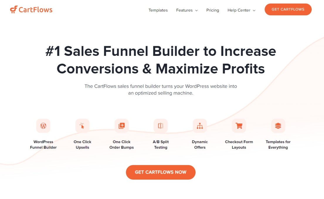
2. Engaging Hero Section with Well-Crafted Headline

The hero section is the first thing a visitor sees when they land on your page.

It’s what hooks visitors and encourages them to scroll down to the call to action so needs to be good.

The headline should cover what and why and the body content should back that up.

Engaging Hero Section with Well-Crafted Headline

You need to answer two fundamental questions. What do you offer and how does it make the visitor’s life better or more profitable?

Answer those two questions and provide a clear call to action and you should have a high converting landing page.

3. Conversion-Oriented Sub Headlines

Sub headlines can help organize content, break it up into bite sized pieces and help reinforce your message.

Conversion-Oriented Sub Headlines

We think ‘The CartFlows sales funnel builder turns your WordPress website into an optimized selling machine.’ sums it up nicely!

All the best landing pages for conversion will reinforce their key message with subheadings and yours should too.

Make them interesting and make sure they accurately describe the body content.

4. Optimized Above the Fold Content

Depending on your hero section design, you may or may not have space for above the fold content.

If you do, highlight key features from the target audience’s perspective or address common pain points to reinforce the message you began with your headline.

Optimized Above the Fold Content

5. Highlight Features and Benefits

Features and benefits sell. When we look for products, we tend to look at what it will do for us rather than what it’s made of.

Address common requirements and perform objection handling by highlighting features and benefits.

Highlight Features and Benefits

Let the reader know you’re on their side, that you understand their situation and that your product is the perfect solution to their problem.

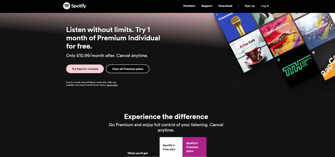
SoFi’s landing page for VA home loans is a great example of this. After the fold, SoFi included pain points that a typical home buyer would bring up, and why SoFi is the best lender to help those who are active personnel, veterans, and reservists with their big purchase.

Sofi Image

That’s how you keep them scrolling to the CTA button.

6. Use Testimonials and Social Proof

Social proof tells the reader ‘people like you loved our product because…’

It’s that extra reassurance that real people actually like what you do or what you sell and it isn’t all just a polished marketing exercise.

Testimonials and Social Proof

Social proof includes:

  • User reviews or client testimonials
  • Google or third-party reviews
  • Number of downloads or active users
  • Business ratings from established authorities

If you can add any or all of these, do so. The newer your business or your product, the more important social proof becomes!

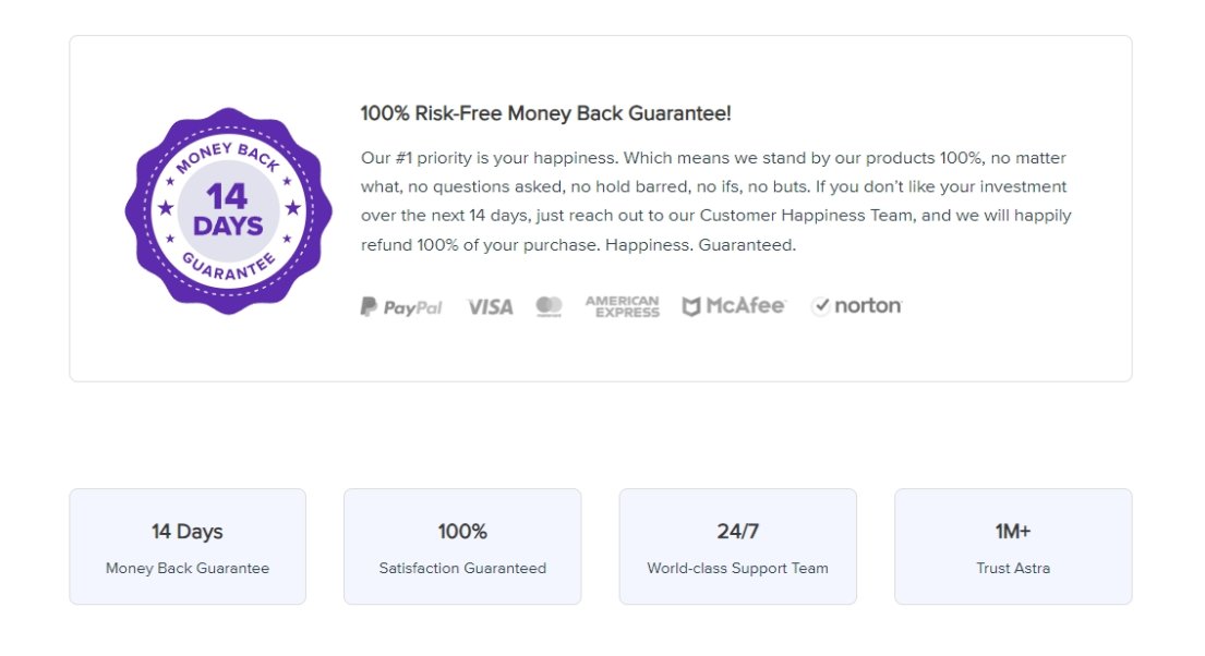
7. Add Trust Signals

Trust signals are another subtle message reinforcement like social proof. They help reassure visitors they are in good hands and that you’re a safe investment.

Trust Signals

The lower the perceived risk, the higher the chance of conversion.

Trust signals include security badges like VeriSign Secured or Verified by Visa.

They can also be guarantee signals like ‘No quibble money back guarantee’ or association trust signals like ‘BBB Accredited Business’.

‘As featured in’ or ‘As used by’ are also trust signals.

Use as many as you’re entitled to use but keep the design simple and effective.

8. Use Images and/or Video

Images and video are more engaging than content and are key to creating the best landing pages for conversions.

Use Images and/or Video on landing pages

Images and video also help add color, flavor and character to a page while breaking up walls of text and helping you show and tell.

Choose images and videos carefully and make sure they are of the highest quality. They should also reinforce your core message to help convert. If you’re struggling to find the perfect visuals, consider using an AI image generator. These tools allow you to describe your ideal image, and the AI will create a unique visual based on your input. This can be a great way to achieve a specific look or concept that might be difficult to find with stock photos.

If you do use video, muted autoplay is your friend. The last thing you want to do is annoy the visitor or give them cause to leave!

Make sure all videos work on mobile too.

9. Logically Flow Down the Page

Landing pages are often sales or lead generation funnels. They should have a simple, defined structure to lead the visitor to the call to action.

For example, a lead generation page should open with a strong hero section with a compelling headline, supporting text and a clear call to action with a button.

If you’re using a form, you could position a small form in the hero section so a user can convert right away. You can also add another form down the page. e.g. to ring you up on your contact center.

Logically Flow Down the Page

Lower sections should answer those key questions, address pain points and solve problems.

All designed to position your offer as the best solution.

Social proof should feature prominently afterwards. Reinforce the idea that your offer is also popular with people like them, followed by another call to action.

Add trust signals, videos and optional content down the page as required.

10. Call To Action With a Single Defined Goal

All the best landing pages for conversions will have a single goal.

That core message can be repeated down the page, but should always have one goal in mind.

It can be a button on its own or have a short message to add context or to convert depending on the offer.

The simpler the offer, the simpler the call to action can be.

Single Call To Action With a Single Defined Goal

What that is depends on the goal of the page, but will usually be something like:

  • Sign up here
  • Join now!
  • Buy now and save!
  • Get started for free!
  • Free download
  • Book now!

The message should be simple, clear and leave no doubt in the mind what you want the visitor to do.

What Type of Landing Page Do You Need?

There are dozens of landing pages you can build, for all kinds of reasons. Most are variations of a theme but all will have a particular purpose.

Splash Page

A splash page appears once you click a link and will open a brand new page.

It can fulfill many roles, from collecting leads to alerting you to discounts, sales, product launches, and anything else you can think of. For example, glitch deals by Amazon use splash pages during sale times to notify customers of unexpected discounts and special offers.

This is a classic example of a splash page:

a classic example of a splash page

Source

Squeeze Page

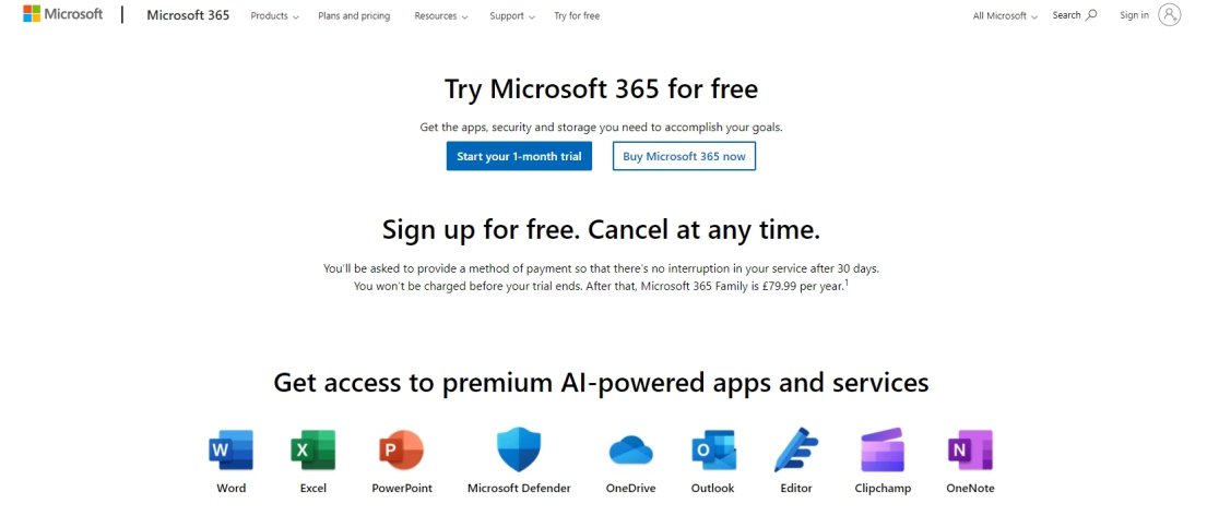
A squeeze page is a type of landing page designed to capture an email address.

It will often offer free access to content, a free trial or download or other offer in exchange for that email.

Here’s an example of a click-through squeeze page from Microsoft:

squeeze page from Microsoft

(Source)

Lead Capture Page

Lead capture pages are probably the most popular landing pages.

They have a single goal, to convince the visitor to provide their email address for future marketing efforts.

In addition to collecting emails, make sure you create SPF records to safeguard your domain from unauthorized email senders.

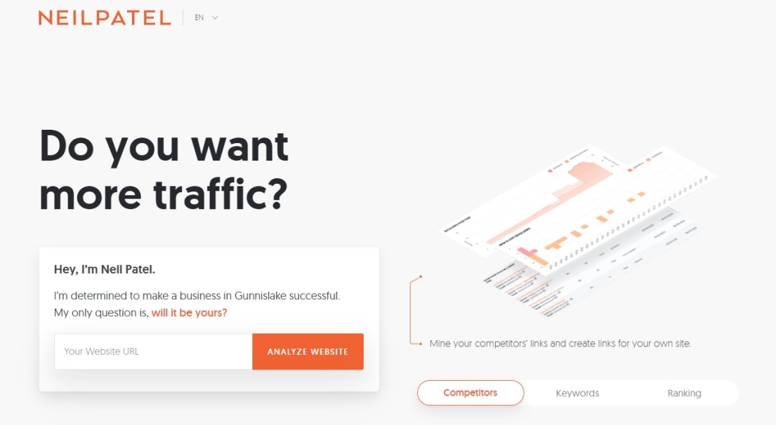
Here’s a lead capture page that first captures a URL, then asks for your email to access results:

Lead Capture

(Source)

Sales Landing Page

A sales landing page is designed to convert.

It should highlight features and benefits and answer common buyer questions while gently guiding the visitor towards a purchase.

Here’s how sales landing pages should be done:

Sales Landing Page

Source

Coming Soon Page

Coming soon landing pages are great for building hype and awareness of an upcoming release.

They often include countdown timers to help build anticipation or announcements of new arrivals.

Here’s a great example of a coming soon page:

Coming Soon Page

Source

Thank You Page

It’s always good to show gratitude, which is why thank you pages can be so effective.

It can also be a place to subtly encourage the customer to continue shopping or engaging with your site.

Here’s a thank you page you’re probably already very familiar with:

Amazon Thank You Page

Unsubscribe Page

An unsubscribe page is the landing page nobody wants to create but has to.

A good unsubscribe page design would allow the user to unsubscribe but also offer alternatives like pausing, changing email frequency or switching to a free version.

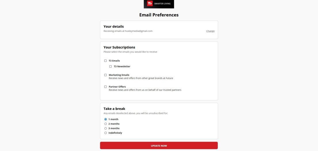
Here’s a classic example of an unsubscribe page:

T3 Unsubscribe Page

It provides the ability to change preferences, unsubscribe or pause. All without getting in the way of the user’s goal.

How To Build Your Own High Converting Landing Page

This video walks you through how to build a coming soon page:

If you prefer to read, you can create a high converting landing page in just 5 steps with this guide.

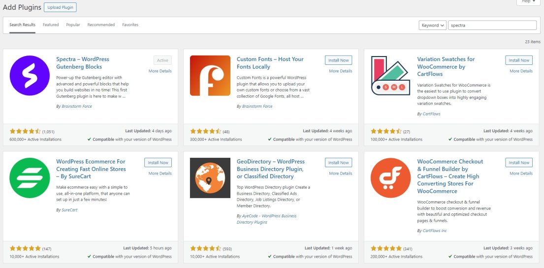
1. Install and Set Up Spectra

Spectra is free and available from the WordPress repository. You can download and install it from there or add it from within the WordPress dashboard.

Install and Set Up Spectra

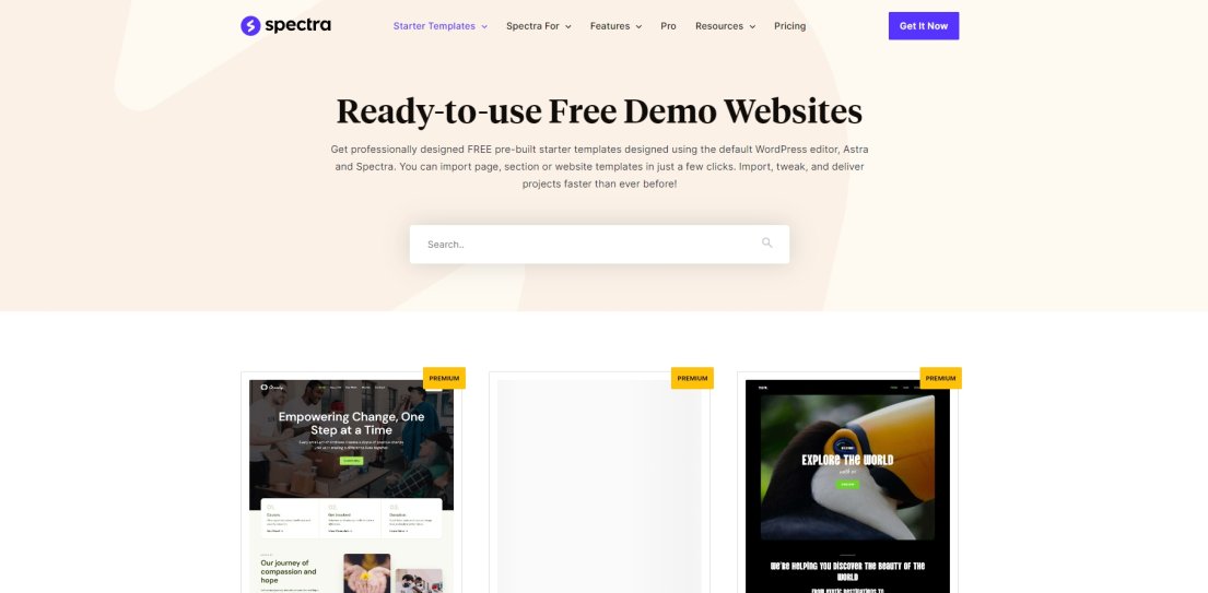
2. Use a Landing Page Template

The easiest way to build a landing page is to use a readymade template.

Select Pages > Add New Page in your WordPress dashboard.

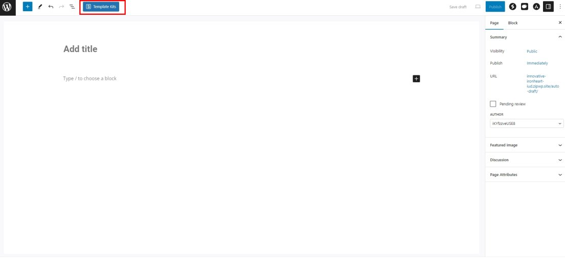
Select the blue Template Kits button at the top of the page editor.

Select the blue Template Kits button at the top of the page editor

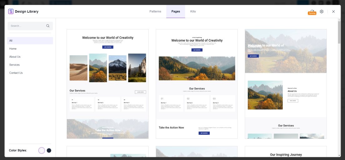
Select the Pages tab at the top of the popup window and choose a template to import.

Template kit window

You could also import a block pattern using the Pattern tab. This is a readymade page section you can use to build your own landing page.

The Kits tab enables you to install a different theme page to the one you have installed.

This can be useful if your current WordPress theme doesn’t have a landing page template or you want a different look.

Once you find a page design you like, select the purple Insert button that appears at the bottom when you hover over the template.

The template should import in seconds and be ready for you to customize.

3. Customize the Content To Suit the Audience

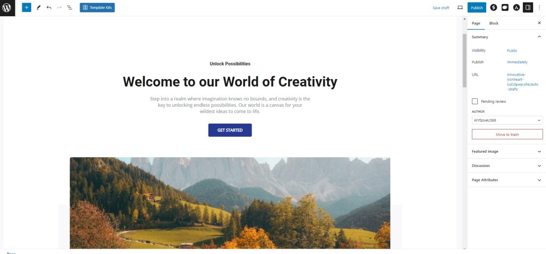
Your new page template should open in the WordPress block editor.

Customize the Content To Suit the Audience

Use the customization controls on the right or within each block to make any changes you need.

Delete any blocks you don’t want and customize the page so it reflects your brand.

Remember the 10 tips above when building your landing page. The more you include, the more effective it will be!

4. Test Your Landing Page

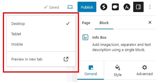
Once you have finished customizing your landing page, save it as a draft in WordPress and open it in a new tab.

Test Your Landing Page

Imagine you’re a first time visitor and check the page to see how it comes across. Check spelling, grammar, headings, body content, images, video and calls to action.

Also check all buttons or forms on the page to make sure they work.

Test in desktop, tablet and mobile modes to make sure everything looks good on all devices.

The more thorough you are here, the lower the likelihood of a visitor discovering an error!

5. Launch and Monitor

Once you’re completely happy with your page, hit Publish in WordPress.

Copy the URL on the right and use it in your marketing efforts. Promote your page as much as you can and monitor the results.

If you created the best landing pages for conversions you can, people should begin converting in no time!

How To Track Landing Page Performance

We think there are 5 key metrics you should be looking at to decide whether your landing page is converting well or not.

All can be tracked in Google Analytics. Other tools are available, but GA4 does it for free.

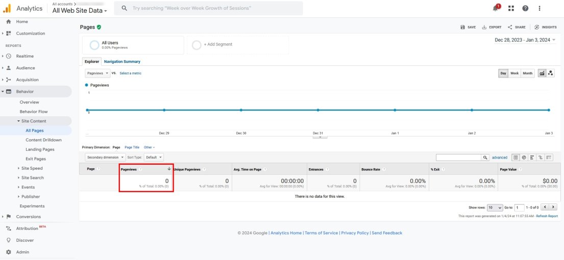
Once you’re logged into GA4, select the domain you want to track and navigate to Behavior > Site Content > All Pages.

Most of your tracking will be done from here.

There is a specific Landing Pages section in GA4 but we find All Pages works well enough for most situations.

Those metrics are:

Page Views

Page views are a fundamental metric. You need to know how many people are looking at your landing page to be able to calculate whether it’s working or not.

Measure:

  • Total page views
  • Unique page views/visitors
Page views in GA4

Locate the URL of your landing page and click on it to see the data.

Conversion Rate

Conversion rates are the calculation of how many visitors perform the action you want them to take.

Conversion rates can include filling in a form, registering for an account, buying a product, subscribing to a newsletter or something else.

By tracking the exact goal, you can get an accurate picture of how well your landing page is converting.

Set conversion goals in Google Analytics to track conversion.

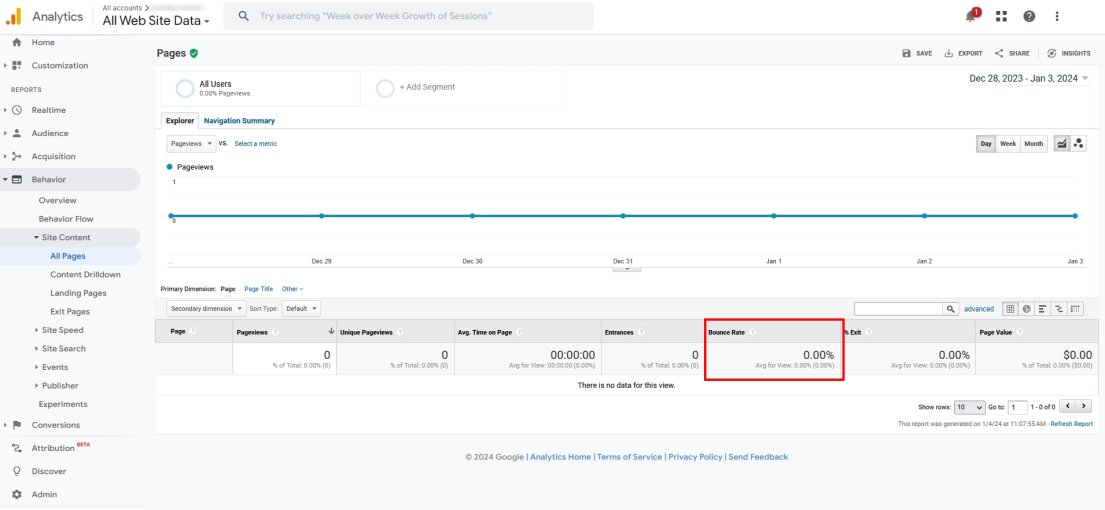
Bounce Rate

Bounce rate is a key indicator of whether your landing page delivers what the visitor is looking for.

You’ll see a box on the main page called Bounce Rate with a number inside.

Bounce Rate in GA4

A high bounce rate indicates your page isn’t delivering what the visitor wants to see or what they expect.

That could be for a multitude of reasons, but is usually:

  • Unclear offer or confusing path to conversion
  • Weak call to action or lack of powerful headline
  • Unclear messaging or unoptimized website content
  • Offer or benefit not enough for the perceived effort or cost

Check all of these things and address any shortcomings you find. Or A/B test to experiment with different landing page styles.

Sessions by Source

Sessions by source tells you where the traffic is coming from. This is a useful metric to track if you’re running paid ads or other promotion to attract traffic.

If you’re using a funnel to your landing page, sessions by source will tell you the proportion of traffic being sent via your funnel and from other sources.

If you’re running an email promotion or other marketing campaign, knowing how effective it is can help future planning or show you where improvements need to be made.

You’ll need to add traffic-source dimensions to use this metric. Once done, you should see a new column showing you the source of all landing page traffic.

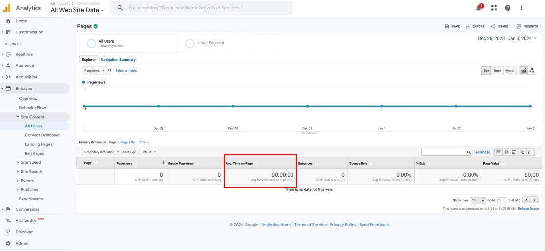
Session Duration

Session duration or average time on page tells you how long someone spends on your landing page.

It’s an optional metric that’s mostly useful for longer landing pages rather than shorter ones.

The more time they spend, the more value they are finding on the page. Hopefully, this would be reflected in the conversion rate, but won’t always.

Session Duration in GA4

Select the URL of your landing page and look for average time on page within the box called Avg. Time on Page.

Landing Page FAQs

How do I make my landing page convert more?

You can help your landing page convert more by following the tips in this post. It should have a clear message, strong headline and subheadings, compelling call to action and give the visitor a solid reason to convert.

How do I create a high converting landing page in WordPress?

To create a high converting landing page, you can use a readymade template, build a page from scratch or adapt an existing page on your website. As long as it follows the tips in this guide and you provide a clear path for a user to follow, your page should deliver the results you’re looking for.

Is WordPress good for landing pages?

Yes, WordPress is good for landing pages. It’s free, easy to use and there are hundreds, if not thousands, of free and premium landing page templates. Use a page builder such as Spectra and you also have access to powerful page blocks to help convert visitors.

What is a high conversion rate for a landing page?

A high conversion rate for a landing page is 10% and above. The industry average is between 2-5% so anything above that is performing well. Hit 10%+ and you’re really converting visitors!

What is the best landing page builder for WordPress?

The best landing page builder for WordPress is Spectra. It has dedicated landing page templates and is completely free. While SeedProd, ThriveArchitect and other builders are very good at what they do, they all cost money. Why give away profit when you don’t need to?

Which WordPress theme is best for high converting landing pages?

The best WordPress theme for high converting landing pages is Astra. It’s fast, easy to use and comes with high quality templates you can use to build high conversion landing pages. Astra is compatible with Spectra, Elementor and other page builders, so you don’t need to know code or have any existing skills to use it.

Conclusion

So there you have it. Our complete guide to building a high conversion landing page.

We covered the what, why and how. We also shared high converting landing page examples, best practices and showed you how to track how pages perform.

That’s all you need to know to get started. What happens next is entirely up to you!

Put these tips into practice and tell us about the results below. We would love to hear how you got on!

💾

Want to set Coming Soon Page for your website? Here is an easy and Right Way to do that Using Spectra Plugin. Set your website to coming soon or maintenance ...
❌